In a sense this exercise reminds me of 12-bar blues. The limits of the form are narrow, yet the results span a wide realm. It is as if the constraints themselves inspire one to work harder to capture and present one's vision. With running gear shots the limits are not quite so narrow, but the possibilities are still endless despite the specificity of the subject. Here are some variations.
 I'm a fan but not a huge fan of Nick d'Amato's shot (captioned version here). In looking at running gear I like the interplay between the curves of the drivers and the lines of the rods and so forth. In Nick's shot the curves are barely visible and the lines are primarily horizontal, with just the one short diagonal. The shot does not have a nice blend of geometric elements. Also, being a flat shot, a shot taken perpendicular to the subjext, it does not have a great deal of depth. What I do like are the textures on the metals, not to mention the wisps of steam here and there and the light coming through from the back at top center, not to mention the many bolts.
 Keith Burgess goes for the angle and steam approach (captioned version here, website here), with the main rod and the steam telling the story. The presence of the steam is sort of a tradeoff; one loses the details of what is a magnificent beast but instead one gets a stronger sense of its life. The steam on the right also hides what would have been distracting complexity, putting the focus on two main rods and one wheel, although my curves-favoring eye is also drawn to the upper curve in the next driver forward. (I will admit to a bit of confusion as to why it is so high; I feel like I am misreading something in the mechanical arrangement.)
 I'm afraid that this shot is also not fully successful to my eye, however. The upper left and upper center in particular is somewhat of a formless mash of elements, and the image does not have strong contrasts. The angled view offers depth in the presentation of the main rods, but the impression of depth is tempered by the steam to some extent. It is cool to see the detail in the layering of rod ends on a common pivot (journal?), but ultimately there are a lot of trees here but it is a bit weak on the forest. (I love lots of Keith's shots and will feature some down the road.)
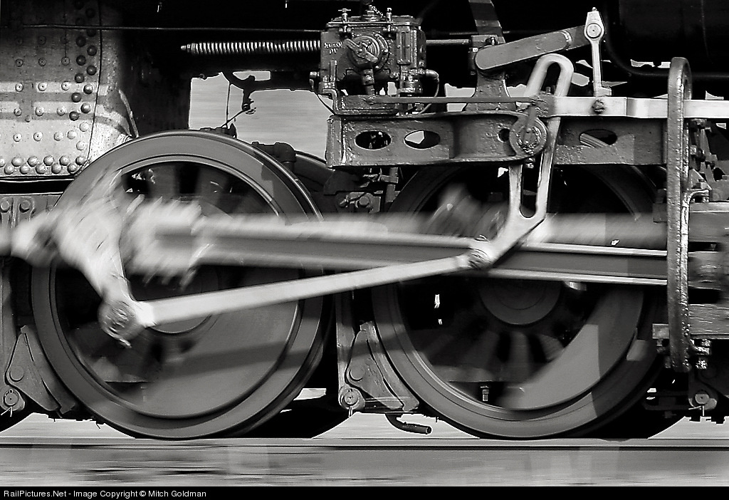 Mitch Goldman goes for what I will call a "detail pan" (captioned version here) with interesting results. This one, unlike the others and unlike most running gear shots, shows the gear running! He's got the up/down on the rod and the circular motion of the drivers, excellent! There is a large expanse of open background flying by. For some reason, that does disturb me, I must say. I think I would prefer a bit more of the boiler to be visible to provide some more weight at the top of the picture. It is nice that the driver area is so open - and so well lit! - but there is a bit missing of what I can only call gravitas. Still a cool shot. I bet Mitch could take a running gear crop of any of a number of his pans and I would love it, but I only like this one.
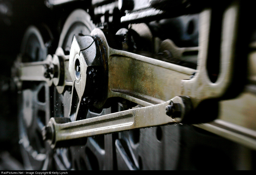 Kelly Lynch's shot (captioned version here, website here) has some really interesting details. First, it has a particular, eccentric (a pun!) mix of focus and out of focus areas; Kelly used a lens baby to create the effect. The focus is on the pivot, an oddly-shaped piece of metal, but with the connections going to it and the contrasting angle formed by the line of the secondary rod and the U-shape in the right foreground, and the drivers in the backgrounds, with their spokes, there are lots of fascinating lines, curves, and shapes to feast on. All seen at a dynamic angle.
Second, the surfaces of the rods scream METAL! in their dull sheen, in their bronze/green/ gray colors, in the variations such as the varying thicknesses in the rods. The variations in the light, with stronger reflections on some surfaces than others, adds to the feel. This shot says machine in this added textural/visual dimension that to some extent Nick's shot also does but Keith's and Mitch's do not. (It occurs to me that the other shots do not have as much tonal variation as I would like to see in BW/monochrome images, with Nick's shot being perhaps an exception, whereas this shot has both color and tonality.)
Finally, the spray of water adds an interesting contrast in detail and in texture, and implies some motion and a story element as well. A fine, fine mix of characteristics resulting in a strong composition.
Boy, this has been an unusually grumpy thread for me! Some might say picky. I like these shots, and I especially like Kelly's shot, but I think I will just continue to seek what I will find to be the perfect running gear shot. Something with a stronger sense of drivers, of big wheels, yet preserving the other dimensions. Perhaps these photographers have already found their perfect shots. Nice work.


