Monday, December 8, 2008

"100 Greatest Railroad Photos"


It seems appropriate to say a few things about the Trains magazine special issue "100 Greatest Railroad Photos." By nature I get irritated by hype of all sorts, and while Trains has been an important venue in the hobby, it is of course ridiculous to choose the top 100 but restrict the selection to those shots. I'll try to let that go. :)

My tastes in shots differ significantly, however, as does my definition of greatest. I am not particularly interested in historical impact, for example. So, while I respect the work of Lucius Beebe and the efforts earlier in RR photography history to orient the hobby away from roster shots, today I look at the shot on page 4 and I see a boring steam wedgie. Just think of how far we've come since then!

Many of the shots are not especially artistic but rather document the industry. They are good photographs, and as documentation of a changing industry is central to the photographic efforts of many, some will consider them great photographs, but they don't interest me here. One such example is the GP-30 shot on page 69. I love the GP-30 but this shot doesn't move me; the framing is conventional, the detail sparse due to darkness, and the worker not particularly engaged in the scene. Another example is the shot spread across pages 70-71 of the M&IR articulated. It is framed competently and having the train on bridge over another track is of some interest but ultimately this is a roster shot of an elevated engine and, while a grand engine it is!, the shot doesn't do much for me as a photograph. No matter, others will enjoy those more and some of my favorites less.

So, the intro is done; what shots are particularly compelling, at least to this observer's eye? I start on page 10 with John Gruber's backlit steamer with the dazzling white fringe on the darkplume and the backlit engine framed in white steam. So nice! (For those of you equally taken by the night Morant's curve shot on the previous page, I simply don't much care for light streak shots, although here the moonlighting, to coin a meaning, is really interesting.)

The spread on pages 18-19 of the Mojave at dusk is really nice, great textures, different shadings of the dominant color, and the trains spread out everywhere, with a lumpy hill in the middleground adding visual contrast. Beautiful, Mark Hemphill! The Greg McDonnell plow and tree across pages 22 and 23 is nice but a bit dark and a bit too formless on the right side to be really compelling, despite the action; I prefer the Lew Ableidinger shots I features a few months ago.

Moving from the "Action" section to the "Icons" section, the issue leads with the tremendous Steinheimer shot (page 28) of the hand and stopwatch. What a hand! What an interesting hand, what work it has done! Page 32 has a fascinating view of the observation car on the 20th Century Limited, by Don Wood, with much to think about in terms of lifestyle and travel. Wonderfully framed.

The page 34-35 spread pacing a warbonnet is very nice; the background holds enough detail to convey context, and catching the engineer looking back at his train adds a nice reverse touch to the dominant left to right movement. By Linn Westcott.

The "under the car" shot by J. Parker Lamb on page 39 is very nice; the engine, the boy on the bicycle, the repeated framework under the roof, but I am turned off by the proximity of the camera to the nearby rail and the unusual appearance of that rail, sunk a bit below ground level or below the level of some sort of surface with a rough edge. The bottom foreground just takes too much attention. (There is a later "under the cars" shot which is really great.)

The final shot here that really captures my attention is the winter depot shot by Mel Patrick, pages 42-43. Foreground passengers in silhouette, middleground passengers and conductor lit, great textures in the stonework, steam coming off the train from the heating system. It is interesting that the people are disengaged from the train, despite some carrying suitcases. Where are they coming from, and going to?

I've only reviewed two out of five sections! I'll blog about the rest soon, and go back and write about how these images relate to those I view today, and some reactions to those images that don't meet my personal "greatest" standard.

My comments continue in Part II.

[Sorry for not having blogged for a while. Big push at work. I'll try to do better. J]

Thursday, October 9, 2008

Backlit + Background

Sometimes I notice an image, find it interesting, and then I notice other images in the same style or with the same theme. One such occasion was when I was viewing the 2008 winners of the CRPA contest. I realized the tremendous power of backlit photography with strong/detailed backgrounds.

We all have seen lots and lots of images where the train is strongly backlit or in silhouette. Generally, these images contrast a dramatic dawn/dusk sky with lots of great color against the black of the train. Compositionally they are often somewhat simple: a wedge of a train against a simple background, sky with maybe a treeline or distant mountain ridge, with some interesting clouds.

What has caught my interest is the possibility for a different sort of background, one that is more of a secondary element or even co-main subject, to support the subject. Thus, the subject, being backlit/silhouetted, may have some detail or only provide a shape, but the background provides a secondary element which contrasts not only in light but in having interesting detail.

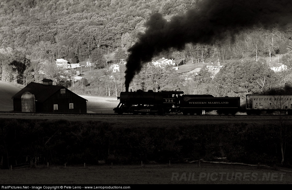
Consider the shot above by Peter Lerro (captioned version here). It is a classic backlit image. But look at the background, what an interesting hillside! Not only the several structures, but also the line of the valley and the splash of light on the field between the engine and barn. The barn complements the train and itself is a combination of darker and lighter elements. The background livens things up. (As does the presence of detail on the visible dark side of the train.) The shot does not tend toward the abstract nearly as much as silhouette shots do.

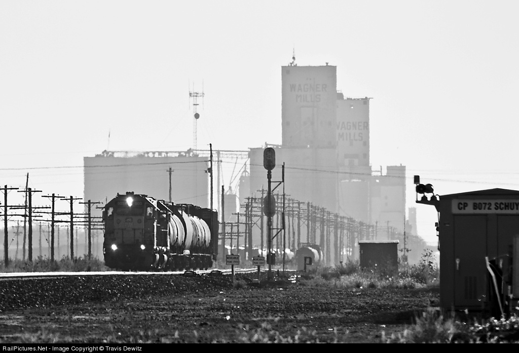
I like the shot - very much - but it only pushes part of the way toward the sort of image I am thinking of. So consider this shot by Travis Dewitz (captioned version here). The background is strong with the grain elevator (but gets a bit muddled with what Travis calls a "utility mess"). But the train is small and is not backlit but rather sidelit, and thus does not have the dramatic separation from the background that attracts me to these types of shots (and I find the presence of the shack at the right too strong and also uninteresting).

What I love is this shot, part of the gold medal-winning portfolio submitted by Olaf Haensch for the 2008 CRPA competition. The engine is in full silhouette but has interesting edge detail. The background is well lit for a night shot and has impressive texture and details and just a touch of color. Putting a steaming train in front of it in a daylight shot would be just fine but the contrast offered by the dark train (and dark sky) makes the building leap out. The contrast also increases the sense of depth, as I suspect that a daylight shot would not have the same strong feel of separation between the train in front and the building behind.

Great details pervade the scene: the (lancet?) arches of the windows and doors, the two tones in the plume, the puddle reflections. But those are specifics, combining into an overall effect which conveys a strong sense of fine beauty, of the angel in the details. Click on it, take a look at a larger version, very well done!

Monday, October 6, 2008

Chris Crook: Complexity

Lately I've been doing a lot of blogging on black/white pictures. That is sort of odd as I love color, but life is random sometimes, bad teams have winning streaks, and here we are. So I wanted to inject a bit of color (besides the terrific Troy Paiva shots a few posts previously) and this one (by Chris Crook) caught my eye. But wouldn't you know it, it has only a bit of color.

I like it nonetheless. We all have our biases and I have a soft spot for shots that emphasize complexity. [One of my goals is to take the definitive freight yard hub-bub shot!] This shot has all sort of industrial grid patterns, steam, lights, and tucked away in the middle just a bit of a splash of blue, and a switcher to boot! And it is at Mingo, my visit to which I still fondly remember, with my father reading the paper in the car while I wandered about, too young to drive there myself.

I'm not saying it is a great shot, but it is an interesting shot and I'll tuck it away, with its strengths and weaknesses (the composition is not that strong, I think, despite the grids) and ponder it as I search for that special shot of my own.

PS: Every so often I'm going to show an image that attracts my attention for idiosyncratic reasons, and present it without much text or justification, as here. Just another type of pix-musing to pop out into the world. :)

Thursday, October 2, 2008

O. Winston Link: The Presence of the Train

In reexamining some of the iconic images of O. Winston Link, I am struck by a particular issue of rail photo composition that has been interesting me for some time, the relationship between the train and the rest of the image. Is there a relationship at all, are they connected in the composition?

Consider the first image of people playing in a river as a train roars by. Well, that is just it; the train roars by but the people do not notice. That is OK to my senses; the river connects the people and the bridge with the train passing over it. To some extent the scene holds together.


But what of the second scene, also of swimmers? In this case the swimming/ people part of the image occupies its own, fenced space, and the train is outside of it. More than just outside, separated by the fence and some foliage, and no one gives it any heed. Two parts of the scene stuck together, as if by happenstance. The train is not "of" the swimming scene, it is an appendage.


An exagger- ation? Well, how about the third scene, the famous drive-in photo? A cluster of cars watching a movie with an airplane. The train passing - does its chuffing drown out the sound inside the cars? Does anyone notice it go by? At least compositionally its lengthy plume helps bring added attention to it, pulling the eye away from the plane (or away from the engine?).


The fourth image, the gas station shot, I find the most striking of all. Look at the action in the shot! The train is huge, so huge that the shot cannot contain it, showing neither the nose nor the cab, much less the tender or train. And it seems to be feet away from the remainder of the scene. And yet, no one notices it go by. How extraordinary!

The attendant and the couple are both focused (intently?) on the delivery of gasoline to the car. Perhaps this is a greatly foreshadowed metaphor for how our society today perceived cars and trains, the former a vital force to be kept fueled, the latter easily ignored despite its great presence? A massive stretch, and I don't believe that is the intent; too early in history for that, I think, and Link was not know for that sort of social commentary. But the presence, or shall I say absence, of the train in the story of the image is, well, astounding!

The last image is a different sort of discon- nection, one of minor presence. The scene is the interior of a hardware store, and it just happens that there is a sizable steam engine outside the window, so large we can only see the number and parts of two drivers. It is literally outside the scene, peeking in, but actually it isn't, it is merely stopped outside, minding its own business, with no apparent connection to or interest in the people and goods inside. What is the connection between train and scene?

These images seem to combine train and scene by happenstance. With the exception of the first, there are no obvious reasons why a train should be present in any of the scenes, not by geography or transportation need. Their presence is accidental, or perhaps coincidental; they are in the scene but not so much a part of it.

Of course, many or most of Link's images are not composed in this way. But I was struck by the parallels here, particularly noticeable to me because several of these images I think of as being the "most iconic" of his work. The question of connection between train and environment is one I intend to return to with reference to contemporary images.

[NOTE: I have tried twice to reach the copyright holder, Link's son, to receive permission to use these images here. On the basis of those efforts and my reading of the doctrine of fair use (in particular the "for purposes such as criticism, comment" phrase, combined with the non-profit nature of this site) I conclude that my use of these images is lawful and appropriate.]

Friday, September 26, 2008

Composition: Brake Wheel

Consider this nice brake wheel image (captioned version here). It has some appealing character- istics. A nice contrast between the round brakewheel, with the rounded shapes inside the rim and the angular running board with its shadow in repeating diagonals, and underlying that the horizontals of the ribbing on the boxcar. Interesting textures, including both the wheel and the wall of the car. A very nice shot (by Bill Grenchik.

By contrast, the next image (captioned version here) has, in my view, a stronger composition, more interesting and more dynamic. Why do I like Nick DAmato's shot more?

First, Bill's shot is taken from a face-on angle, which I find inherently less interesting than an off-center angle. An off-center angle introduces depth and diagonals, which often add life to an image. Having a third dimension is important in bringing life to what is, after all, a two dimensional image. Depth is important.

Here, the depth comes from two sources. Obviously, the angular view puts the far side of the car end further away from the viewer. More subtly, the brake wheel casts a shadow which necessarily falls behind the wheel and thus generates a perception of depth, creating an implicit sense of in front/behind, although in actuality the shadow may be no further away from the viewer.

Second, Nick's shot has lots of diagonals, the obvious one being the top of the hopper running from upper right to middle left. But the brake wheel and its shadow form a second, implied diagonal from upper left to lower right. The diagonals form an X which, along with the depth, add to the dynamism, which the horizontal composition of Bill's, with the wheel on the left and the running board and shadow on the right, lacks.

Also, I'm not personally a fan of the somewhat 'up' angle in Bill's shot. I find it off-putting - insufficient to create a strong dynamic, yet not quite right as a flatter scene. All in or all out for me, I guess.

Of course, there are lots of things to like in Bill's shot and there are a number of things I prefer, starting with the textures. Also, the sky separates better from the car because the car is dark, and I'm not a fan of how the wheel shadow is cut off in Nick's shot. Both have something to offer, and for that matter opinions will vary and some will like the first one more.

Tuesday, September 23, 2008

Shaughnessy: Another Review

A month ago I posted a link to a review of the upcoming Jim Shaughnessy book by Alex Craghead. I have since come across another review of the book, by Otto Vondrak. His review is also lengthy, shows several images from the book, and even makes reference to rock and roll. Read up!

Saturday, September 20, 2008

Troy Paiva: Color

One of my goals for this blog has been to find and present interesting rail photography that pushes the limits of the genre, in particular in the more-artistic, less-representational direction. One interesting example is this set of shots by Troy Paiva. These shots are all taken at night using gelled strobes and flashlights to create the coloring; details of the technique are here. (Thanks, Troy, for the correction.)

The first shot, above (original here), uses a strong red color to bring the inside of the switcher cab alive in a way that capturing standard interior light simply can not. The contrast of variants on the primary blue and red colors along with the rather bright levels of light on both inside and outside surfaces make this shot almost playful; a simple geometric study, happy.

The second shot, at right (original here), uses color differently, the green and blue being more complementary in tone, in a way, and the scene peaceful. And yet the colors take a rather drab peace of equipment, a rustic relic, and give it some life. The composition is enlivened by a wide white stripe that intersects with the lines in the car, and a well-placed puddle of water.

The third shot (original here) is a bit of a muddle, yet I find it interesting. While the right side is bold and clean, colorized cab, number, and (air?) tank, the left side has a jumble of hardware without strong definition. Note the light touch of added color on the domes at the top. I find the shot a bit out of balance, but the applications of color have a certain presence. Not a favorite, but interesting to look at.

I find the last shot (original here) fascinating! It appears to be a pile of taken-down signals, both crossing and line. The foreground has an upside down "STOP ON RED SIGNAL" sign (overturned sign, overturned equipment, overturned world) with red highlights, echoed in subtler red applied to a line pole in the background. The signals themselves either glow from moonlight or are lit/processed artificially and have a touch of blue tint. Their horizontal lines oppose the vertical of the pole and the square of the sign. The pole stands out against a plain background while the sign gives definition to the muddle of pieces below. It's a beautiful rendition of discarded material!

A bonus: Troy has some excellent shots from his night visit to the S.S. Independence, a decommissioned "ghost ship." While many of these shots (also found here) make use of the coloring approach seen in the shots here, a number of excellent ones do not. A stunning set of shots! I must say, more interesting than the train images. Other shots are here and here . I have yet to go through his entire website but I bet there is much more to savor.