Wednesday, December 31, 2008

"100 Greatest Railroad Photos" Part III (Edited)

This post continues the one immediately below, discussing the images in the Trains magazine publication "100 Greatest Railroad Photos."

The final section of the publication, "Environment," features not just scenic shots but also shots that show the railroad in its environment. Some or many of the compositions have much in common with what one might call the standard rail scenic shot, done well.

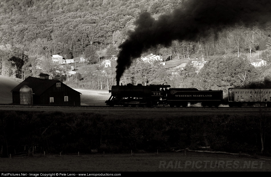
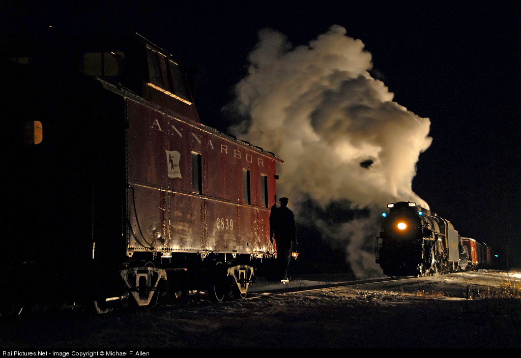
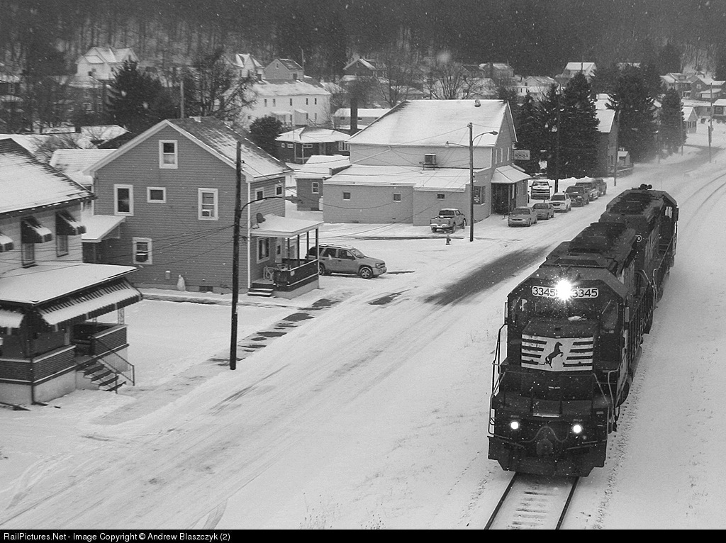
The Jilson numberboard closeup (page 92) depicts cold weather railroading nicely; I like the streaks of moving snow in the headlight beam. The Acton glint shot is nice but to my eye standard. The unusual frosty look in the Holmes WP shot makes up for it being a standard wedgie, and does not distract from the Stan Kistler under-the-cars view, which is creative and has nice BW contrasts, taking advantage of an extremely sharp (and temporary) curve.

On page 98 Philip Weibler's Chicago commuter scene, in the single train, the many tracks, the snow, the soft focus, reminds me of a classic photography scene from maybe a century ago by a big name photographer whose name I cannot recall. So I will insert that information down the road when it finally comes back to me. [EDIT: It came to me! It's the shot shown here, by Alfred Steiglitz, called "New York Central Yard" from the 1900s. Is it similar? Well, maybe, maybe not, but one made me think of the other. Link to a captioned version here.]

I don't happen to find the Tehachapi shot "magical" in part because I have seen versions of that shot a number of times, and in part because streaks of light winding around make it a fine technical work but not particularly artistic. The shot doesn't move me. The Hellman steel mill shot, page 104, is a well-done view of the inner workings. Scott Lothes' Hawks Nest shot is extremely well done, with the dawn sky reflecting in the river and the patches of ice on the water providing added texture.

I'm not a fan of the Rasmussen caboose loop shot; it seems out of balance. It documents the loop well but that is all. The other shots do little for me, and the closing Solomon sunset shot is too simplistic a composition to catch my eye despite the beautiful colors.

Can you tell I am not moved by this set of shots? What is lacking? The main thing is that the compositions are not interesting - there is a low weight on artistry as compared to documentation, especially a problem for the section of the collection where documentation is least important. Although there are relevant documentation shots, such as the Charles Brewster shot of a train going up Saluda (page 107). So the issue is really that I am expecting to see more on the artistic side, whether classic landscape or otherwise, and I am not seeing it. (Toward that end, where is the fantastic taconite yard shot by Dave Schauer with the steam rising off the cars and spreading over the yard? Unbelievable that one is not considered one of the top 100 appearing in Trains!) As a secondary matter, I don't see much in the way of vivid color (which I will admit a bias towards) or interesting light.

I'll do a summary in a fourth post.

Thursday, December 11, 2008

"100 Greatest Railroad Photos" Part II

This post continues the one immediately below, discussing the images in the Trains magazine publication "100 Greatest Railroad Photos."

The third section of the publication, "Locomotives," is for me the most disappointing section, as I only found two images there of real interest. Frank Barry's Big Boy shot on page 51 interests me because in a way it is a high-key shot, with dark engine against white ground, sky, and even signals, although the up from the ground angle does leave it imbalanced, bottom heavy. The Steinheimer shot on page 54, on the other hand, is all a shot should be, black water crane against the main light source, light gray engine, dark gray sky, almost white steam, a fabulous series of contrasts with an interesting composition to boot. A beauty!

The remaining shots in this section are either documentary (nice N&W Y6's! The RGS shot is interesting for the brakeman riding the pilot) or wedges and other common views. Some of the material is topically quite interesting (a special kudo for including the Mingo Junction Alco's - I visited there at around that time as a teenager!) but not visually so.

The People section is of mixed interest. A straight person-doing-the-job shot doesn't generally interest me (two operator shots, an engineer shot, some track workers, a magazine-reading smoker in a station) and few of the shots represent compelling portraiture or action. There is little art in many of the shots here, in my view.

A few shots do catch my eye, the first being the Plowden shot of the coal pouring into a tender (and I'm not even a Plowden fan, really).The overhead shot of the Grand Central concourse is a nice abstract. Also, for some reason I am taken by the signal maintainer with the blurred train, which conveys some of the effort of making a RR go. It is documentary; I don't think it evokes any feelings of hardship or cold or something else, but I do like it.

Starting on page 85 it gets more interesting. I like the overhead shot of the track worker; it has simple lines and a nice contrast between color and bland. Furthermore, it reminds me of a favorite person/abstract shot, this one by MJ Scanlon (link only; I will try to get permission to do an embedded image soon).

The really interesting shot is on the next page, a brakeman gazing out upon the land. He has an alert look, not smiling but somehow appears to be pleased to be where he is, doing what he is doing (but is my opinion swayed by having read the caption?). The light on his face and the shade on the side is perfect and the curve of the train and the light on the land emphasize the open spaces feel. Nice portraiture, it offers a story.

The next shot is also nice, a platform action shot that is nicely framed internally and has excellent depth and movement, and the turned head of the lady is well-timed. Turning the page, the office shot is a nice view of the trappings of power: inner office, outer office, cigar (?), huge desk. Page 89 has a nice shot of traveling children, one asleep, one casually draping his arm.

I'm generally not a fan of the kid-looking-at-the-train shot, too much a cliche, but the presence and low position of the child on page 90 wonderfully highlights the size of the enormous drivers.

In the final part of what turns out to be a trilogy of posts, I will review the Environment section and then write a few things about photography then and now.

Monday, December 8, 2008

"100 Greatest Railroad Photos"


It seems appropriate to say a few things about the Trains magazine special issue "100 Greatest Railroad Photos." By nature I get irritated by hype of all sorts, and while Trains has been an important venue in the hobby, it is of course ridiculous to choose the top 100 but restrict the selection to those shots. I'll try to let that go. :)

My tastes in shots differ significantly, however, as does my definition of greatest. I am not particularly interested in historical impact, for example. So, while I respect the work of Lucius Beebe and the efforts earlier in RR photography history to orient the hobby away from roster shots, today I look at the shot on page 4 and I see a boring steam wedgie. Just think of how far we've come since then!

Many of the shots are not especially artistic but rather document the industry. They are good photographs, and as documentation of a changing industry is central to the photographic efforts of many, some will consider them great photographs, but they don't interest me here. One such example is the GP-30 shot on page 69. I love the GP-30 but this shot doesn't move me; the framing is conventional, the detail sparse due to darkness, and the worker not particularly engaged in the scene. Another example is the shot spread across pages 70-71 of the M&IR articulated. It is framed competently and having the train on bridge over another track is of some interest but ultimately this is a roster shot of an elevated engine and, while a grand engine it is!, the shot doesn't do much for me as a photograph. No matter, others will enjoy those more and some of my favorites less.

So, the intro is done; what shots are particularly compelling, at least to this observer's eye? I start on page 10 with John Gruber's backlit steamer with the dazzling white fringe on the darkplume and the backlit engine framed in white steam. So nice! (For those of you equally taken by the night Morant's curve shot on the previous page, I simply don't much care for light streak shots, although here the moonlighting, to coin a meaning, is really interesting.)

The spread on pages 18-19 of the Mojave at dusk is really nice, great textures, different shadings of the dominant color, and the trains spread out everywhere, with a lumpy hill in the middleground adding visual contrast. Beautiful, Mark Hemphill! The Greg McDonnell plow and tree across pages 22 and 23 is nice but a bit dark and a bit too formless on the right side to be really compelling, despite the action; I prefer the Lew Ableidinger shots I features a few months ago.

Moving from the "Action" section to the "Icons" section, the issue leads with the tremendous Steinheimer shot (page 28) of the hand and stopwatch. What a hand! What an interesting hand, what work it has done! Page 32 has a fascinating view of the observation car on the 20th Century Limited, by Don Wood, with much to think about in terms of lifestyle and travel. Wonderfully framed.

The page 34-35 spread pacing a warbonnet is very nice; the background holds enough detail to convey context, and catching the engineer looking back at his train adds a nice reverse touch to the dominant left to right movement. By Linn Westcott.

The "under the car" shot by J. Parker Lamb on page 39 is very nice; the engine, the boy on the bicycle, the repeated framework under the roof, but I am turned off by the proximity of the camera to the nearby rail and the unusual appearance of that rail, sunk a bit below ground level or below the level of some sort of surface with a rough edge. The bottom foreground just takes too much attention. (There is a later "under the cars" shot which is really great.)

The final shot here that really captures my attention is the winter depot shot by Mel Patrick, pages 42-43. Foreground passengers in silhouette, middleground passengers and conductor lit, great textures in the stonework, steam coming off the train from the heating system. It is interesting that the people are disengaged from the train, despite some carrying suitcases. Where are they coming from, and going to?

I've only reviewed two out of five sections! I'll blog about the rest soon, and go back and write about how these images relate to those I view today, and some reactions to those images that don't meet my personal "greatest" standard.

My comments continue in Part II.

[Sorry for not having blogged for a while. Big push at work. I'll try to do better. J]

Thursday, October 9, 2008

Backlit + Background

Sometimes I notice an image, find it interesting, and then I notice other images in the same style or with the same theme. One such occasion was when I was viewing the 2008 winners of the CRPA contest. I realized the tremendous power of backlit photography with strong/detailed backgrounds.

We all have seen lots and lots of images where the train is strongly backlit or in silhouette. Generally, these images contrast a dramatic dawn/dusk sky with lots of great color against the black of the train. Compositionally they are often somewhat simple: a wedge of a train against a simple background, sky with maybe a treeline or distant mountain ridge, with some interesting clouds.

What has caught my interest is the possibility for a different sort of background, one that is more of a secondary element or even co-main subject, to support the subject. Thus, the subject, being backlit/silhouetted, may have some detail or only provide a shape, but the background provides a secondary element which contrasts not only in light but in having interesting detail.

Consider the shot above by Peter Lerro (captioned version here). It is a classic backlit image. But look at the background, what an interesting hillside! Not only the several structures, but also the line of the valley and the splash of light on the field between the engine and barn. The barn complements the train and itself is a combination of darker and lighter elements. The background livens things up. (As does the presence of detail on the visible dark side of the train.) The shot does not tend toward the abstract nearly as much as silhouette shots do.

I like the shot - very much - but it only pushes part of the way toward the sort of image I am thinking of. So consider this shot by Travis Dewitz (captioned version here). The background is strong with the grain elevator (but gets a bit muddled with what Travis calls a "utility mess"). But the train is small and is not backlit but rather sidelit, and thus does not have the dramatic separation from the background that attracts me to these types of shots (and I find the presence of the shack at the right too strong and also uninteresting).

What I love is this shot, part of the gold medal-winning portfolio submitted by Olaf Haensch for the 2008 CRPA competition. The engine is in full silhouette but has interesting edge detail. The background is well lit for a night shot and has impressive texture and details and just a touch of color. Putting a steaming train in front of it in a daylight shot would be just fine but the contrast offered by the dark train (and dark sky) makes the building leap out. The contrast also increases the sense of depth, as I suspect that a daylight shot would not have the same strong feel of separation between the train in front and the building behind.

Great details pervade the scene: the (lancet?) arches of the windows and doors, the two tones in the plume, the puddle reflections. But those are specifics, combining into an overall effect which conveys a strong sense of fine beauty, of the angel in the details. Click on it, take a look at a larger version, very well done!

Monday, October 6, 2008

Chris Crook: Complexity

Lately I've been doing a lot of blogging on black/white pictures. That is sort of odd as I love color, but life is random sometimes, bad teams have winning streaks, and here we are. So I wanted to inject a bit of color (besides the terrific Troy Paiva shots a few posts previously) and this one (by Chris Crook) caught my eye. But wouldn't you know it, it has only a bit of color.

I like it nonetheless. We all have our biases and I have a soft spot for shots that emphasize complexity. [One of my goals is to take the definitive freight yard hub-bub shot!] This shot has all sort of industrial grid patterns, steam, lights, and tucked away in the middle just a bit of a splash of blue, and a switcher to boot! And it is at Mingo, my visit to which I still fondly remember, with my father reading the paper in the car while I wandered about, too young to drive there myself.

I'm not saying it is a great shot, but it is an interesting shot and I'll tuck it away, with its strengths and weaknesses (the composition is not that strong, I think, despite the grids) and ponder it as I search for that special shot of my own.

PS: Every so often I'm going to show an image that attracts my attention for idiosyncratic reasons, and present it without much text or justification, as here. Just another type of pix-musing to pop out into the world. :)

Thursday, October 2, 2008

O. Winston Link: The Presence of the Train

In reexamining some of the iconic images of O. Winston Link, I am struck by a particular issue of rail photo composition that has been interesting me for some time, the relationship between the train and the rest of the image. Is there a relationship at all, are they connected in the composition?

Consider the first image of people playing in a river as a train roars by. Well, that is just it; the train roars by but the people do not notice. That is OK to my senses; the river connects the people and the bridge with the train passing over it. To some extent the scene holds together.


But what of the second scene, also of swimmers? In this case the swimming/ people part of the image occupies its own, fenced space, and the train is outside of it. More than just outside, separated by the fence and some foliage, and no one gives it any heed. Two parts of the scene stuck together, as if by happenstance. The train is not "of" the swimming scene, it is an appendage.


An exagger- ation? Well, how about the third scene, the famous drive-in photo? A cluster of cars watching a movie with an airplane. The train passing - does its chuffing drown out the sound inside the cars? Does anyone notice it go by? At least compositionally its lengthy plume helps bring added attention to it, pulling the eye away from the plane (or away from the engine?).


The fourth image, the gas station shot, I find the most striking of all. Look at the action in the shot! The train is huge, so huge that the shot cannot contain it, showing neither the nose nor the cab, much less the tender or train. And it seems to be feet away from the remainder of the scene. And yet, no one notices it go by. How extraordinary!

The attendant and the couple are both focused (intently?) on the delivery of gasoline to the car. Perhaps this is a greatly foreshadowed metaphor for how our society today perceived cars and trains, the former a vital force to be kept fueled, the latter easily ignored despite its great presence? A massive stretch, and I don't believe that is the intent; too early in history for that, I think, and Link was not know for that sort of social commentary. But the presence, or shall I say absence, of the train in the story of the image is, well, astounding!

The last image is a different sort of discon- nection, one of minor presence. The scene is the interior of a hardware store, and it just happens that there is a sizable steam engine outside the window, so large we can only see the number and parts of two drivers. It is literally outside the scene, peeking in, but actually it isn't, it is merely stopped outside, minding its own business, with no apparent connection to or interest in the people and goods inside. What is the connection between train and scene?

These images seem to combine train and scene by happenstance. With the exception of the first, there are no obvious reasons why a train should be present in any of the scenes, not by geography or transportation need. Their presence is accidental, or perhaps coincidental; they are in the scene but not so much a part of it.

Of course, many or most of Link's images are not composed in this way. But I was struck by the parallels here, particularly noticeable to me because several of these images I think of as being the "most iconic" of his work. The question of connection between train and environment is one I intend to return to with reference to contemporary images.

[NOTE: I have tried twice to reach the copyright holder, Link's son, to receive permission to use these images here. On the basis of those efforts and my reading of the doctrine of fair use (in particular the "for purposes such as criticism, comment" phrase, combined with the non-profit nature of this site) I conclude that my use of these images is lawful and appropriate.]

Friday, September 26, 2008

Composition: Brake Wheel

Consider this nice brake wheel image (captioned version here). It has some appealing character- istics. A nice contrast between the round brakewheel, with the rounded shapes inside the rim and the angular running board with its shadow in repeating diagonals, and underlying that the horizontals of the ribbing on the boxcar. Interesting textures, including both the wheel and the wall of the car. A very nice shot (by Bill Grenchik.

By contrast, the next image (captioned version here) has, in my view, a stronger composition, more interesting and more dynamic. Why do I like Nick DAmato's shot more?

First, Bill's shot is taken from a face-on angle, which I find inherently less interesting than an off-center angle. An off-center angle introduces depth and diagonals, which often add life to an image. Having a third dimension is important in bringing life to what is, after all, a two dimensional image. Depth is important.

Here, the depth comes from two sources. Obviously, the angular view puts the far side of the car end further away from the viewer. More subtly, the brake wheel casts a shadow which necessarily falls behind the wheel and thus generates a perception of depth, creating an implicit sense of in front/behind, although in actuality the shadow may be no further away from the viewer.

Second, Nick's shot has lots of diagonals, the obvious one being the top of the hopper running from upper right to middle left. But the brake wheel and its shadow form a second, implied diagonal from upper left to lower right. The diagonals form an X which, along with the depth, add to the dynamism, which the horizontal composition of Bill's, with the wheel on the left and the running board and shadow on the right, lacks.

Also, I'm not personally a fan of the somewhat 'up' angle in Bill's shot. I find it off-putting - insufficient to create a strong dynamic, yet not quite right as a flatter scene. All in or all out for me, I guess.

Of course, there are lots of things to like in Bill's shot and there are a number of things I prefer, starting with the textures. Also, the sky separates better from the car because the car is dark, and I'm not a fan of how the wheel shadow is cut off in Nick's shot. Both have something to offer, and for that matter opinions will vary and some will like the first one more.

Tuesday, September 23, 2008

Shaughnessy: Another Review

A month ago I posted a link to a review of the upcoming Jim Shaughnessy book by Alex Craghead. I have since come across another review of the book, by Otto Vondrak. His review is also lengthy, shows several images from the book, and even makes reference to rock and roll. Read up!

Saturday, September 20, 2008

Troy Paiva: Color

One of my goals for this blog has been to find and present interesting rail photography that pushes the limits of the genre, in particular in the more-artistic, less-representational direction. One interesting example is this set of shots by Troy Paiva. These shots are all taken at night using gelled strobes and flashlights to create the coloring; details of the technique are here. (Thanks, Troy, for the correction.)

The first shot, above (original here), uses a strong red color to bring the inside of the switcher cab alive in a way that capturing standard interior light simply can not. The contrast of variants on the primary blue and red colors along with the rather bright levels of light on both inside and outside surfaces make this shot almost playful; a simple geometric study, happy.

The second shot, at right (original here), uses color differently, the green and blue being more complementary in tone, in a way, and the scene peaceful. And yet the colors take a rather drab peace of equipment, a rustic relic, and give it some life. The composition is enlivened by a wide white stripe that intersects with the lines in the car, and a well-placed puddle of water.

The third shot (original here) is a bit of a muddle, yet I find it interesting. While the right side is bold and clean, colorized cab, number, and (air?) tank, the left side has a jumble of hardware without strong definition. Note the light touch of added color on the domes at the top. I find the shot a bit out of balance, but the applications of color have a certain presence. Not a favorite, but interesting to look at.

I find the last shot (original here) fascinating! It appears to be a pile of taken-down signals, both crossing and line. The foreground has an upside down "STOP ON RED SIGNAL" sign (overturned sign, overturned equipment, overturned world) with red highlights, echoed in subtler red applied to a line pole in the background. The signals themselves either glow from moonlight or are lit/processed artificially and have a touch of blue tint. Their horizontal lines oppose the vertical of the pole and the square of the sign. The pole stands out against a plain background while the sign gives definition to the muddle of pieces below. It's a beautiful rendition of discarded material!

A bonus: Troy has some excellent shots from his night visit to the S.S. Independence, a decommissioned "ghost ship." While many of these shots (also found here) make use of the coloring approach seen in the shots here, a number of excellent ones do not. A stunning set of shots! I must say, more interesting than the train images. Other shots are here and here . I have yet to go through his entire website but I bet there is much more to savor.

Saturday, September 6, 2008

Lew Ableidinger and the Open Spaces

Lew Ableidinger works primarily in black and white. In going through his images, I immediately took an interest in several shots from the Woodworth, ND area. I love the ways these shots convey open spaces through composition and texture.

In the first shot, "Road to Nowhere," note the unusual angle of the train. It's barely in the frame and it is already up and out of here, heading over the small hill (an effect enhanced by the road which is also going up and out). This shot does not have en expanse retreating into the distance, and for that matter the train doesn't appear small relative to its surroundings. And yet, the unusual angle, the train sitting on some sort of a ridge, the balance with the road and the tree give this somewhat odd view great appeal. It perhaps does not fit with the rest of the shots here as the "open spaces" feel is weaker and there are more elements in the frame (including the grassy textures). But I enjoy the way the subject is the road, enhanced by the tree/bush and the fencing, and one is in effect driving up to meet the train and both will subsequently make their own explorations on the other side of the ridge.

I will treat the next two shots, "The Open Country" and "Life in the Vast Lane," involving the same crossing and tree, as a pair. They are simple compositions, a train, a road, a tree (or two), and the endless plains.

The first shot of the pair is a classic scene, a road leading up to a short train. The foreground tree provides depth in front of the train and the receding plains behind, and stands on the left, balancing the light source at the right background. The plains have just enough roll to them to provide a stronger sense of distance. The combination of snow and backlight make for excellent contrasts, both at the "macro" level in terms of the tree and train and at the "micro" level in terms of the grasses in the snow. It's a peaceful, interesting scene.

Sometimes a road takes the eye in a direction, but sometimes it frames. In the second shot of the pair, it forms a diagonal that "supports" the trees and train. The two trees create an internal framing for the train, helping to keep the eye from following the road to the right. In doing so, however, the road is left as a strong triangular element; too strong for me. To me it is a large dark object, dominating the smaller tree, the train, and what is visible of the open spaces. It detracts, without itself bringing sufficient interest in terms of its texture or otherwise (unlike the road in the opening shot of this post).

The final shot, "Trains and Plains," turns out to my eye, surprisingly, to be an abstract. Compositionally, it has three elements, two of which are the lines of the train and horizon and the block of the backlit engines. The third, subtle but to me rather striking, is a curve in the sky, a bowl shape formed by variations in the light and clouds.

Complementing these simple elements are restrained variations in light and texture. The fine granularity of the grasses poking through the snow fades into a formless sky with diffuse changes in light across the frame. The land has just enough roll to the land to convey a greater sense of depth. The light does not radiate but rather glows in an odd, foggy/hazy manner, with only a partial sense of the direction of light. The black, backlit power enters the frame from the left (presumably), proving a dominant element, but to me, participating in the scene as an equal party rather than being the focus of it.

I think of this shot as being conceptually equivalent to a pastel picture; just as pastels tend to have subdued colors, this image has subdued compositional elements and light, but the overall effect conveys an interesting glow and a strong, uplifting, almost spiritual sense or presence.

Recently I've been absorbing David Plowden's recent tome, which has a number of non-RR shots of this type. The present of a train makes Lew's shots more accessible to me, because they draw a contrast between the small train and the large space, a contrast enhanced by my knowledge that the train is actually large. And yet, the trains don't necessarily appear small in these pictures; it is not that the trains become smaller when faces with these expanses, but that the expanses appear timeless, permanent, as the train temporarily occupies part of the space.

Saturday, August 23, 2008

Alex Craghead: Book Reviews


Alexander Craghead is a self-described writer and photographer (whom I don't know). He has just written a detailed review of the upcoming book "The Call of Trains: Railroad Photographs by Jim Shaughnessy," due out in November but for which he received an advance review copy. I ran across his review in the Yahoo ObsCar group and found it fascinating, and his blog even more so, because he has also reviewed the David Plowden book "Vanishing Point: Fifty Years of Photography." (Several years ago he also reviewed "A Passion for Trains" by Richard Steinheimer; alas, only in a cursory manner.) He has also reviewed a number of other books on railroad subjects; here is his book review section and here is his personal web page (with a very interesting organization, analogous to sections and chapters of a book).

Shaughnessy is of course an important figure in railroad photography and I look forward to the book. But the review is worth examining in its own right, of course especially if one is considering buying the book (or putting it on one's holiday wish list, which I definitely am). He not only discusses some of the images in the book but also comments on the accompanying essay by Jeff Brouws and expands on that to discussing his own views of the (implicit) comparison to Steinheimer created by the mere existence of the book, in similar form and by the same editor/author as the Steinheimer volume. The review is detailed and rich.

His review of the Plowden book is equally valuable. He also gives significant attention to the included essay (by Steve Edwards) and also goes through the images, in even greater detail than in the Shaughnessy review. Having re-read the review with my copy of Plowden at hand, I can attest to the quality of the insights made. In turn, that makes me look forward even more to the Shaughnessy book.

One might quibble with some of Craghead's points. For example, in discussing Plowden he notes "the clinical inhumanity of a nuclear power plant" but later he says "We walk freely amongst barns and inside of feed mills. It seems that dust still hangs in the air, as if someone was just here, just working, but where have they gone? There is a profound solemnity, as if in church, and each successive image shows us less and tells us more." One wonders the extent the observation is driven by the actual differences between the images versus the personal perceptions of the nuclear power and agricultural industries. Having less of a romantic view of farming, I am less taken by the barn images, devoid of surrounding tools, animals, even footprints in the mud and thus quite dry (plates 213, 217, and 220 leave me unmoved) and categorize them more closely to a number of the images of industrial structures with a similar flavor.

Nonetheless I have learned much by reading Craghead's reviews. His mind operates differently than mine; I do not write phrases like "mixing a lyric style of photography with a documentary sensibility" or think thoughts like "b
eyond, there is no world, no ocean, no hills." By nature I don't read stories into pictures, or at least I leave them in my unconscious. By reading material like this, I can try.

In writing about the reviews and the reviewer, however, I should not overlook the reviewed! I have the Plowden and Steinheimer books and will purchase the Shaughnessy when it comes out. The first two are lengthy and beautifully printed compendiums, retrospectives of their work, and the Shaughnessy should be of the same editorial and production quality as the Steinheimer. I have contemplated blogging on some of the individual Steinheimer images and intend to inquire about the use of smaller versions of the images here; otherwise I might yet do it anyway without images, simply referring to the plate numbers.

Only a small portion of the Plowden book features RR images, however, 28 in the opening chapter plus a handful at the end; a few images elsewhere in the book have some RR content. I find them of less interest than those by Steinheimer, with the possible exception of plate 14 and 20 and perhaps 7 and 230. As a whole I find the images in the book more difficult to appreciate but am finding that the effort bears some fruit. Nonetheless, I don't favor Plowden's style overall, although a number of the images do move me or capture my attention.

[NOTE: I have not asked for permission to use the images from the dust jackets of the books. As those images are being used to sell those books, I presume there is no problem with my use of them here.]

Sunday, July 27, 2008

Steve Crise: Shallow Depth of Field

Steve Crise (website here; look not only in "railroads" but also in "Project 3751" and in "Urban Environments") has done some excellent work with extremely shallow depth of field. Here are some similar compositions, verticals with track as the foreground/in-focus element. In these shots the zone of focus is particularly narrow, encompassing only a few ties in shots with much more depth.

Let's start off with this frog shot, with intermodal cars in the background. Interesting shot, lots of details, muted yet colorful with browns and some reds and blues (compared to most people, I am more of a fan of rich browns). But I find the shot busy, cluttered; where is my eye supposed to go? The focal point is weak, due in large part to the frog being simply longer than the range in focus. Also, the background is rather busy and in some sense visually close to the frog, resulting in a lack of separation. Nice, but lets turn to shots that are really nice!

Really nice would be this track and signal shot. So much to see, two different signals, two different signal colors, pinkish hue in the sky which is picked up in the rails. I am a fan of what I think of as a triangle compo- sition, here formed by the two signals and the zone of the track in focus.

What I find interesting here is the choice to limit the focus to an arbitrary, nondescript section of track - no switchpoint, switchstand, spike, anything. I like the effect, I think because it equalizes the three points. The foreground, which could be a stronger element if more distinct, becomes equal in presence; the left signal is a strong element here. Overall, I love the peaceful flavor here, interrupted only by the knowledge that green over red means a train is coming. The shallow depth of field eliminates all minor elements that one might find in a scene, junk and weeds in the foreground, the signal boxes, details of the mountains, leaving a beautiful semi-abstraction.

The third image is powerful. The foreground is distinct, the spike, the complementary nearby fasteners. Balanced against this element is the train, strong and powerful yet not over- whelming, colorful (nice contrast against the overall coldness), with distinct form. The absence of focus reduces the nose to basic elements, three circles on a field of red (itself shrouded by clouds, with blue only above - cool!).

More than that, the shallow depth of field reduces the entire scene to basic elements, and the key here is that Steve has chosen the elements well, track and the train that runs on it. The blur gives added emphasis to the track, which to my eye results in excellent balance, just the right emphasis on the track, eliminating the natural instinct of any railfan to focus on the engine.

When I began to ponder this post, I was of the opinion that this engine/spike shot was by far my favorite. In pondering them more, I now realize that the signals shot is its equal if not more favored. The pastels are so nice, the lines (rail parallel to signal post) so strong, the essence of the scene so well conveyed. Sweet!

Steve, hope you don't mind, but I am going to copy this type of composition, if not the exact forms here, at the next opportunity! :)

Wednesday, July 23, 2008

Mechanics versus Artistry

It has been noted that I take a somewhat mechanistic approach to an activity that is inherently spontaneous or inspired. Certainly true! I have a good bit of an engineer's mentality.

A correspondent recently wrote of my blog that "perhaps the process is one of trying to put into objective terms what was originally done very subjectively by the author." By this he meant that no photographer thinks in the terms I use in my commentary. (See also the comments made on my Subtle Color post.) This is undoubtedly mostly true, although I suspect some photographers to think about dimensions of composition in conscious or semi-conscious ways.

But what happens to spontaneity? One could argue, for example, that a rules-based (rule of thirds!) approach necessarily hinders one from achieving higher artistic qualities in one's work. Following rules stifles creativity, one might say. I suspect that, instead, the effect is in the other direction. Certainly the better we become at the technical aspects of photography, exposure and such, the better our images become and the more likely we are to achieve something beyond the mundane.

Surely this goes beyond the technical aspects to the creative ones, however! The more we know about, and internalize, aspects of composition like form, line, texture, etc., and the more we learn to see the aspects of light in a scene, the easier it is to release ourselves from the rules-based, nuts and bolts, mechanistic aspect of composition and see creatively, and thus achieve great results in our work. To internalize the objective in order to free the subjective.

But this blog is as much or more about appreciating shots already taken than about shooting. I find it helpful to think about these images in terms of principles of composition. "Debugging" these shots gives some insight into how they are put together. At the same time, I certainly realize that the best shots often have an extra quality that cannot be reduced into basic principles. Some shots "work" and some shots have innate beauty, and some of those qualities are beyond my language to express.

Any effect of these musings on the reader's practice of photography is, while welcome, incidental or at least secondary. Other than my hope that people are inspired by interesting images to try new ideas in their work.

As for my mechanistic approach in this blog, well, it's true! The principles of composition, as I have informally learned them, are the main "language" I have for expressing my thoughts. Over time here also I will be pursuing a non-mechanistic mode of expression, but it will be a while!

[The image is mine, one of the more creative shots I have taken. Captioned, B/W version here.]

Saturday, July 12, 2008

Trains in the Distance

In a recent post, I made the following statement: "The image is a train in its environment, not an environment with a train in it." By this I implicitly referred to a tension between the size of a train in a shot and its presence within the image. A train can be a small element within a shot and yet have a much larger presence, in fact, be a major focal point, as it is in the images in that post. The converse is not necessarily true, usually, as a train that occupies a sizable part of an image will necessarily tend to have presence. Nonetheless, size and presence need not be in proportion. Here I want to consider a set of images where the train is small but their presence differs from minuscule to significant.

Consider first this image by Justin Tognetti (captioned version here; more of his work here). The train is pretty small, but this is obviously a train shot, in fact, two trains appear. The scene is basic, terrain, water, sky. I just love the way the front of the more distant train is framed by cloud shadows, which also gives it a more distinct identity relative to the first. The terrain has lots of interesting textures and hues and the two trains have a bit of lower left / upper right positioning. Very nice!

But the train need not be such an obvious part of the image. This boat shot is by Gerald Oliveto (captioned version here; more of his work here). The light is nice and the color of the water is subtly gorgeous. But the train is difficult to find (and would be more difficult but for the precise framing of the power in front of a brighter spot of water). It's an interesting scene, but not particularly a railroad image, as the train is barely visible. (For my tastes, had the shot been a bit wider, so that the boat was less squeezed and more of the marina were present on the left, it may have had better balance.)

Both of those shots are landscape scenes. Instead, a shot can be more abstract. Here is one by Tom Mugnano (captioned version here; more of his work here). The train has a subtle presence here, but a bit stronger (and it is hard for me to judge since I know the location well and therefore the train is more obvious to me). What I find interesting is the layout of the town - all the blocks and buildings (and windows within them) give the shot a bit of an abstract feel. It reminds me of shots I have seen and taken, from a much lower angle, across an old European cities with a series of tile roofs. Lots of rectangles and such.

So, then, how does one consider this image, by Graham Williams (more of his work here)? This is the image that first compelled me to contemplate this subject. The scene lacks an obvious subject - there are a number of elements, (short) train, village, windmills, isolated farms, trees. One could say the scene is the scene, or that the scene is a pastiche of things, one of which happens to be a train. I happen to find this scene pretty, in a way, and interesting, in that my eye dances around the scene. At the same time, my eye doesn't stop much; perhaps I can exaggerate and call it an anti-composition because it lacks form. It's a jumble of elements with only tangential relationships to each other, in my view, but it all works for me. It's pleasant, it's interesting to look at. It's not a great shot, but it is a nice shot, and it's a bit off the beaten path of scenics, so it is inherently interesting.

Sunday, July 6, 2008

Subtle Color

My favorite dimension of photography is color. Yes, more than light, as much as we all love great light. Here are some shots whose use of color has particular appeal to me, even though in both cases its role is secondary.

First is a night scene by Michael Allen. One can photograph night scenes in many ways, such as the extensively-lit, colorful shots by Gary Knapp. Usually one must take a moderate approach, however. Michael's shot (captioned version here) was taken during a photo charter, using several light stands to light up the train but not the surrounding scene.

I love the rich yet understated hue of the caboose; one gets a strong sense of what it would look like during daytime, yet here it has a quiet presence. But in addition, there are splashes of green, in the marker lights and in the distance (a signal? on another caboose?). And the red of the caboose is repeated in the boxcar behind the tender. (I also like the hint of browns in the plume.) By no means is this a colorful shot, yet the colors make it rich and complete.

Next is an engine-shop shot by Brandon Smith (PBase site here, RP pix here). The light is muted, but the colors, while not vibrant, stand out (perhaps in part because they are primary colors, red, yellow, a bit of blue in the STOP signs). The yellow of the exhaust pipe is echoed in the yellow of the handrails and of the post on the left.

The composition (captioned version here) is interesting also, with the engine well off center and below. I think of the shot as two blocks, the big vertical rectangle formed by the engine staring in the lower left and taking up a good bit of the frame, and the smaller horizontal rectangle of the window above, slightly off center, and further weighted toward the right by the stronger pattern in the panes on the center and right compared to the left. The exhaust pipe ties it all together, and there is even a bit of steam.

In addition, there is a nice mix of textures, with the pattern in the bricks, the horizontal lines in the roll-up door, the smooth surface of the front of the engine, and the snow. All in all, sure I'd prefer stronger light, but still very nice work, so much else there to enjoy.

Finally, look at Mitch Goldman's shot (captioned version here). It's a better known shot than the other two, so normally I would not use it, but I just like it! and it's a shot I think of when I think of color. What makes this shot so nice is that strong colors are set in front of a black background, making them appear brighter and stronger. The dominant red of the cart is echoed in the PRR keystone on the nose of the GG-1. Softer reddish hues appear in the bricks, the lamps, and to some extent on the pilot of the GG-1. The splash of bright blue above the engine, the area of reflected light, and the yellow stripes give the left side a bit of color complexity to balance the strong presence of the red on the right.

Overall, the first two of these shots use color with some subtlety. They are not about color primarily, but color greatly contributes. The third shot has dominant color, but what is of interest to me is the color in other parts of the image that makes subtle contributions.

Tuesday, July 1, 2008

Extreme Positioning

Photographers pursuing making images beyond simple snapshots tend to quickly run across the rule of thirds. But rules are made to be broken, as the cliche states, and sometimes a shot works well with the subject closer to or at the center. (For that matter the "rule" of thirds is only a guideline, after all.) What interests me here is the opposite, where one moves the subject of a shot, or at least one of the important elements, further away from the rule of thirds locations towards the boundaries of the image. Here are two images that do so quite successfully.

The first image is a mountain image by John West (captioned version here). And that is the point; in one sense it is a mountain image, against which the train measures up as a trivial presence. Of course, the primary subject is the train. In particular, it does not appear so small that it is difficult to observe and relate to, and for that matter the mountain is not so much a second element in the composition as the primary background and definer of scale. The image is a train in its environment, not an environment with a train in it. And yet, the mountain is huge; its peak is clearly well above the top of the image. Its height receives greater emphasis because of the placement of the train at the very bottom of the image, instead of, say, at a rule-of-thirds location.

Of course, there are other things to love about this shot, the falling snow, the splash of yellow in an otherwise field of muted colors.

The second shot, by contrast, is a flatland scene by Francois Iliovici, taken at Fagelsta in Sweden. This shot also reduces the scale of the train relative to that of nature, albeit in a different way. The shot has two elements, of course, train and moon. Francois could have easily placed the train at the lower rule of thirds location and the image would have been just fine. Instead, he places it further down, not on the margin but well down toward it. As a result he creates a greater sense of space, in the compositional meaning of the term as well as the astronomical! Thus, here, instead of a mere mountain, it is the cosmos itself that is being juxtaposed with the train.

Notice also the gradual transition, the gradient, in the sky color, from whitish blue at the bottom with hints of light red to a full sky blue at the top. Very nice! [BTW, the orientation of the scene is such that it appears not to be level, but it is.]

It comes to mind that this type of composition has something in common with the Cut The Corner compositions I discussed a few weeks ago. Both posts show examples of how photographers can successfully go beyond standard approaches.

Friday, June 27, 2008

This Website Will Continue!

With a gap of three weeks between posts, some may have wondered if this was a flash in the pan. While I have had family and work (and therefore sleep!) obligations crop up, I want to say I have a number of ideas accumulated, a number of photographer permissions to use pictures received, and continued interest in pursuing this approach to my interest in rail photography. I expect going forward that I will continue to post at least every two weeks, with some waves of extra effort and, necessarily, the occasional hiccup, leading to the occasional gap in timing of new material. The effort is harder than I expected (individual posts are not put together in 10 minutes but take contemplation over time as well as writing and rewriting to bring ideas to final fruition).

Please continue to check back occasionally; I intend to continue to provide commentary worth your time. Toward that end, I now provide RSS links on the right hand side of this page.

Scott Lothes: Bridges

Scott Lothes (website here; take a look at the image on his home page!!) has graciously offered to have me write about some of his shots. He sent me six and I have chosen these two for discussion. Neither is the best nor the worst (least good?) of the six, but both serve as exemplars of his style without additional complications. These are different shots of the same bridge, one Scott has been "working on" for some time.

My first observation is simply that his style here is different than I am accustomed to. I am used to looking at rail and non-rail landscapes that are somewhat dramatic, colorful (or broader tonality in B/W) and sharp.

These shots are interesting to me because they are just the opposite; the effects are subtle. Yes, they are silhouettes, but the light in them is neither colorful nor bright. The light is quite dull, both faded and subtle in shading. They approach B/W in feel, in emphasis on tonality, yet by retaining what appears to be natural color, they retain a presence in reality.

This is my bias; while I love good B/W work, my reaction to it has always involved an element of distancing from the subject, an abstraction. While viewing a B/W shot, I never feel as though I am standing trackside myself; rather, I absorb the image much as I would a painting. Thus, I view B/W work as a bridge, to some extent, between the realism inherent in photography and the abstraction in painting.

Back to these shots. I have mixed preferences here; I like some aspects of each shot. The first shot has more implied action, in the cloud bank moving in and in the lights on the distant shore under the bridge, a motion in time rather than space, towards nightfall or daybreak.

I also see the pattern of the wavelets in the water. I notice these wavelets in particular because I am a windsurfer (lapsed, I should say) and I have learned to see the wind coming/shifting through them. There is a zone, a triangle at the lower left, continued a bit somewhat higher, just in front of the left end of the bridge. [I'll make the probably obvious comment that we all bring our own experiences to bear when we look at an image.]

The shot has an interesting three-zone layout, sky at the top, then darker cloud with dark, then light water. At the same time, this is the major weakness of the shot, in my view. I find that the bridge and the train get just a bit lost in the darkness. My reaction would be less so were there not brighter areas elsewhere in the frame. Also, the bridge separate poorly from the darkness of the far short below the bridge, especially on the left side.

The second shot is simpler, a more pure silhouette, albeit one with more going on in the darker elements. The medium tone of the distant port, to the right of the bridge pier, is a nice second focal point. [Again, my experiential baggage, I love ports. Does your eye go to this area of the shot the way mine does?] The birds bring an element of life to the shot, always dynamic, that the first shot lacks.

However, it has less interesting color, sort of like a sepia in that there is one dominant hue, whereas the first shot has a bit of yellow/orange in the sky, a bit more reddish in the quieter water in the lower left corner, and some bluish in the clouds (the latter I think is actually not part of the actual hue, but my brain basically puts it there as a response to the entire image). The image is a bit hazy, in a way which seems to be part of the style but I personally don't find interesting. Again, I tend to like things to be more dramatic.

[It occurs to me that another dimension of this is that these images by Scott are not razor sharp; that does not bother me at all and I think that aspect intentionally contributes to the muted feel of the shots overall, but I know some will find it a distinct shortfall in image quality.]

The question of drama is a good point to end on. There are various levels of pizazz in images. These shots feature reduced tonal and color drama in favor of other elements. The amount of drama is one of many choices in our palette of style elements. Ultimately, I doubt I will become a fan of this style of shooting. But exposure to it, and seeing and contemplating what it does and what it conveys, helps in gaining a broader appreciation of photography.

By the way, take a look at Scott's website, which has a modest number of excellent shots, culled from a larger body of work as among his best. If your tastes run toward mine, you will find plenty of interest, with notable differences in styles. I would argue that many of those shots are "better" than the two here, but of course that reflects my preferences. I would love to write about the others down the road, and thanks to Scott's further permission, I will!

Sunday, June 8, 2008

2009 CRPA Contest Theme

The 2009 contest theme is "light impressions." I should take some time and mull over what this means, especially given that photography is all about capturing light. My initial thought (after having read the additional text in the announcement, link above) is that this means any sort of light except plain light. In other words, an image that has some combination of interesting pattern, texture, line, form, and color, but nothing interesting or noteworthy about the light, will not do well.

So, while light is an important element in photography, one can get excellent shots which emphasize other dimensions. For example, it is often suggested that outdoor portraiture can be done well when it is overcast, because then the light is soft and thus more flattering. I view "light impressions" as excluding shots for which light is not a predominant defining factor. My suspicion is that this excludes much mid-day rail photography - even during times of the year when "high sun" is not a factor - because, while the subject are well-lit, they are not necessarily lit in an interesting way. A well done sunny postcard-style landscape shot is a well done shot, but is not artistic in how it uses light.

However, the guidelines make explicit reference to "mid-day light"! How about that! As I shoot most of the time in such conditions, unfriendly to interesting light, I will be contemplating what one can do during that part of the day.

The included image may not be the ideal illustration for "light impressions" but it is at least interesting in that dimension, and I feel a bit lazy today and I want to get this out (blogging is hard, I am finding!), so I have simply grabbed an AB2 shot (captioned version here); thanks Andrew! I love everything about this shot (except, for some reason, the headlight beam grates on me, perhaps because it is off-color, bluish, compared to the rest of the shot). Note how the reflection of the light coming off the engine lights up the water and the stone, and see how the pinkish hue of the glint upper right is complemented by the pinkish glow of the limbs near the water lower left. Subtle details like that expand the image, adding to its complexity and the unity of its structure.

Saturday, June 7, 2008

Cut the Corner

When I spotted this shot by Walter Scriptunas (captioned version here), I was immediately reminded of a favorite Andrew Blaszczyk shot. In both shots the tracks cut off the lower right corner, running from the lower margin to the right margin. Why did this particular style of composition work for me?

Let's take a look at Walter's shot first. Shooting steam results in unique challenges. One, for me, is that having the plume come up out of the engine means that one tends to think vertically in composition, especially if the shot is nose on (or, here, tail on). If one goes horizontal, one has to use the considerable space on either side of the subject.

The best way to fill that space is with interesting environment. But Walter is in a stand of trees - what to do? First of all, he shoves the engine to the right. Since the plume hangs off the left side a bit, he is able to fill the middle of his shot, not only with the top of the plume, but with two well defined tree trunks that lead the eye upwards. And he has a nice bonus for the viewer, a water tank peeking out from near the right edge. So, while all of the hardware action, so to speak, is in the right and lower right, he uses the plume to spread things out.

Andrew's shot (captioned version here) is a beautiful town and train shot. I see a diagonal with the railroad world on the right and the town on the left. The houses face the railroad, both literally in the position of their porches and in how their horizontal lines, the rooflines, the pieces of siding, lead to the tracks. The railroad side, by contrast, is a series of near verticals - the tracks, the engines in a pleasing near-vertical diagonal. The engines are a helper set, so the train fits completely within the frame and the eye is not drawn to the edges of the frame. The snow on the ground and in the air gives a nice base for the BW treatment.

One can always quibble. In particular, I think Walter leaves too much space on his left margin, so not quite enough compositional oomph over there and a bit of imbalance. So I would have cropped more. But then, I would not have gotten this shot in the first place! But both shots are the sorts of shots I think about when I am out, or that come to mind when I am at home and realize some missed possibilities. Try putting the train in a corner and fill the frame with elements that complement it.

I really, really like Andrew's shot and so I may return to it in a different context.

2008 CRPA Awards

Every year the Center for Rail Photography and Art has a photography contest. The most recent theme was "sense of place" (I will blog about that another time) and the winner was Olaf Haensch. See the winners here; I hope to talk about Olaf's shots when I get permission to show his shots here.

Monday, May 26, 2008

What Pans Out?

Let's talk pans! What makes some of them better than others? IMHO! Let's take a look at some of Mitch Goldman's pans.

First of all, I'm not a big fan of many pans. A roster shot with a blurred background, that's all. A technical trick, but one that doesn't add too much compositionally. Why not?

Well, let's start with why we do pans - because they convey a sense of motion. Some of that motion is implied by the train itself, of course, presumed to be moving forward; the blur makes the movement more overt. Thus, it helps if the blurred background contributes to that. A blur of trees is neutral, to my eye, a jumble of shades, with the result not that much different than a roster shot; the focus is the engine and there is nothing else to look at. A blurred building, on the other hand, conveys a sense of a second object that the first object, the train, is moving past.

Steam is particularly good as a subject for pans, because the plume clearly indicates direction. In addition, the plume adds a secondary compositional element; a diesel pan can end up being a simple box in the middle of a blur background; boring. Also, that element is a pleasing diagonal up above the engine which makes for a nice contrast with the generally horizontal lines of the engine. Of course, one also captures driver rod blur for yet more dynamism, and often the shape is more interesting than a rectangle, with a smokestack on top and interesting exposed running gear.

Here is the link to 25 of Mitch's pans on RP. I'll talk about a few here. First up, geesh, what a shot (captioned version here)! Steam, of course. The plume has a nice blend of whites and grays, set against a blue sky. The snow means that the engine is surrounded by a light background (yet multicolored and thus more interesting: sky blue, snow white, weedy beige), making it stand out; the light sheen on the engine adds to that greatly, as does the excellent light overall. Extensive detail in the sharp detail (despite the 1/25 shutter speed!) makes it all the more compelling.

To illustrate the comparison, I will be a bit unfair and show one of Mitch's poorer pans. If I had one of my own to use, I would! Consider this picture (captioned version here). Put aside the somewhat "high sun" lighting for now. The background is a weakly-defined green blur. The plume goes straight up and out of the frame, eliminating the second compositional element. The wedge angle creates lines that are off horizontal, some slope, but not enough to make them stand out (or maybe I'm just jaded by having seen, and shot!, zillions of wedgies over the years). The wedge angle means the entire engine can't be in focus because of differences in movement relative to the film plane.

In Mitch's defense, he did shoot this back in 1999! He's come a long way.

As for compositional differences inherent to steam vs. diesel, take a look at Mitch's recent TC&W shot (captioned version here). It's a rectangle on a blurred background, a very simple composition. Don't get me wrong, there are lots of what I will call "plus factors" here: the semi-glint, the contrast between the side in light and the nose in shadow (a plus here as it breaks up the rectangle in terms of tonality). I really like the verticals of the dark tree trunks, which adds a pattern to the background. Compare the strength of the background's presence here with the previous shot, just blurred leaves. And, I just like the purple hue of the engine. It's a very nice diesel pan. But I think a well done steam shot is heads and shoulders over this one (for photographic reasons, and not because of any steam bias!).

Looks like there is much to be said about this topic. I'll revisit Mitch's pans another time, and find some others as well. Suggestions about other shots, particularly those with interesting backgrounds, welcome. Part II, down the road someday. :)

Wednesday, May 21, 2008

A Big Welcome to Everybody!

Hello, everyone, welcome to my blog. This one is all about train pictures, why I like them, what I see in them. For details as to what I want to do, and my qualifications (if any), read the first entry, which is now way at the bottom. (Or click on "What this blog is all about" on the right.) But in general, I intend, in each post, to talk about one picture or a few using basic terms of photographic composition. No technique, no equipment stuff here.

So welcome, take a look around, if you like what you see, come back every few weeks. You can click on any image and see it full size (if there is a way to make those to open in new tabs, please tell me!). I'll try to post once per two weeks, hopefully weekly; I doubt I'll have time to do more. Send me hints, please, as to topics of interest to you, and especially links to good artistic photographers outside of the RP realm. And leave comments, lots of comments, especially any that forward the discussion of the image(s).

Welcome!


PS: You will see a number of posts below with various dates going back a few weeks. I have had this private for a bit as I did initial development and I am finally going public now. I don't see an easy way to change those dates. Doesn't matter.

Monday, May 19, 2008

More than a Wedge

I'm not a big fan of wedgies, although of course I take zillions of them, just like most of us. Well, maybe fewer than I used to, but still, plenty. But sometimes that is what can be done, or sometimes doing something else is a lot of effort and one is constrained by time or company. So, can one max out the wedge?

Well, here's one example, by Mitch Goldman (captioned version here). Now, this one is not constrained; taken during a photo charter. But there wasn't much to work with, in terms of immediate scenery. So what does one do? Do a pan, as Mitch is wont to do? Tele-smash? Mitch went wide, not ultra-wide (17mm on a crop body), but wide. But what else did he get in the shot?

First, there is something about the way the wide angle enhances the angle of the pilot (and the far grabiron on the nose) that gives the shot a stronger dynamic feel than most shots. Of course, can't do that with a diesel (unless it's something like an EMD E)!

Furthermore, the sky is helpful. Not glorious, but it contributes, as the lines in the clouds, a gentle diagonal from the left edge, the near-vertical diagonal of the leading cloud edge coming down from the top, draw the eye to the engine. Some of the swirls near the top give a subtle framing to the plume. (Too subtle? So subtle that this comment is a real stretch, making something of what is really nothing?) The sky has an interesting presence, not at all strong, but not blank blue either. Furthermore, the relatively monotoned gray plume sets off beautifully against the white.

Up front, the whitish grasses help enhance the presence of the black engine. Finally, the linepole adding just enough to make it more of a scene than a roster (of course, the trailing cars also, but the pole does a lot). Call it an action-wedgie-portrait. :) Not an excellent shot, but a really likeable shot. It has grown on me. Mitch got out of it all that was there and a bit more.

Saturday, May 17, 2008

Bye, Bye, Train

Consider the end of train shot. Not shot nearly as often as head end shots (helper shots excepted), unless everyone is shooting them and keeping them to themselves. Generally speaking, it's harder to take a picture that tells a story. The front of a train has an inherent dynamic, a story, its motion or pending movement. The tail end, especially now that cabooses are not in general use, just does not, or its dynamic is muted. How can one make the story?

Well, here's a gem by Brian Plant, my favorite EOT shot. What makes this shot work? First of all, the low angle. The strong element of the track in the close foreground stretches the picture, from just in front of the photographer to the distant mountains. The train adds to this feeling of depth, especially since one is looking at the tail end; the eye has a stronger desire to go to the "back" of the picture to find the power. Were the train coming toward the camera, one would take a much weaker interest in the far end. The shot is so "big" in terms of space that one is surprised to see that it was taken with a 100mm lens!

The BW is nice, first of all because it is well done, but furthermore because removing the color places greater emphasis on the elements of the composition. It's not a pretty, colorful scenic with a dynamic composition, it is a dynamic composition. At the same time, it conveys a full sense of "wide open spaces" and of the desert but through light and tonal contrast instead of color.

Now consider a different shot, one from my personal collection. The concept is simple, common to many shots: have a strong foreground element and something of interest in the background, creating an emphasis on the distance between the two. The somewhat dull light is unfortunate - the snowfall is quite fresh but the location is fairly well shaded. I am OK with that the grayness contributes to a theme of abandonment and in fact, I can now see the shot being a bit darker. Still, overall there isn't that much going on here. So a few of the basic elements are there - some depth, a bit of mood - but it does not have power like Brian's shot.

One factor that may or may not detract is the diagonal symmetry. There is an element in the lower right and one in the upper left. One might say they occupy the "rule-of-fourths" positions, were there such a rule. It works for me, but then I like compositions that are in pairs, horizontals that are left-right combinations. Brian's composition is much more complex, with significant curves, a train that goes front-to-back and side-to-side, great light, distant horizon mountain elements. By contrast mine is just a simple thing.

One question I have is the appropriate distance to the receding train? I personally like this somewhat extended distance. The train is goooone! And there is more depth. While the train is small, its red marker lights strengthen its presence in this grayish scene. Would you prefer the train nearer, or farther? Sorry, no comparison shot available; I didn't see the shot develop and this was the first of the series.


Anyway, I am interested in seeing more such end of train shots, so if you know of a decent one, please send me a link! I might even add to this post, or revisit the subject from scratch, down the road.