First is a night scene by Michael Allen. One can photograph night scenes in many ways, such as the extensively-lit, colorful shots by Gary Knapp. Usually one must take a moderate approach, however. Michael's shot (captioned version here) was taken during a photo charter, using several light stands to light up the train but not the surrounding scene.
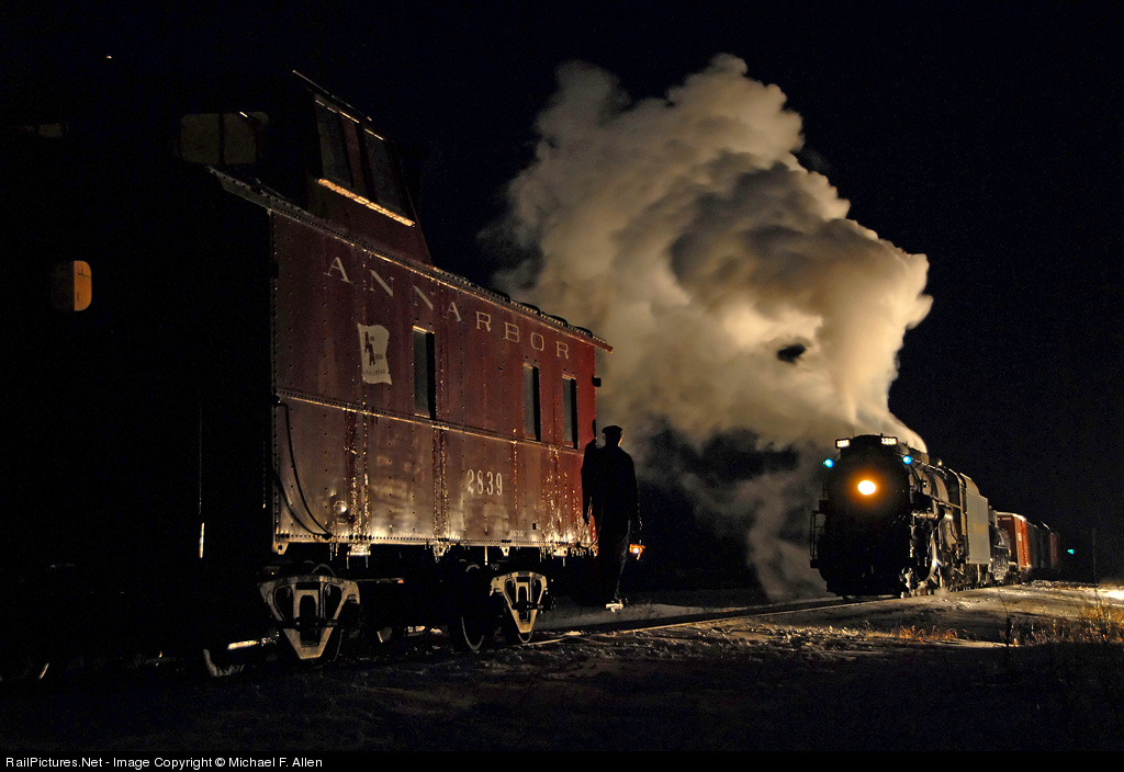 I love the rich yet understated hue of the caboose; one gets a strong sense of what it would look like during daytime, yet here it has a quiet presence. But in addition, there are splashes of green, in the marker lights and in the distance (a signal? on another caboose?). And the red of the caboose is repeated in the boxcar behind the tender. (I also like the hint of browns in the plume.) By no means is this a colorful shot, yet the colors make it rich and complete.
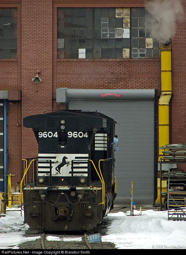 Next is an engine-shop shot by Brandon Smith (PBase site here, RP pix here). The light is muted, but the colors, while not vibrant, stand out (perhaps in part because they are primary colors, red, yellow, a bit of blue in the STOP signs). The yellow of the exhaust pipe is echoed in the yellow of the handrails and of the post on the left.
 The composition (captioned version here) is interesting also, with the engine well off center and below. I think of the shot as two blocks, the big vertical rectangle formed by the engine staring in the lower left and taking up a good bit of the frame, and the smaller horizontal rectangle of the window above, slightly off center, and further weighted toward the right by the stronger pattern in the panes on the center and right compared to the left. The exhaust pipe ties it all together, and there is even a bit of steam.
In addition, there is a nice mix of textures, with the pattern in the bricks, the horizontal lines in the roll-up door, the smooth surface of the front of the engine, and the snow. All in all, sure I'd prefer stronger light, but still very nice work, so much else there to enjoy.
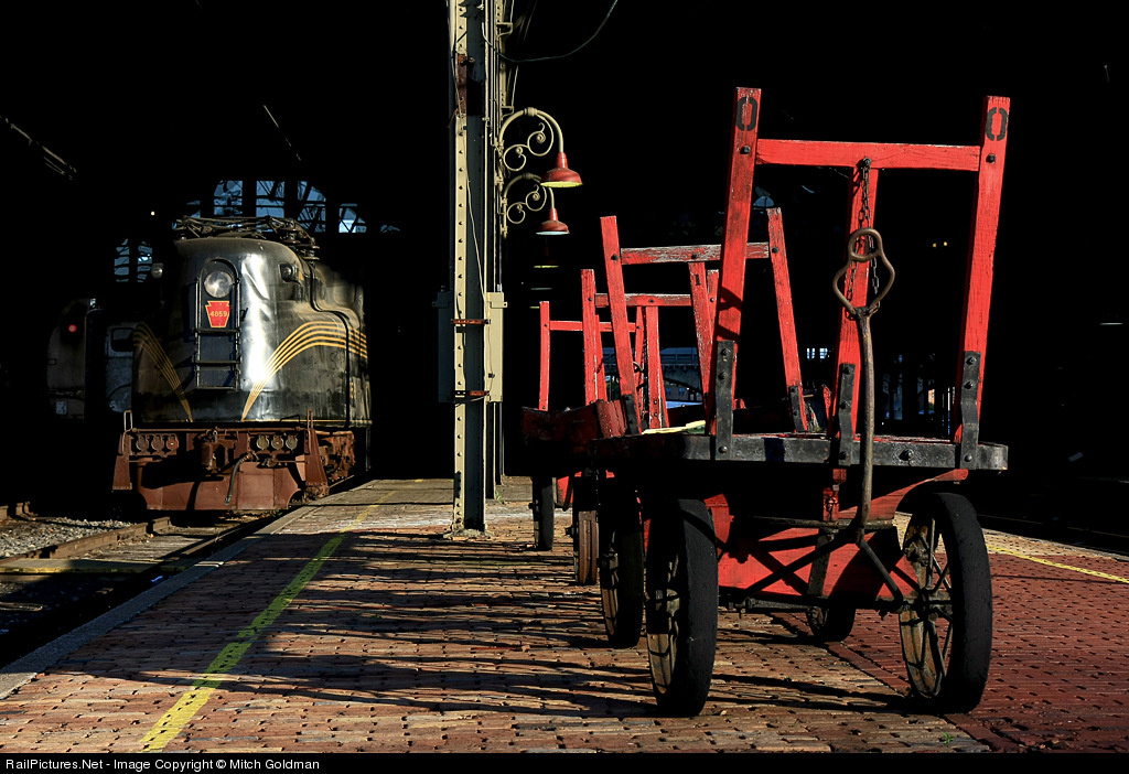 Finally, look at Mitch Goldman's shot (captioned version here). It's a better known shot than the other two, so normally I would not use it, but I just like it! and it's a shot I think of when I think of color. What makes this shot so nice is that strong colors are set in front of a black background, making them appear brighter and stronger. The dominant red of the cart is echoed in the PRR keystone on the nose of the GG-1. Softer reddish hues appear in the bricks, the lamps, and to some extent on the pilot of the GG-1. The splash of bright blue above the engine, the area of reflected light, and the yellow stripes give the left side a bit of color complexity to balance the strong presence of the red on the right.
Overall, the first two of these shots use color with some subtlety. They are not about color primarily, but color greatly contributes. The third shot has dominant color, but what is of interest to me is the color in other parts of the image that makes subtle contributions.


4 comments:
The understanding of light, color and composition are key tools to any photographer. Being aware of those tools and their proper use is what enables the photographer to elevate their craft.
I propose that in the three examples in the Subtle Color post the use of color by the photographers was not intentional, but totally a result of the lighting.
Michael Allen's and Mitch Goldman's night photos are notable because they don't overdo the lighting, as we so often see in staged night scenes. The subtle lighting is because of the strongly angled light sources. Brandon Smiths photo at the Juniata Shops was taken on an overcast day, which gave the muted hues and textures.
I would be interesting to hear thoughts from any of these photographers regarding their photos, especially comments on whether the use of the colors in the images were under consideration when they made the photos.
Kevin
Thanks, Kevin. To be clear, I do not claim, here or elsewhere, that photographers think of all these dimensions when they shoot, at least not consciously. Maybe a few do, but I suspect most do not; rather, they shoot with a mix of instinct combined with premeditation about the general "look." This is just how I think of shots ex post.
For one, I wasn't thinking of the colors, at least not coherently when I was taking the shot. I was more concerned with the composition, trying to make everything spaced correctly in the photo. One thing I like to generally do when composing a shot is to try to get more than just the train in the shot. It gives the viewer another point to focus on in relation to the train, not making the train the almighty piece of the work. To me, the color can be tweaked in CS2, to better suit the mood of the photo that you are trying to get across.
Brandon
Less is more, and this fact is wonderfully illustrated in Michael’s night shot of the 1225 and the Ann Arbor caboose. Now I know there are a lot of fans of Gary Knapp’s work, but I personally find it “over produced”, some what a kin to Phil Spector’s wall of sound productions in the 1960’s except Gray blasts his subjects with light while Phil used decibels in his efforts. In either case, they produced some fantastic hits, but it’s not something that you’d want to listen to or look at every day and neither approach leaves much to ones imagination.
If nothing else, Gary is one prolific photographer. I keep seeing new images from him that I’ve never seen before! But by the same token, the style has become predictable. I’d like to see him go for a more low key approach. Let there be darkens Gary, or at least some zone 2 areas in the image…
Thank you for your indulgence.
Steve Crise
Post a Comment