Monday, May 26, 2008

What Pans Out?

Let's talk pans! What makes some of them better than others? IMHO! Let's take a look at some of Mitch Goldman's pans.

First of all, I'm not a big fan of many pans. A roster shot with a blurred background, that's all. A technical trick, but one that doesn't add too much compositionally. Why not?

Well, let's start with why we do pans - because they convey a sense of motion. Some of that motion is implied by the train itself, of course, presumed to be moving forward; the blur makes the movement more overt. Thus, it helps if the blurred background contributes to that. A blur of trees is neutral, to my eye, a jumble of shades, with the result not that much different than a roster shot; the focus is the engine and there is nothing else to look at. A blurred building, on the other hand, conveys a sense of a second object that the first object, the train, is moving past.

Steam is particularly good as a subject for pans, because the plume clearly indicates direction. In addition, the plume adds a secondary compositional element; a diesel pan can end up being a simple box in the middle of a blur background; boring. Also, that element is a pleasing diagonal up above the engine which makes for a nice contrast with the generally horizontal lines of the engine. Of course, one also captures driver rod blur for yet more dynamism, and often the shape is more interesting than a rectangle, with a smokestack on top and interesting exposed running gear.

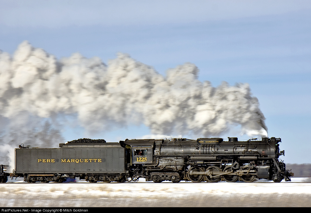
Here is the link to 25 of Mitch's pans on RP. I'll talk about a few here. First up, geesh, what a shot (captioned version here)! Steam, of course. The plume has a nice blend of whites and grays, set against a blue sky. The snow means that the engine is surrounded by a light background (yet multicolored and thus more interesting: sky blue, snow white, weedy beige), making it stand out; the light sheen on the engine adds to that greatly, as does the excellent light overall. Extensive detail in the sharp detail (despite the 1/25 shutter speed!) makes it all the more compelling.

To illustrate the comparison, I will be a bit unfair and show one of Mitch's poorer pans. If I had one of my own to use, I would! Consider this picture (captioned version here). Put aside the somewhat "high sun" lighting for now. The background is a weakly-defined green blur. The plume goes straight up and out of the frame, eliminating the second compositional element. The wedge angle creates lines that are off horizontal, some slope, but not enough to make them stand out (or maybe I'm just jaded by having seen, and shot!, zillions of wedgies over the years). The wedge angle means the entire engine can't be in focus because of differences in movement relative to the film plane.

In Mitch's defense, he did shoot this back in 1999! He's come a long way.

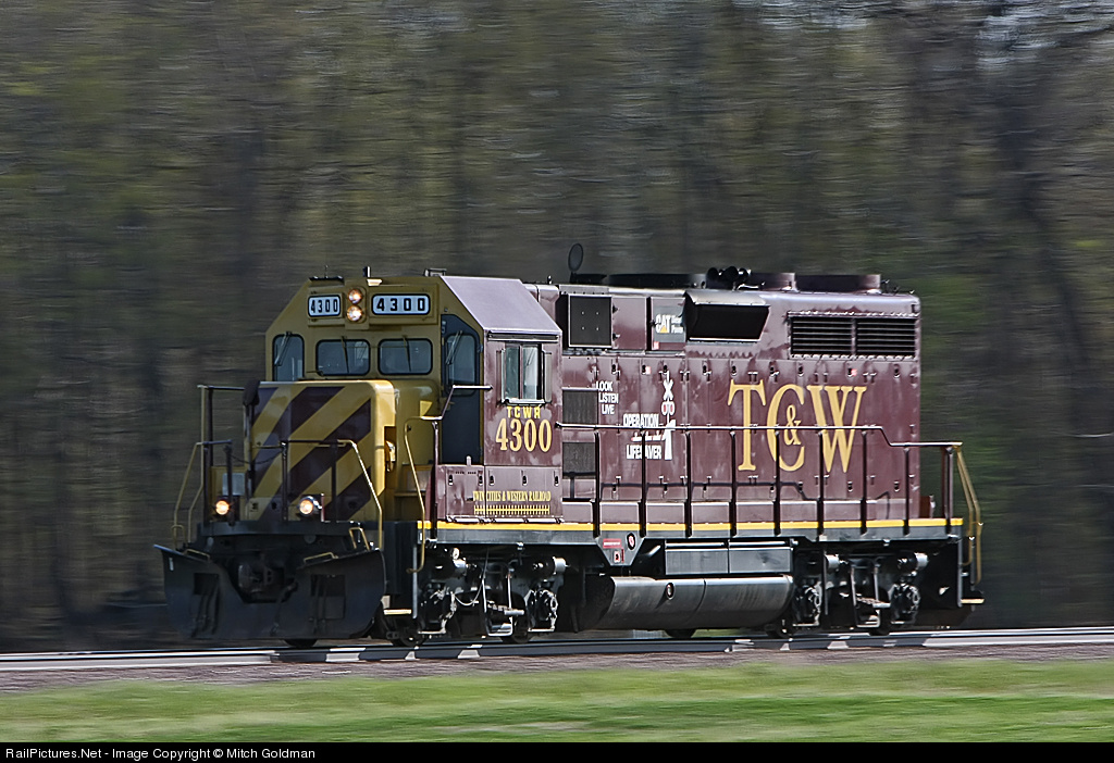
As for compositional differences inherent to steam vs. diesel, take a look at Mitch's recent TC&W shot (captioned version here). It's a rectangle on a blurred background, a very simple composition. Don't get me wrong, there are lots of what I will call "plus factors" here: the semi-glint, the contrast between the side in light and the nose in shadow (a plus here as it breaks up the rectangle in terms of tonality). I really like the verticals of the dark tree trunks, which adds a pattern to the background. Compare the strength of the background's presence here with the previous shot, just blurred leaves. And, I just like the purple hue of the engine. It's a very nice diesel pan. But I think a well done steam shot is heads and shoulders over this one (for photographic reasons, and not because of any steam bias!).

Looks like there is much to be said about this topic. I'll revisit Mitch's pans another time, and find some others as well. Suggestions about other shots, particularly those with interesting backgrounds, welcome. Part II, down the road someday. :)

Wednesday, May 21, 2008

A Big Welcome to Everybody!

Hello, everyone, welcome to my blog. This one is all about train pictures, why I like them, what I see in them. For details as to what I want to do, and my qualifications (if any), read the first entry, which is now way at the bottom. (Or click on "What this blog is all about" on the right.) But in general, I intend, in each post, to talk about one picture or a few using basic terms of photographic composition. No technique, no equipment stuff here.

So welcome, take a look around, if you like what you see, come back every few weeks. You can click on any image and see it full size (if there is a way to make those to open in new tabs, please tell me!). I'll try to post once per two weeks, hopefully weekly; I doubt I'll have time to do more. Send me hints, please, as to topics of interest to you, and especially links to good artistic photographers outside of the RP realm. And leave comments, lots of comments, especially any that forward the discussion of the image(s).

Welcome!


PS: You will see a number of posts below with various dates going back a few weeks. I have had this private for a bit as I did initial development and I am finally going public now. I don't see an easy way to change those dates. Doesn't matter.

Monday, May 19, 2008

More than a Wedge

I'm not a big fan of wedgies, although of course I take zillions of them, just like most of us. Well, maybe fewer than I used to, but still, plenty. But sometimes that is what can be done, or sometimes doing something else is a lot of effort and one is constrained by time or company. So, can one max out the wedge?

Well, here's one example, by Mitch Goldman (captioned version here). Now, this one is not constrained; taken during a photo charter. But there wasn't much to work with, in terms of immediate scenery. So what does one do? Do a pan, as Mitch is wont to do? Tele-smash? Mitch went wide, not ultra-wide (17mm on a crop body), but wide. But what else did he get in the shot?

First, there is something about the way the wide angle enhances the angle of the pilot (and the far grabiron on the nose) that gives the shot a stronger dynamic feel than most shots. Of course, can't do that with a diesel (unless it's something like an EMD E)!

Furthermore, the sky is helpful. Not glorious, but it contributes, as the lines in the clouds, a gentle diagonal from the left edge, the near-vertical diagonal of the leading cloud edge coming down from the top, draw the eye to the engine. Some of the swirls near the top give a subtle framing to the plume. (Too subtle? So subtle that this comment is a real stretch, making something of what is really nothing?) The sky has an interesting presence, not at all strong, but not blank blue either. Furthermore, the relatively monotoned gray plume sets off beautifully against the white.

Up front, the whitish grasses help enhance the presence of the black engine. Finally, the linepole adding just enough to make it more of a scene than a roster (of course, the trailing cars also, but the pole does a lot). Call it an action-wedgie-portrait. :) Not an excellent shot, but a really likeable shot. It has grown on me. Mitch got out of it all that was there and a bit more.

Saturday, May 17, 2008

Bye, Bye, Train

Consider the end of train shot. Not shot nearly as often as head end shots (helper shots excepted), unless everyone is shooting them and keeping them to themselves. Generally speaking, it's harder to take a picture that tells a story. The front of a train has an inherent dynamic, a story, its motion or pending movement. The tail end, especially now that cabooses are not in general use, just does not, or its dynamic is muted. How can one make the story?

Well, here's a gem by Brian Plant, my favorite EOT shot. What makes this shot work? First of all, the low angle. The strong element of the track in the close foreground stretches the picture, from just in front of the photographer to the distant mountains. The train adds to this feeling of depth, especially since one is looking at the tail end; the eye has a stronger desire to go to the "back" of the picture to find the power. Were the train coming toward the camera, one would take a much weaker interest in the far end. The shot is so "big" in terms of space that one is surprised to see that it was taken with a 100mm lens!

The BW is nice, first of all because it is well done, but furthermore because removing the color places greater emphasis on the elements of the composition. It's not a pretty, colorful scenic with a dynamic composition, it is a dynamic composition. At the same time, it conveys a full sense of "wide open spaces" and of the desert but through light and tonal contrast instead of color.

Now consider a different shot, one from my personal collection. The concept is simple, common to many shots: have a strong foreground element and something of interest in the background, creating an emphasis on the distance between the two. The somewhat dull light is unfortunate - the snowfall is quite fresh but the location is fairly well shaded. I am OK with that the grayness contributes to a theme of abandonment and in fact, I can now see the shot being a bit darker. Still, overall there isn't that much going on here. So a few of the basic elements are there - some depth, a bit of mood - but it does not have power like Brian's shot.

One factor that may or may not detract is the diagonal symmetry. There is an element in the lower right and one in the upper left. One might say they occupy the "rule-of-fourths" positions, were there such a rule. It works for me, but then I like compositions that are in pairs, horizontals that are left-right combinations. Brian's composition is much more complex, with significant curves, a train that goes front-to-back and side-to-side, great light, distant horizon mountain elements. By contrast mine is just a simple thing.

One question I have is the appropriate distance to the receding train? I personally like this somewhat extended distance. The train is goooone! And there is more depth. While the train is small, its red marker lights strengthen its presence in this grayish scene. Would you prefer the train nearer, or farther? Sorry, no comparison shot available; I didn't see the shot develop and this was the first of the series.


Anyway, I am interested in seeing more such end of train shots, so if you know of a decent one, please send me a link! I might even add to this post, or revisit the subject from scratch, down the road.

Friday, May 9, 2008

Studies in Texture


This pair of sepias by Kevin Ashbaugh are nice studies in texture with plenty of other interesting dimensions. The first one (captioned version here) is a lock on a flange greaser, but the details of what it is are less relevant given the tight crop, which reduces the focus on what it is, on the documentation component of the shot, and heightens interest in the surfaces of the various objects, on the artistic component.

The composition begins with a dominant shape, the lock, in the lower middle, an interesting parallelogram. There is contrast between the dark left and brighter right. The diagonal, not quite vertical, line on the right, the edge of the flanger?, is a nice element. The chain lower left is balanced by the bracket through which the lock passes, upper right.

But the shot, to me, is all about the cool rough surfaces contrasting with the smoother body of the lock. On the right, the flanger has a finely detailed, granular surface. The lock itself is smooth. Above the lock the bracket is flaky, or smooth but variations in color give it a flaky appearance. Blurred in the upper left are much larger chunks, of ballast. I find this mix of textures compelling.

Am I reading too much into this (or any other) shot? Perhaps. But these are the things I notice, that I like to think about, that result in my liking a shot, and now induce me to write about.

The second shot (captioned version here) has different textures, and variations in light contribute more. The composition is a simple sideways T where the horizontal element is enhanced with a spike. Three textures contrast each other - finely grained rail surface, the wooden tie with a different sort of grain, the leaves with their smoothly lumped surfaces and their irregular outlines. The whole definitely exceeds the parts.

In noticing the textures, I can't ignore the composition, how the intersection brings the eye to the leaf, glowing in light and casting a strong shadow that reminds one of a bird taking flight, with its narrow sparrow beak pointing up. Great stuff! The interesting glow on the surfaces of the leaves is a bonus.

Now, one can always find something, and this shot isn't perfect. I think the large dark area on the left leaves the shot a bit imbalanced. I might have considered rotating the shot a bit to get the rail and tie at a bit of an angle rather than parallel to the sides of the shot; that would introduce a bit more visual interest, or tension, or energy, or something. But who's to say? I'd have to see it. Still a very nice shot.

[Note: this post greatly expands on one I made in the RP forums.]

Thursday, May 8, 2008

Tight Cropping Towards Abstraction


I have a particular interest in making tightly cropped shots of engines and cars. By removing the totality or the easily recognizable form of the engine, I hope to highlight the individual components, both for their own sake as interesting elements of an image, and as a form of abstraction.

Here I want to focus on two shots. One is by Alex Ramos (his pBase gallery here), whose work I enjoy viewing. The other is one of my own.

Alex's shot (captioned version here) offers an interesting contrast. At the bottom, a bit to the right of center, is a round element with interesting detail (cool "EMD") and texture. The round shape and its flat position relative to the viewer contrast with the remainder of the image, which is a set of various lines that project to a vanishing point off the top edge of the frame. There is sufficent detail to make it easily recognizeable as an engine nose, but nonetheless quite abstract. The top of the frame has a bit of visual closure through a pair of horizontal elements, the handrail and chain.

The shot also has nice depth, using a wider angle to get the cable opening cover close yet show the rest of the nose.

My shot, by contrast (captioned version here) does not have the sense of motion conveyed by the vertical lines in Alex's. Instead, mine is a study of two round elements, the cable end (nicely standing out in a bare metal silver) and the ditch light, and the various yellows, the dominant area above complemented by the grab irons below. There are various details that add a bit of interest if not spice, such as the white sticker, the portion of the number board (with a bit of glint nearby) and the hoses and cables.

I do think my shot lacks in balance a bit. The angled view puts greater weight on the left side, but there is not enough on the right. Perhaps I should have included the knuckle, but then the framing would have been squarish and more empty space would be in the upper right. Something to work on.

By the way, don't get me wrong, I love engines! There is plenty of interesting detail in both shots to enjoy. But there is much more, especially in Alex's.

As a follow-up, here is a shot by Alex that is not, in my view, an attempt at abstraction. Rather, it simply frames the relevant part of the engine to focus on the lettering (full size here). I like the textures in the peeling paint and the color/hue is interesting also.