A natural instinct for any photographer is to include the subject in the frame. This extends to supporting elements also. To many eyes something that is cut-ff is something that isn't right.
But it need not be so. Let's take a look at some shots by Steve Crise (webpage
here, railroad stuff
here). Yes, it is my second look at Steve's stuff, and there are LOTS of other photogs with great stuff, but the topic came to mind and it turned out he has some shots worth discussing. I go where my mind takes me! (And besides, as long as it has been since the last post, I really need to follow my thoughts while they are active and get some things written.)
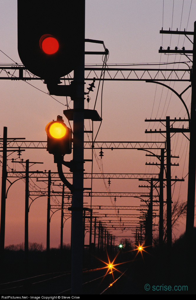
Consider this signal shot (annotated version
here). Why not include the entire signal? Well, for one, then the shot becomes a shot of a signal, an in-your-face signal to boot, with a background, rather than a scene with a signal in it. Cutting off the top serves to de-emphasize it somewhat in favor of the background (as does the corner placement of the signal head). The dueling sets of foreground and background lights are also in better balance.
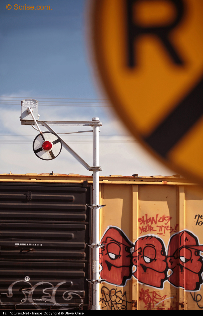
Now, take a look at this shot featuring multiple cut-offs (annotated version
here): crossing sign in the corner but also the boxcar, and signal post, at the bottom. The cut-off of the crossing sign is somewhat understandable, along the same lines as above: feature it more prominently and it becomes the story instead of contributing to the story. Here, keeping it in means that the shot has some depth rather than being essentially flat, and gives some context for the unusual signal.
But what of the cut-off undercarriage and trucks? Well, they are conventional but the don't need to be included. This shot is about a crossing, done with a signficant degree of abstraction, but hardly abstract. (I love semi-abstracts!) To the knowlegeable viewer, the undercarriage and trucks are inferred; we know they are present. In their place we have a stronger sense of color, a stronger focus on the details of the boxcar (excellent placement of the signal pole between black and yellow, by the way!) and more abstraction. Box car with verticals and horizontals (ribs in the door) in the lower half and curves and diagonals (in bracket, in signal face, in the fragment of the "X") up top. Here, the cut-off serves not so much to balance the image as it does to increase the degree of abstraction so that there is greater focus on the basic forms of lines and curves.
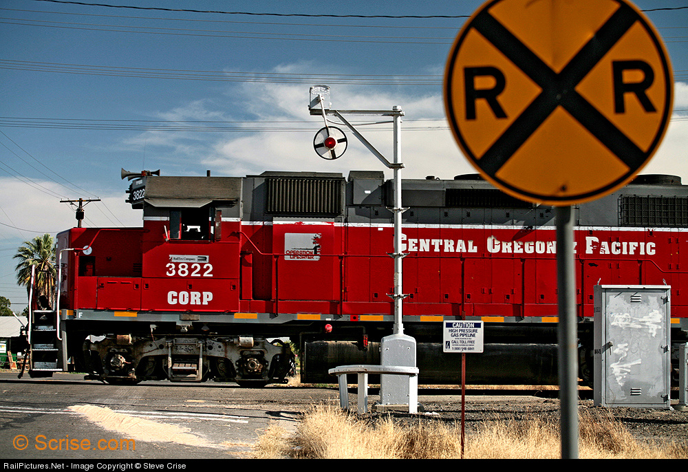
I can enhance the point by comparing with a more conventional shot at the very same location (annotated version
here). In this shot the crossing sign is again cut off, to a lesser degree, but the other elements are not, other than the trailing end of the engine. So the look is more "conventional" in framing, much like the first shot, and has no abstraction. Rather, it is a "tight" look at a scene.
It isn't clear here why the cut-off was chosen, although one may surmise from the small distance between nose and left edge, the cutting-off of the back end of the engine (which does place the signal box in a good location close to the right edge), and the signal cut-off, which reduces the sky, that Steve simply wanted a cramped look, perhaps to increase the size of and attention to various details of the scene. Also, the sign is rather ugly, poorly lit (and thus oddly colored?). It doesn't work for me, so I'm not a fan of this one. But it isn't the fault of the cut-off sign.
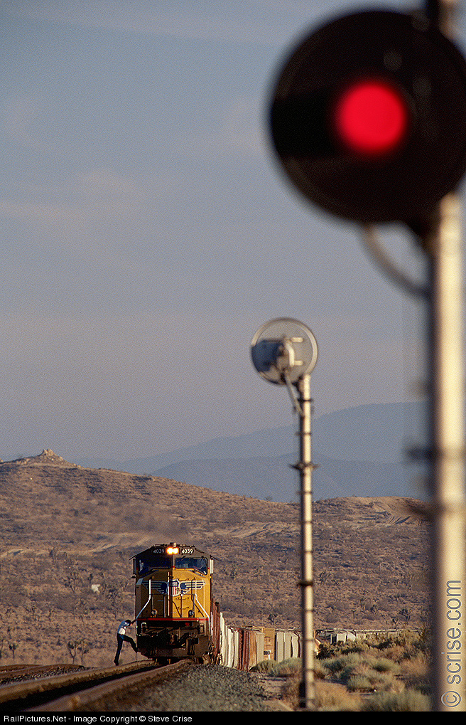
Let's finish with another successful shot. This shot takes an ordinary (but attractive!) train and signal scene, one we have all shot a zillion times, and adds a second signal in the foreground (annotated version
here). The signal head is trimmed just a bit on the side but the bottom half of the post is not shown.
So what does it add? Well, it adds a bit of framing and considerably extra depth. The two signal heads, blurred and focused, form a line with the nose of the train. The in-your-face signal - sure it is blurred but a sharp one would still be a red light in a black disk on a silver pole - tells a strong story as one associates the red with "stop" (never mind that the signal does not face the train). In this case I don't think the side cut-off matters so much, perhaps it mainly serves to place the pole against the edge rather than leaving a gap, while the bottom cut-off allows the signal's scale to be larger, a stronger presence. Many shots would be overpowered with such a close-in element but here the background, with both the scale of the mountains and the detail of the boarding crewman, holds its own.
These shots are examples of only some dimensions and styles of cut-off shots. I have seen lots of other varieties, but most seem to share the same motivation, to eliminate either extraneous detail, or extraneous lack of detail (as when cutting off part of a compositional element also eliminates a great deal of dead space) in order to focus the composition on what the photographer sees as important.
 Gallery of Steel: International Railway Art Exhibition is "where I capture and share the very best, most artistic, compelling, creative, moving, bold, original, unique, edgy, brilliant (in my opinion) railway-related photographs on Flickr." A person (persons?) after my own heart! A nice range of creativity, most notably in a sizable volume of HDR work, done not for realism but for expression. This is a Flickr-based moderated group of images. There is a regular page here but what is interesting and nicely done is the alternative black-background presentation linked to above. The regular page includes a brief statement of principles from which the above quote is taken.
 Beyond the Wedge is less creative than Gallery of Steel in that it does not feature photography that deviates from representational photography to the same extremes. Which doesn't mean it is worse, or better, just different! One thing I notice (because my preferences favor them) is the many shots that involve capturing equipment and other details, plus broader perspectives, with severe and/or non-standard cropping. But that is just one part of a set of images with interesting variety. Also Flickr-based, also moderated.
