 But it need not be so. Let's take a look at some shots by Steve Crise (webpage here, railroad stuff here). Yes, it is my second look at Steve's stuff, and there are LOTS of other photogs with great stuff, but the topic came to mind and it turned out he has some shots worth discussing. I go where my mind takes me! (And besides, as long as it has been since the last post, I really need to follow my thoughts while they are active and get some things written.)
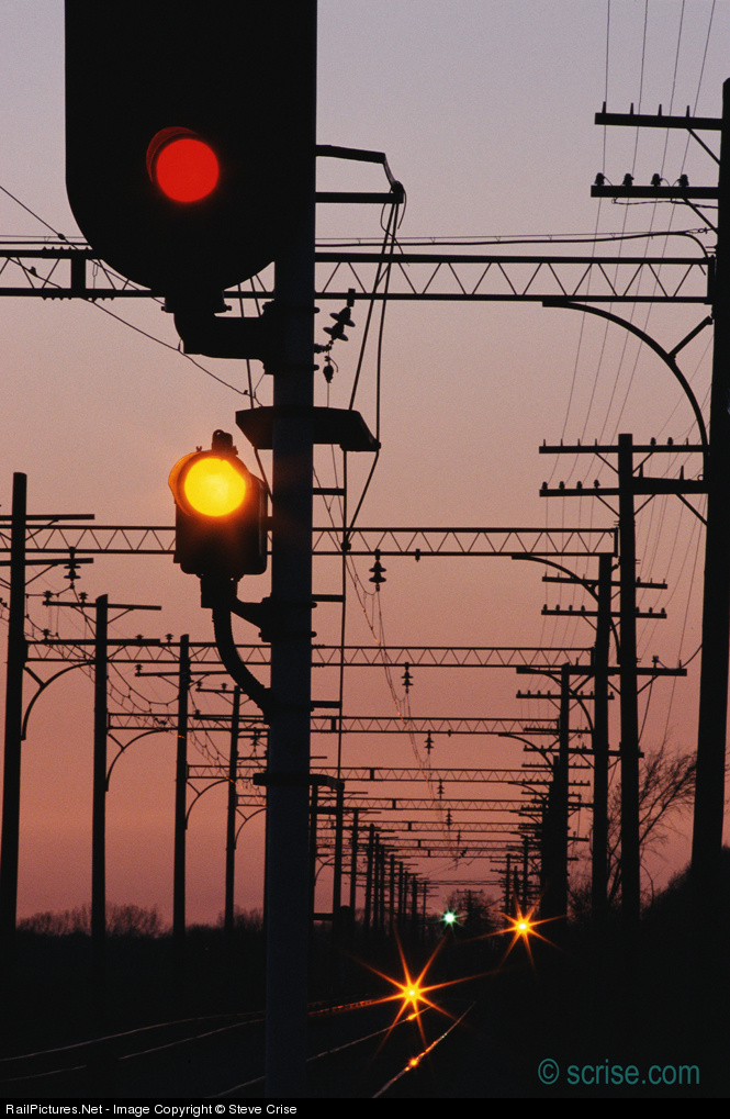
Consider this signal shot (annotated version here). Why not include the entire signal? Well, for one, then the shot becomes a shot of a signal, an in-your-face signal to boot, with a background, rather than a scene with a signal in it. Cutting off the top serves to de-emphasize it somewhat in favor of the background (as does the corner placement of the signal head). The dueling sets of foreground and background lights are also in better balance.
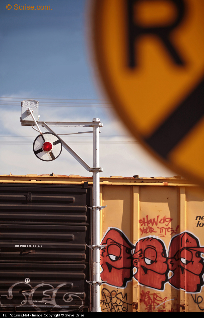 Now, take a look at this shot featuring multiple cut-offs (annotated version here): crossing sign in the corner but also the boxcar, and signal post, at the bottom. The cut-off of the crossing sign is somewhat understandable, along the same lines as above: feature it more prominently and it becomes the story instead of contributing to the story. Here, keeping it in means that the shot has some depth rather than being essentially flat, and gives some context for the unusual signal.
But what of the cut-off undercarriage and trucks? Well, they are conventional but the don't need to be included. This shot is about a crossing, done with a signficant degree of abstraction, but hardly abstract. (I love semi-abstracts!) To the knowlegeable viewer, the undercarriage and trucks are inferred; we know they are present. In their place we have a stronger sense of color, a stronger focus on the details of the boxcar (excellent placement of the signal pole between black and yellow, by the way!) and more abstraction. Box car with verticals and horizontals (ribs in the door) in the lower half and curves and diagonals (in bracket, in signal face, in the fragment of the "X") up top. Here, the cut-off serves not so much to balance the image as it does to increase the degree of abstraction so that there is greater focus on the basic forms of lines and curves.
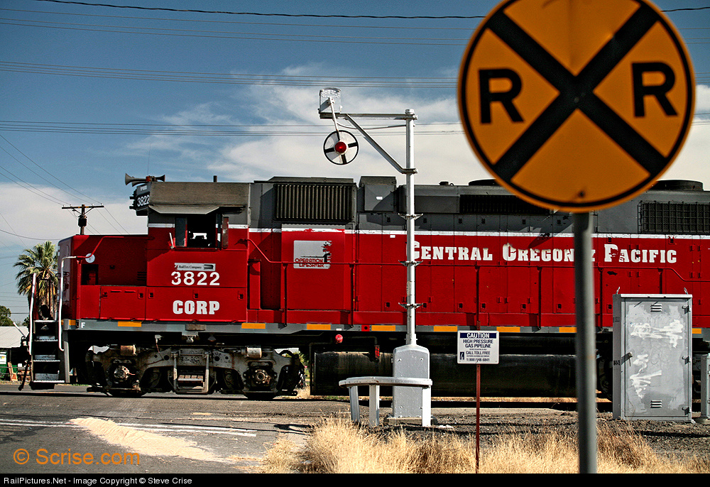 I can enhance the point by comparing with a more conventional shot at the very same location (annotated version here). In this shot the crossing sign is again cut off, to a lesser degree, but the other elements are not, other than the trailing end of the engine. So the look is more "conventional" in framing, much like the first shot, and has no abstraction. Rather, it is a "tight" look at a scene.
It isn't clear here why the cut-off was chosen, although one may surmise from the small distance between nose and left edge, the cutting-off of the back end of the engine (which does place the signal box in a good location close to the right edge), and the signal cut-off, which reduces the sky, that Steve simply wanted a cramped look, perhaps to increase the size of and attention to various details of the scene. Also, the sign is rather ugly, poorly lit (and thus oddly colored?). It doesn't work for me, so I'm not a fan of this one. But it isn't the fault of the cut-off sign.
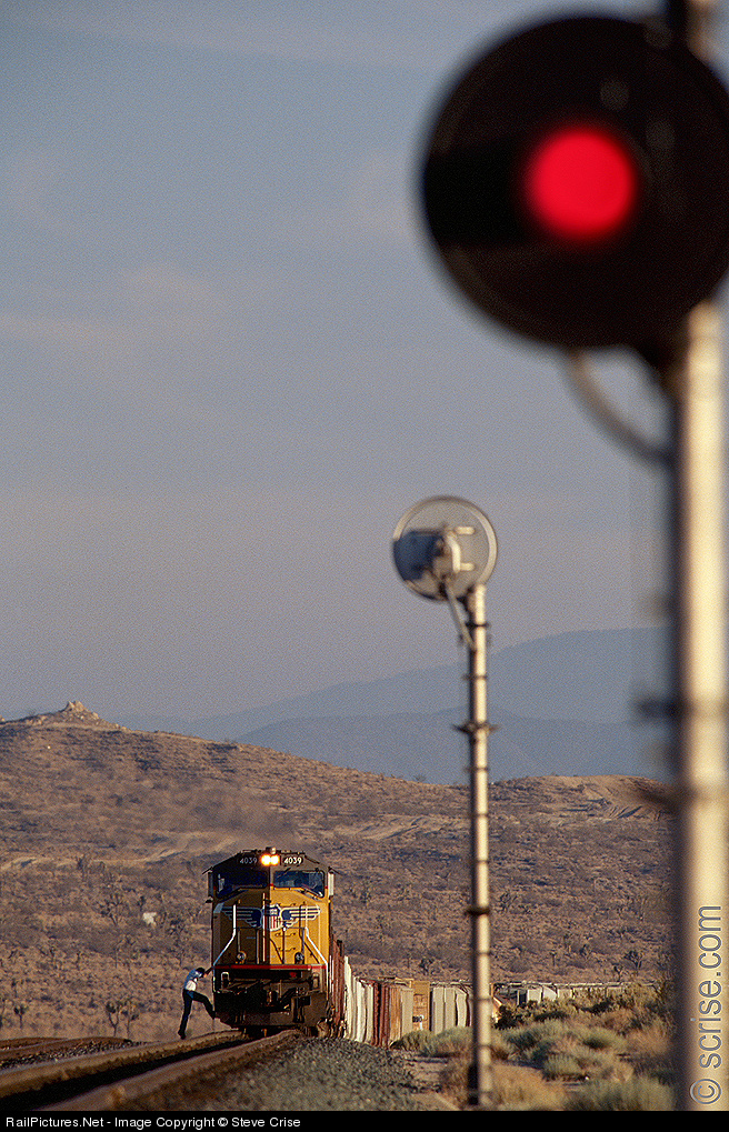 Let's finish with another successful shot. This shot takes an ordinary (but attractive!) train and signal scene, one we have all shot a zillion times, and adds a second signal in the foreground (annotated version here). The signal head is trimmed just a bit on the side but the bottom half of the post is not shown.
So what does it add? Well, it adds a bit of framing and considerably extra depth. The two signal heads, blurred and focused, form a line with the nose of the train. The in-your-face signal - sure it is blurred but a sharp one would still be a red light in a black disk on a silver pole - tells a strong story as one associates the red with "stop" (never mind that the signal does not face the train). In this case I don't think the side cut-off matters so much, perhaps it mainly serves to place the pole against the edge rather than leaving a gap, while the bottom cut-off allows the signal's scale to be larger, a stronger presence. Many shots would be overpowered with such a close-in element but here the background, with both the scale of the mountains and the detail of the boarding crewman, holds its own.
These shots are examples of only some dimensions and styles of cut-off shots. I have seen lots of other varieties, but most seem to share the same motivation, to eliminate either extraneous detail, or extraneous lack of detail (as when cutting off part of a compositional element also eliminates a great deal of dead space) in order to focus the composition on what the photographer sees as important.


3 comments:
It's great! Thank you for starting writing again!
This topic - again - is very interesting, the more because even more creative railroad photographers tend to think in "a train" or "a locomotive", only in dramatic lighting, a different angle, more carefully picked background or foreground. I used to consider myself a photographer with a telephoto lens, nowadays I find myself going wider and searching for locations where shooting even wider adds to the scene. Going for a tighter composition is something I have to try again.
Well Janusz, I feel somewhat compelled to comment on your post because I don't regard any of these images as having the foreground being "cut off". All of the images you selected have foreground, it just that it’s not located at the bottom third of the image were its expected to be, nor is it necessarily in focus either. That is part of what makes these images interesting and different, their not adhering to what is considered the conventional rules of composition but they still work.
What they all have in common is the placement of bold, simple, graphic shapes in a somewhat unconventional arrangement using subject matter that is easily recognizable to this audience but placed in the frame that is "challenging" to their eye. We all know what that stuff is within the frame, but we've never seen it used that way within a square or rectangular format of a photograph.
Think of it this way, if you were to trace the basic shapes of my photos on your computer screen with tracing paper, you'd end up with a few very simple circles, lines, squares and triangles on your paper. Forget for a moment which shapes would be in focus and what color they would be, the arrangements of the shapes within the frame would still hold your interest even when broken down to their most basic principles. If you did the same study with 50 different randomly selected wedgie shots, you'd have the same basic shape of a long triangle lying on its side 50 different times. Regardless of whether the triangle recedes to the left or to the right would be irrelevant and not enough of a difference to hold your attention 50 times over.
What I try to do with all my personal photography is to try to avoid repeating the same basic shapes within the constraints of my viewfinder in as many new and different ways as I can.
I believe that the basic rules of composition are pretty easy for most people to learn. Things like centering your subject in the frame, balancing one object against the other, depth of field and so on. The real trick is to be able to understand the rules beyond the basics and apply them in new and challenging arrangements. It’s really very similar to learning how to read. We all start out with "See Dick and Jane run" type sentences. As we progress, hopefully past this point, our skill level increases and the need for more challenging material develops and pushes us far beyond the basics fulfillment that Dick and Jane once provide.
Because of their very nature, railroads provide a photographer a very unique opportunity of advancing their craft by exploring the endless possibilities of manipulating their basic shapes within a frame. I see my job as a person who is willing to exploit this opportunity to the farthest extent of my talents.
Steve Crise
July 20th 2009
First of all, thanks Steve for the detailed response!
Second, perhaps unfairly to Steve, I have changed the title. I now see that his response reflected, in part, that the original title was "Steve Crise and the Cut-off Foreground" which was just plain not what I wanted to say; I thought I had changed it before posting but apparently not. I have made it now and while it may make Steve's comments less clear, it makes for a better title, especially for those who never click through to the comments to see what Steve adds.
Thanks again, Steve, for the comment and for letting me use the shots.
Post a Comment