Steve Crise (website here; look not only in "railroads" but also in "Project 3751" and in "Urban Environments") has done some excellent work with extremely shallow depth of field. Here are some similar compositions, verticals with track as the foreground/in-focus element. In these shots the zone of focus is particularly narrow, encompassing only a few ties in shots with much more depth.
Let's start off with this frog shot, with intermodal cars in the background. Interesting shot, lots of details, muted yet colorful with browns and some reds and blues (compared to most people, I am more of a fan of rich browns). But I find the shot busy, cluttered; where is my eye supposed to go? The focal point is weak, due in large part to the frog being simply longer than the range in focus. Also, the background is rather busy and in some sense visually close to the frog, resulting in a lack of separation. Nice, but lets turn to shots that are really nice!
Really nice would be this track and signal shot. So much to see, two different signals, two different signal colors, pinkish hue in the sky which is picked up in the rails. I am a fan of what I think of as a triangle compo- sition, here formed by the two signals and the zone of the track in focus.
What I find interesting here is the choice to limit the focus to an arbitrary, nondescript section of track - no switchpoint, switchstand, spike, anything. I like the effect, I think because it equalizes the three points. The foreground, which could be a stronger element if more distinct, becomes equal in presence; the left signal is a strong element here. Overall, I love the peaceful flavor here, interrupted only by the knowledge that green over red means a train is coming. The shallow depth of field eliminates all minor elements that one might find in a scene, junk and weeds in the foreground, the signal boxes, details of the mountains, leaving a beautiful semi-abstraction.
The third image is powerful. The foreground is distinct, the spike, the complementary nearby fasteners. Balanced against this element is the train, strong and powerful yet not over- whelming, colorful (nice contrast against the overall coldness), with distinct form. The absence of focus reduces the nose to basic elements, three circles on a field of red (itself shrouded by clouds, with blue only above - cool!).
More than that, the shallow depth of field reduces the entire scene to basic elements, and the key here is that Steve has chosen the elements well, track and the train that runs on it. The blur gives added emphasis to the track, which to my eye results in excellent balance, just the right emphasis on the track, eliminating the natural instinct of any railfan to focus on the engine.
When I began to ponder this post, I was of the opinion that this engine/spike shot was by far my favorite. In pondering them more, I now realize that the signals shot is its equal if not more favored. The pastels are so nice, the lines (rail parallel to signal post) so strong, the essence of the scene so well conveyed. Sweet!
Steve, hope you don't mind, but I am going to copy this type of composition, if not the exact forms here, at the next opportunity! :)
Sunday, July 27, 2008
Wednesday, July 23, 2008
Mechanics versus Artistry
It has been noted that I take a somewhat mechanistic approach to an activity that is inherently spontaneous or inspired. Certainly true! I have a good bit of an engineer's mentality.
A correspondent recently wrote of my blog that "perhaps the process is one of trying to put into objective terms what was originally done very subjectively by the author." By this he meant that no photographer thinks in the terms I use in my commentary. (See also the comments made on my Subtle Color post.) This is undoubtedly mostly true, although I suspect some photographers to think about dimensions of composition in conscious or semi-conscious ways.
But what happens to spontaneity? One could argue, for example, that a rules-based (rule of thirds!) approach necessarily hinders one from achieving higher artistic qualities in one's work. Following rules stifles creativity, one might say. I suspect that, instead, the effect is in the other direction. Certainly the better we become at the technical aspects of photography, exposure and such, the better our images become and the more likely we are to achieve something beyond the mundane.
Surely this goes beyond the technical aspects to the creative ones, however! The more we know about, and internalize, aspects of composition like form, line, texture, etc., and the more we learn to see the aspects of light in a scene, the easier it is to release ourselves from the rules-based, nuts and bolts, mechanistic aspect of composition and see creatively, and thus achieve great results in our work. To internalize the objective in order to free the subjective.
But this blog is as much or more about appreciating shots already taken than about shooting. I find it helpful to think about these images in terms of principles of composition. "Debugging" these shots gives some insight into how they are put together. At the same time, I certainly realize that the best shots often have an extra quality that cannot be reduced into basic principles. Some shots "work" and some shots have innate beauty, and some of those qualities are beyond my language to express.
Any effect of these musings on the reader's practice of photography is, while welcome, incidental or at least secondary. Other than my hope that people are inspired by interesting images to try new ideas in their work.
As for my mechanistic approach in this blog, well, it's true! The principles of composition, as I have informally learned them, are the main "language" I have for expressing my thoughts. Over time here also I will be pursuing a non-mechanistic mode of expression, but it will be a while!
[The image is mine, one of the more creative shots I have taken. Captioned, B/W version here.]
Saturday, July 12, 2008
Trains in the Distance
In a recent post, I made the following statement: "The image is a train in its environment, not an environment with a train in it." By this I implicitly referred to a tension between the size of a train in a shot and its presence within the image. A train can be a small element within a shot and yet have a much larger presence, in fact, be a major focal point, as it is in the images in that post. The converse is not necessarily true, usually, as a train that occupies a sizable part of an image will necessarily tend to have presence. Nonetheless, size and presence need not be in proportion. Here I want to consider a set of images where the train is small but their presence differs from minuscule to significant.
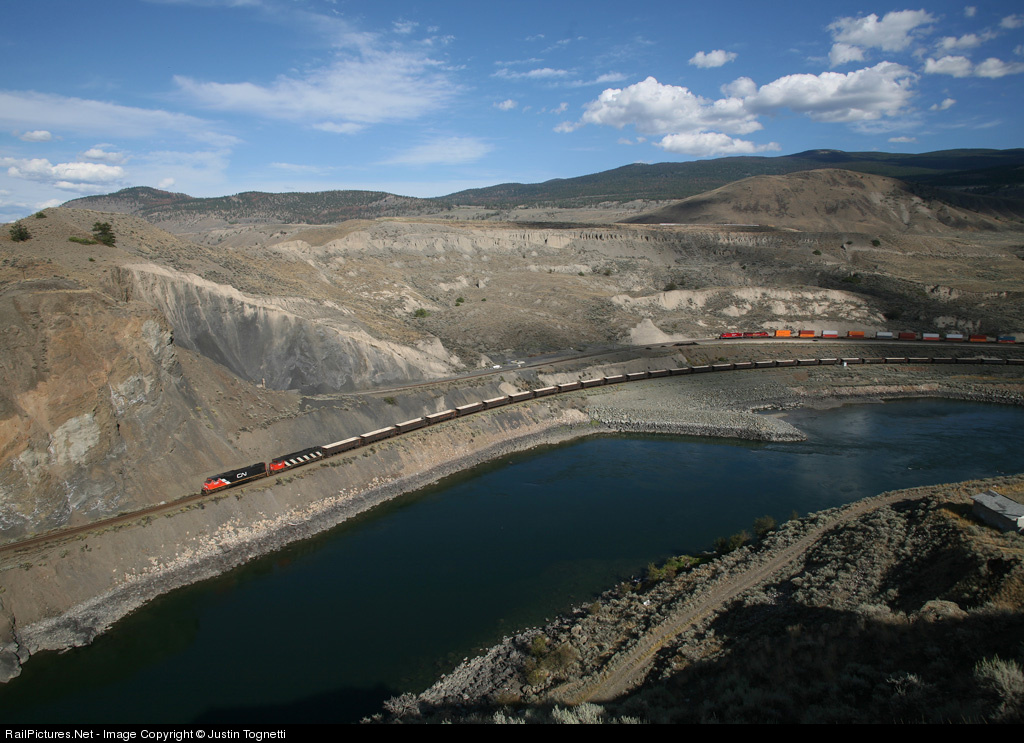
Consider first this image by Justin Tognetti (captioned version here; more of his work here). The train is pretty small, but this is obviously a train shot, in fact, two trains appear. The scene is basic, terrain, water, sky. I just love the way the front of the more distant train is framed by cloud shadows, which also gives it a more distinct identity relative to the first. The terrain has lots of interesting textures and hues and the two trains have a bit of lower left / upper right positioning. Very nice!
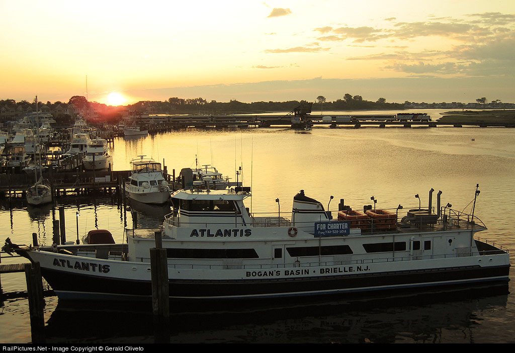
But the train need not be such an obvious part of the image. This boat shot is by Gerald Oliveto (captioned version here; more of his work here). The light is nice and the color of the water is subtly gorgeous. But the train is difficult to find (and would be more difficult but for the precise framing of the power in front of a brighter spot of water). It's an interesting scene, but not particularly a railroad image, as the train is barely visible. (For my tastes, had the shot been a bit wider, so that the boat was less squeezed and more of the marina were present on the left, it may have had better balance.)
Both of those shots are landscape scenes. Instead, a shot can be more abstract. Here is one by Tom Mugnano (captioned version here; more of his work here). The train has a subtle presence here, but a bit stronger (and it is hard for me to judge since I know the location well and therefore the train is more obvious to me). What I find interesting is the layout of the town - all the blocks and buildings (and windows within them) give the shot a bit of an abstract feel. It reminds me of shots I have seen and taken, from a much lower angle, across an old European cities with a series of tile roofs. Lots of rectangles and such.
So, then, how does one consider this image, by Graham Williams (more of his work here)? This is the image that first compelled me to contemplate this subject. The scene lacks an obvious subject - there are a number of elements, (short) train, village, windmills, isolated farms, trees. One could say the scene is the scene, or that the scene is a pastiche of things, one of which happens to be a train. I happen to find this scene pretty, in a way, and interesting, in that my eye dances around the scene. At the same time, my eye doesn't stop much; perhaps I can exaggerate and call it an anti-composition because it lacks form. It's a jumble of elements with only tangential relationships to each other, in my view, but it all works for me. It's pleasant, it's interesting to look at. It's not a great shot, but it is a nice shot, and it's a bit off the beaten path of scenics, so it is inherently interesting.
Sunday, July 6, 2008
Subtle Color
My favorite dimension of photography is color. Yes, more than light, as much as we all love great light. Here are some shots whose use of color has particular appeal to me, even though in both cases its role is secondary.
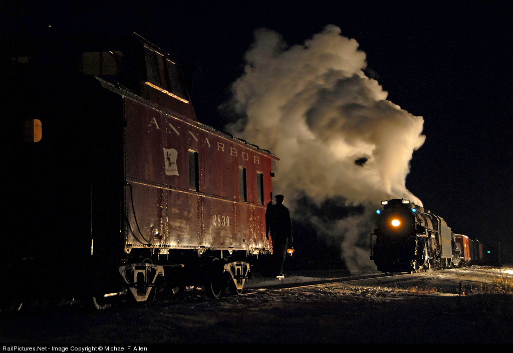
First is a night scene by Michael Allen. One can photograph night scenes in many ways, such as the extensively-lit, colorful shots by Gary Knapp. Usually one must take a moderate approach, however. Michael's shot (captioned version here) was taken during a photo charter, using several light stands to light up the train but not the surrounding scene.
I love the rich yet understated hue of the caboose; one gets a strong sense of what it would look like during daytime, yet here it has a quiet presence. But in addition, there are splashes of green, in the marker lights and in the distance (a signal? on another caboose?). And the red of the caboose is repeated in the boxcar behind the tender. (I also like the hint of browns in the plume.) By no means is this a colorful shot, yet the colors make it rich and complete.
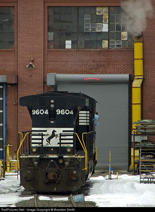
Next is an engine-shop shot by Brandon Smith (PBase site here, RP pix here). The light is muted, but the colors, while not vibrant, stand out (perhaps in part because they are primary colors, red, yellow, a bit of blue in the STOP signs). The yellow of the exhaust pipe is echoed in the yellow of the handrails and of the post on the left.
The composition (captioned version here) is interesting also, with the engine well off center and below. I think of the shot as two blocks, the big vertical rectangle formed by the engine staring in the lower left and taking up a good bit of the frame, and the smaller horizontal rectangle of the window above, slightly off center, and further weighted toward the right by the stronger pattern in the panes on the center and right compared to the left. The exhaust pipe ties it all together, and there is even a bit of steam.
In addition, there is a nice mix of textures, with the pattern in the bricks, the horizontal lines in the roll-up door, the smooth surface of the front of the engine, and the snow. All in all, sure I'd prefer stronger light, but still very nice work, so much else there to enjoy.
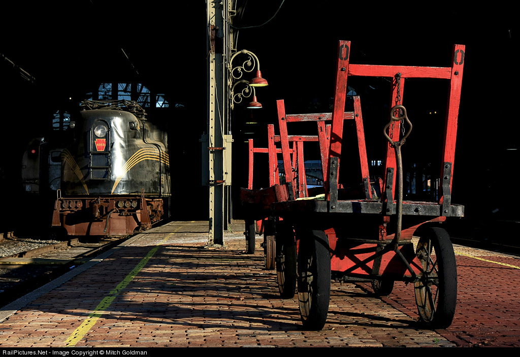
Finally, look at Mitch Goldman's shot (captioned version here). It's a better known shot than the other two, so normally I would not use it, but I just like it! and it's a shot I think of when I think of color. What makes this shot so nice is that strong colors are set in front of a black background, making them appear brighter and stronger. The dominant red of the cart is echoed in the PRR keystone on the nose of the GG-1. Softer reddish hues appear in the bricks, the lamps, and to some extent on the pilot of the GG-1. The splash of bright blue above the engine, the area of reflected light, and the yellow stripes give the left side a bit of color complexity to balance the strong presence of the red on the right.
Overall, the first two of these shots use color with some subtlety. They are not about color primarily, but color greatly contributes. The third shot has dominant color, but what is of interest to me is the color in other parts of the image that makes subtle contributions.
Tuesday, July 1, 2008
Extreme Positioning
Photographers pursuing making images beyond simple snapshots tend to quickly run across the rule of thirds. But rules are made to be broken, as the cliche states, and sometimes a shot works well with the subject closer to or at the center. (For that matter the "rule" of thirds is only a guideline, after all.) What interests me here is the opposite, where one moves the subject of a shot, or at least one of the important elements, further away from the rule of thirds locations towards the boundaries of the image. Here are two images that do so quite successfully.
The first image is a mountain image by John West (captioned version here). And that is the point; in one sense it is a mountain image, against which the train measures up as a trivial presence. Of course, the primary subject is the train. In particular, it does not appear so small that it is difficult to observe and relate to, and for that matter the mountain is not so much a second element in the composition as the primary background and definer of scale. The image is a train in its environment, not an environment with a train in it. And yet, the mountain is huge; its peak is clearly well above the top of the image. Its height receives greater emphasis because of the placement of the train at the very bottom of the image, instead of, say, at a rule-of-thirds location.
Of course, there are other things to love about this shot, the falling snow, the splash of yellow in an otherwise field of muted colors.
The second shot, by contrast, is a flatland scene by Francois Iliovici, taken at Fagelsta in Sweden. This shot also reduces the scale of the train relative to that of nature, albeit in a different way. The shot has two elements, of course, train and moon. Francois could have easily placed the train at the lower rule of thirds location and the image would have been just fine. Instead, he places it further down, not on the margin but well down toward it. As a result he creates a greater sense of space, in the compositional meaning of the term as well as the astronomical! Thus, here, instead of a mere mountain, it is the cosmos itself that is being juxtaposed with the train.
Notice also the gradual transition, the gradient, in the sky color, from whitish blue at the bottom with hints of light red to a full sky blue at the top. Very nice! [BTW, the orientation of the scene is such that it appears not to be level, but it is.]
It comes to mind that this type of composition has something in common with the Cut The Corner compositions I discussed a few weeks ago. Both posts show examples of how photographers can successfully go beyond standard approaches.
Subscribe to:
Posts (Atom)