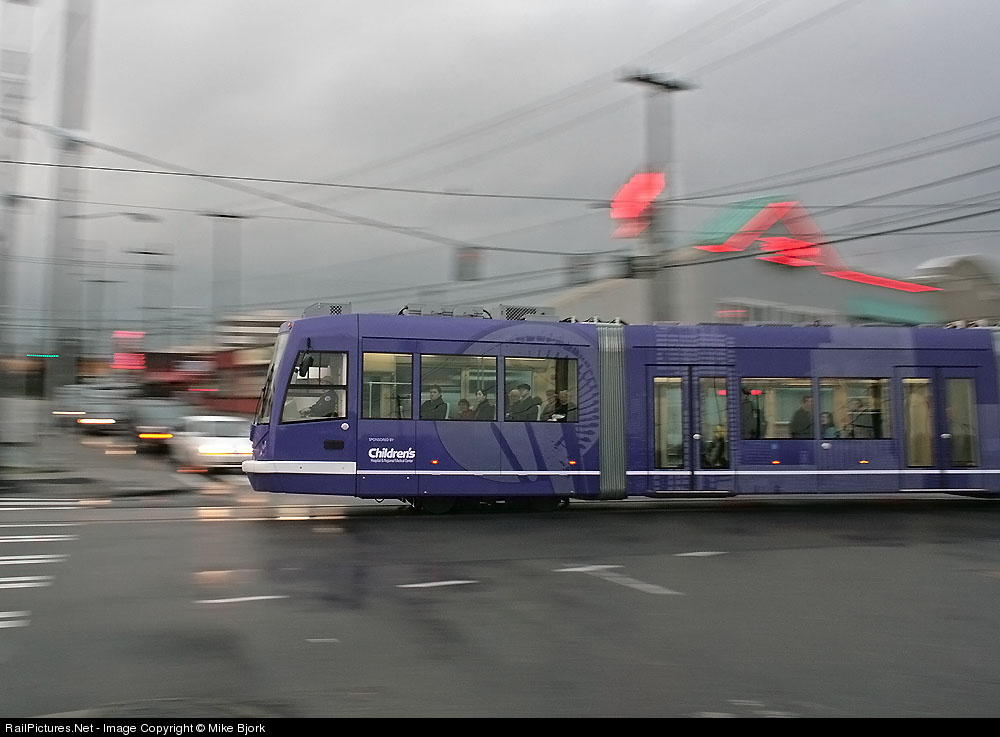
I usually don't care for pans; to me they seem like roster shots with shallow DoF, just an engine and a blurred background, just a different kind of blur. Diesels especially, even with the implied motion there isn't much life in those sorts of shots. But I have seen pans that bring more to the table; here are a few. The key is that the background show some context or offer some contrast, some juxtaposition to the subject.
Mike Bjork's trolley shot above (captioned version here, RP shots here) does a bit of both. I like rain shots when they give the image a bit of shimmer and the wetness on the pavement does that here. The context is a busy intersection, and the contrast is in color, the right purple of the trolley versus the reds of the store lighting and the streaks of various other lights in other colors, a bit of yellow, a bit of green, a bit of white. Very nice (and not only because I am a big fan of rich color)!
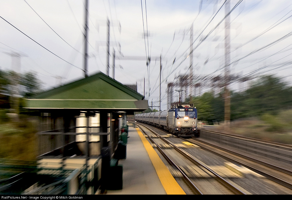
Mitch Goldman, well known for his pans (and other great shots, RP shots here) has been developing his zoom pan technique recently. What I love about this one (captioned version here) is the context. It can be tricky to do an "electrified pan" because one can end up with just a mess of blurred wires and catenary structure. Mitch solves the problem here by doing a zoom pan at a station. By doing the nose-on shot he has room to include trackside elements; by shooting at a station he finds interesting elements to include, not just the shelter but the yellow warning stripe and the wooden paths for boarding on the inner track. He places the train further back, increasing the depth and thus adding to the sense of motion, not just a generic blur but an approaching speedster. Excellent!
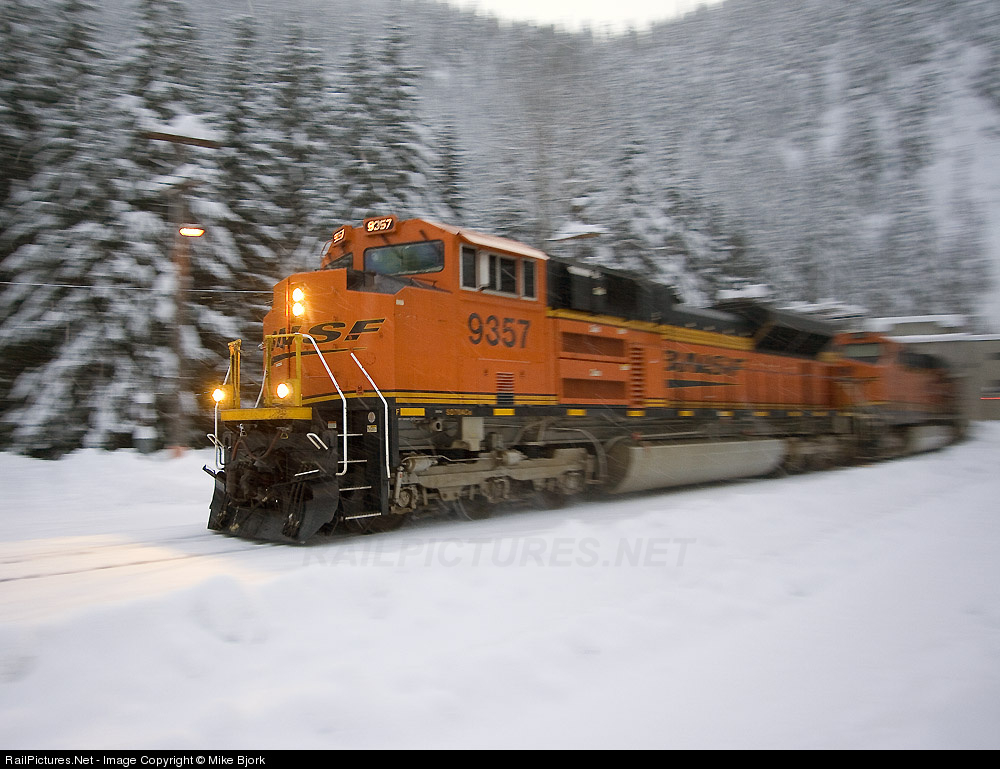
For the final shot, let's go back to Mike Bjork. He recently shot what I will call a "wedgie pan" at Cascade Tunnel (captioned version here). The wedgie angle results in the pan only freezing part of the engine, but look at what one gets from that angle, a view going back down the train to the portal, adding context and interest. Given that the angled view means less panning is required, one gets less blurring of the background, which here means the trees retail reasonable definition. Add to that lots of snow and the semi-selective color that comes with shooting BNSF orange during darkening conditions and you end up with a super shot!
I am glad to see that people have found ways to liven up what to me is the rather staid if not dull basic pan shot.
Tuesday, February 17, 2009
Friday, February 6, 2009
Nick Suydam: Master of the Night
I won't claim to have made a full study of all night-time rail photography work. I don't want to get into recent debates, or more serious ones, about what constitutes excellence in the night. All I want to do, really, is to point out that Nick Suydam's recent slide show, "A Late Night in the City: The Railroad Capital After Dark" is tremendous!
Consider the shot above. One of the hardest thinks I find to deal with is the "foreground obstruction." Put something in front of the viewer's face, and the viewer's eyes go there, generally to ill effect. Here it works, however, as the post serves to act as an internal frame, turning the scene into something of an asymmetric diptych, with the main scene on the left, a man and the train, and the secondary scene on the right. The man and the platform tie the pieces together as he is on the left side but about to walk onto the right, where the vanishing point for the various lines lies. The color is a surprisingly attractive yellow, with splashes of blue and red. One engine is seen from the side, the other nose-on. A really interesting combination of elements!
Here is an entirely different sort of shot. Moody, and telling a simple story, or perhaps not, perhaps it has more questions than answers. An engine, a backlit girl, and a round thing of some sort. Some fog, some beams of light, just a bit of track, the form of the engine invisible, with even the numberboards displayed only subtly. Very mysterious, where is the location, is it a pedestrian crossing, where is the girl going and what is she putting in her mouth, what is the mound in the foreground? A simple study, nice. (I'd like it a bit better if I knew what the round thing is.)
The next shot is a dusk shot. I won't claim that this is a great shot, maybe not even a good shot, but I find it interesting, mostly because of the compexity. It is a maze of geometric patterns and blocks of light. I like the way some of the cars have only single containers, exposing the ends of some of the containers to light, creating dark/light variation, with other bright blocks formed by the ribbed container side and the signal box. I like the way the signal bridge in the background is lit up but the foreground cantilever is dark. I like the way the verticals in the train (container sides, wells, container edges) go along with the verticals in the power line support structures. I like the way the yellows and pastels are accented with the red in the signals and the green reflecting off the sides of the train.
But does it fall on the busy, disorganized side of complexity? Maybe, but I am interested in how to capture complexity so I find it interesting to contemplate. Is there a lack of a recognizable composition? Maybe, although the solid rectangles among the complex mix of lines and the contrasting signals do provide some structure. Would I put it on my wall? Well, no.
Ok, then, let's now get to a shot I love. This shot is what pulled me in to this body of work, what led me to search it out to see what else was there. This shot has it all, forms, lines, mood, color, depth, motion. What a dramatic scene!
As always, I like to think about the nuts and bolts of the scene, but here that seems inadequate to the task. There is an internal frame of the train portrait, but it is itself composed a fascinating set of geometric elements and interesting color/texture patterns on the metal surfaces of what is customarily a forbidding place, the underside of a bridge/viaduct at night. And the bolts, both near and far, the shadows! Into that area the train is seemingly moving, but what an interesting angle! The distortions of the extreme wide lens and the fog cause the train to emerge as a monster, red eyed, and what is the nature of its lair with its glowing light underneath? A wondrous image, best thought of lyrically rather than analytically.
Consider the variation in compositions, in style, in abstraction versus documentation across the shots here, and in the all the shots in the slide show. Nick's work is not only fabulous but it shows his versatility and his artistry. An outstanding body of night photography. If you want to see more of Nick's stuff, go to his web page or to his Flickr site.
Subscribe to:
Posts (Atom)