 The question is when is it OK to make the train the main focus and when is it ok to have more human interest? Well, I would suppose it depends on what sort of story you are trying to tell.
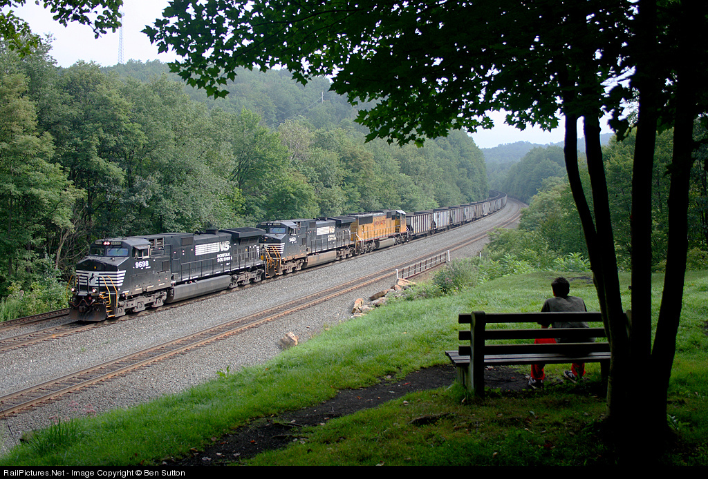
This one (by Ben Sutton, other shots here) fits together as a harmonious whole. The person is in shadow, and is obviously a supporting element. His gaze is directed at the train; so is ours. The train is well-lit, framed by the trees, and is therefore the main subject. This is a very soothing, peaceful photo to view.
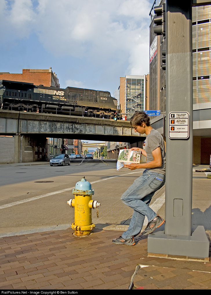
 In this one (also by Ben Sutton), there is tension between the person, the train, the magazine, the bright yellow fire hydrant, and the leading lines of the street with the many angular overpasses receding into the distance. We look at the train and the person, but the person's attention is not on the train or us, but the magazine, which itself is about trains. This isn't a "relaxing" composition, because the viewer is left wondering what is the "story". It is "strange". I like it anyway because of that tension and "strangeness".
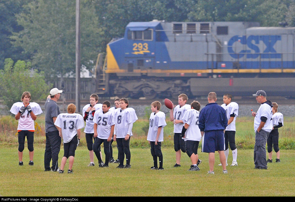
 Here, I was trying to show the train as part of the scenery. The kids and coaches are here to play football, not watch trains. The train noise nearly drowns out conversation, but the team ignores the intrusion. The focus is on the people; the train passes through, and the game goes on.
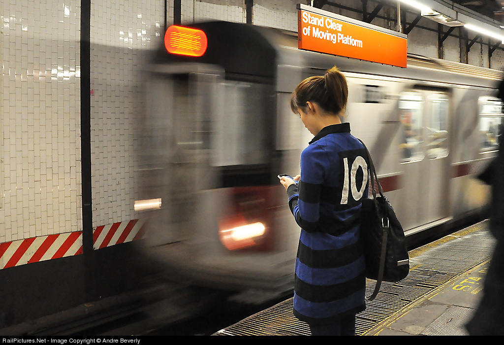
 Not mine (by Andre Beverly, other shots here), but I love this shot. The girl stands mere feet away from the onrushing transit train, but is completely oblivious. We can imagine the noise and rush of air as the train enters the station, but she might as well be a statue. The viewer wants to look at the massive object in motion, but instead we are drawn to her handheld device. Who is she texting? What message is so important that she shuts out all her surroundings, including us?
What are you trying to say with your photos? Everything else should follow from that.
PS by Janusz: When I first viewed Ben's second shot above (which started the forum discussion) I felt it looked contrived and so I didn't really like it despite its obvious good qualities. Over time, however, I have come to like it more. Sure it is posed but there are lots of photographs that are and I am not interested so much in realism and the more I look the less it seems artificial. The shot is interesting, is well composed, and has nice color. I am not so negative on the cut off engine, although it would have been interesting to see what the shot looked like with more width. My only issue with the shot is the Railpace - it isn't obviously a train magazine but upon close inspection it is and it is a detail that doesn't really fit for me. (Well, add a second issue: not a fan of the contrast, I would adjust the midtones and shift the peak of the histogram left a bit, get rid of some of the HDR-ish feel.)
The shot definitely has a "story" in that it has tension in the composition, whether true to life or artificial does not matter to me if it fits together. One looks at the shot and wonders, just what is so interesting about that magazine that the train goes by unnoticed? A well-staged work, staged not so much for realism as for interest, and that it captures and rewards.


