Saturday, September 25, 2010

Telling the Story: Tension

[This is a guest blog by Mike H. (RP images here, SmugMug here), taken with permission from a forum thread; I have added a few thoughts at the end. If anyone else wants to take a shot at writing down some thoughts, please let me know.]

The question is when is it OK to make the train the main focus and when is it ok to have more human interest? Well, I would suppose it depends on what sort of story you are trying to tell.

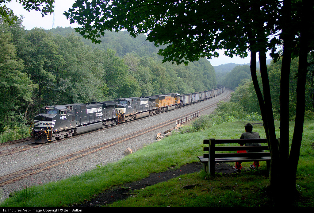
This one (by Ben Sutton, other shots here) fits together as a harmonious whole. The person is in shadow, and is obviously a supporting element. His gaze is directed at the train; so is ours. The train is well-lit, framed by the trees, and is therefore the main subject. This is a very soothing, peaceful photo to view.
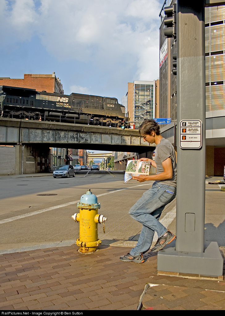
In this one (also by Ben Sutton), there is tension between the person, the train, the magazine, the bright yellow fire hydrant, and the leading lines of the street with the many angular overpasses receding into the distance. We look at the train and the person, but the person's attention is not on the train or us, but the magazine, which itself is about trains. This isn't a "relaxing" composition, because the viewer is left wondering what is the "story". It is "strange". I like it anyway because of that tension and "strangeness".
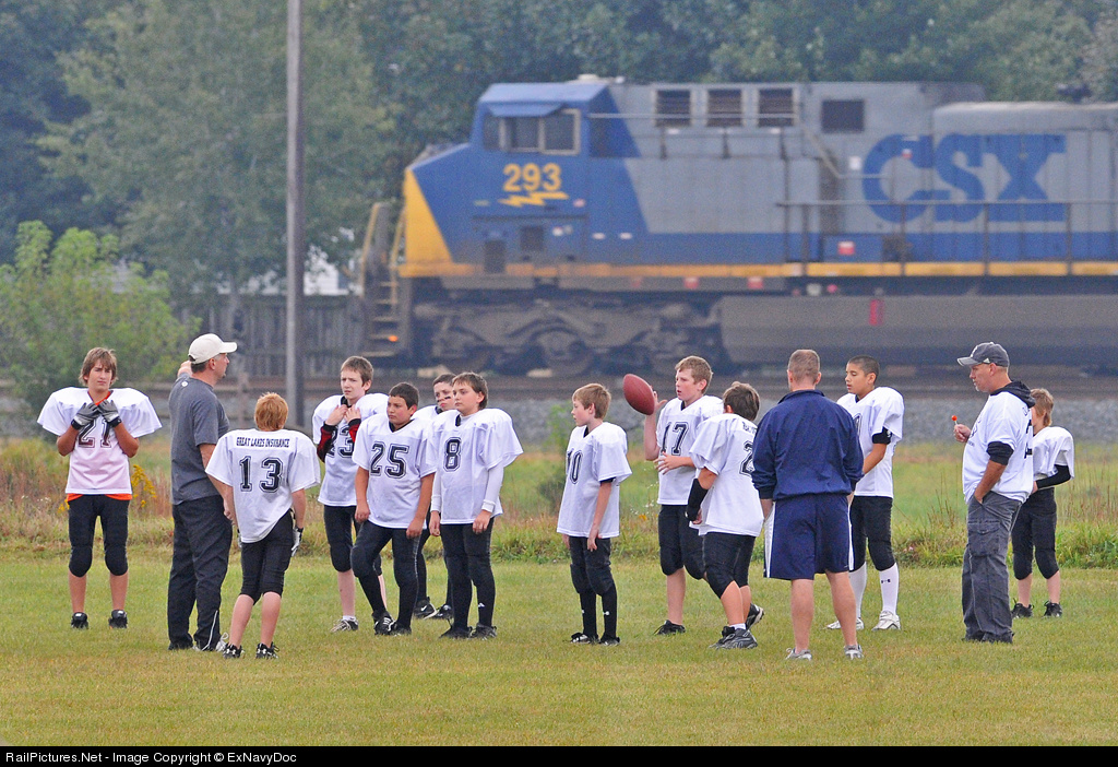
Here, I was trying to show the train as part of the scenery. The kids and coaches are here to play football, not watch trains. The train noise nearly drowns out conversation, but the team ignores the intrusion. The focus is on the people; the train passes through, and the game goes on.
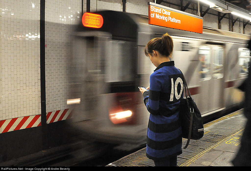
Not mine (by Andre Beverly, other shots here), but I love this shot. The girl stands mere feet away from the onrushing transit train, but is completely oblivious. We can imagine the noise and rush of air as the train enters the station, but she might as well be a statue. The viewer wants to look at the massive object in motion, but instead we are drawn to her handheld device. Who is she texting? What message is so important that she shuts out all her surroundings, including us?

What are you trying to say with your photos? Everything else should follow from that.

PS by Janusz: When I first viewed Ben's second shot above (which started the forum discussion) I felt it looked contrived and so I didn't really like it despite its obvious good qualities. Over time, however, I have come to like it more. Sure it is posed but there are lots of photographs that are and I am not interested so much in realism and the more I look the less it seems artificial. The shot is interesting, is well composed, and has nice color. I am not so negative on the cut off engine, although it would have been interesting to see what the shot looked like with more width. My only issue with the shot is the Railpace - it isn't obviously a train magazine but upon close inspection it is and it is a detail that doesn't really fit for me. (Well, add a second issue: not a fan of the contrast, I would adjust the midtones and shift the peak of the histogram left a bit, get rid of some of the HDR-ish feel.)

The shot definitely has a "story" in that it has tension in the composition, whether true to life or artificial does not matter to me if it fits together. One looks at the shot and wonders, just what is so interesting about that magazine that the train goes by unnoticed? A well-staged work, staged not so much for realism as for interest, and that it captures and rewards.

Tuesday, September 21, 2010

Blur and Abstraction


Consider this image by Mitch Goldman, heavy on distortion/ blur (you will want to click through to see the blur at full size, it doesn't make sense in the thumbnail view). First, is it photography? Of course, but is it rail photography? It isn't representational photography, for the most part, and it doesn't really try to convey anything in particular about railroading. But as an abstract, and one that abstracts not through cropping or careful composition but through what I will call an artistic effect, it might have merit.

Thus, one might consider this image more in the realm of certain types of painting than in photography. Of course, photography has always pursued such types of abstractions, but in doing so, is this image still a rail image? Is it an interesting abstraction of railroading and of a particular event, or is the abstraction disconnected from the subject, call it a random interpretation?

My first impression of this shot was rather positive. Heat distortion is always attractive, and by presenting overall blur with sufficient definition of subject this image offered a consideration of what is the essence of a rail setting. But ultimately the image shrunk on me (or whatever the antonym of "grew" is). For one, I found the elements unnecessarily muddled. The endless blurred posts are heavy handed. They are bright and take the eye away from

the more important parts of the image. It isn't so evident what they support (signal bridge? pedestrian overpass?), in that the top is cropped too tight for my tastes, I want to see a clear bar across and not something merged into the upper margin. The bright rectangles behind the posts on the left are bad in this regard also.

The image does have an interesting deliniation between top and bottom, the top having all the verticals and the bottom having diagonals, with the action at the line - nicely done! But the bottom is rather dull, especially in color, all brown, and the ballast lacks in interesting contrast, it is a muddle. Perhaps I just find it washed out and ugly.

The point of interest, the train and person, is problematic also. The pilot of the train looks weird, too tall, something going on under the coupler I don't understand, and there is this large black area behind the person that at first I thought might be a dog but then realized was the shadow of the train. And there is this weird orange-y area on the left, below the posts.

The issue for an abstraction, I conjecture, is whether the abstraction offers a good balance between taking one away from the object captured but also maintaining identification of what that object is or was. This image suffers from both, I think, odd as that seems. The individual elements are identifiable (especially to a railfan), catenary posts, many rails, engine, etc. There is a line between interpretation and blur, and this one falls into the blur zone, I think because there is sufficient detail remaining, and that detail is sufficiently distracting (posts! orange! rails!) to suppress whatever mood or pattern the abstraction would otherwise convey. And at the same time, perhaps because one expects certain things at trackside, the distraction gets confusing. What is that behind the posts on the left? What is that orange zone? Some details are abstracted (ok, blurred :) ) to the point they cannot be identified, but others are not, and this is a problem here.

Put differently, what is the subject? I find that abstract works often put a focus either on one important element, or they put the focus on no subject, instead being primarily works that consider pattern, or texture, or other dimension. Here, there is a clear subject, there is an interesting event, a trespass, with the train bearing down. But, the blur confuses rather than focuses, it takes away attention from the action but does not replace it with something else for the viewer's attention, merely distraction. The eye recognizes the event and one wants to know more (does the person have a face of fear or of distraction?). But there is no more here, it is eliminated and replaced with other stuff. The balance between identification and abstraction does not fit the subject.

So, I am no longer a fan of the image. But this is inappropriate as a full consideration of the image. The additional question is where do we/Mitch go from here? Can one do full-blur rail photography in an effective manner? I don't know, but here are some dimensions I would consider. First, what spot make for a good subject for a blur? The poles here are awful, in my view, unless they become a focal point. At least in this take they are too strong as a secondary element. How much detail at trackside is too much for this level of blur? Are there other magnitudes of blur that work better, and does that vary by location? I would look first to locations with less detail.

Second, what is the blur, the art, trying to do? Is the focus going to be on color? On patterns? What are the elements that remain after distortion/blur that capture a viewer's interest? I suspect those will have to do with interesting color variation along with a simpler division of the image area, simpler forms that hold up well to blurring.

Just some thoughts. (BTW, I presume I took this waaay more seriously than Mitch did. I just find it worth pondering.) I view this as an interesting first attempt. We will see if Mitch or anyone else pursues this and finds images of greater artistic merit. Nice try!

PS: I encourage you to read the comment from Mitch regarding what he intended, what he did, and why he likes the result.

Friday, April 23, 2010

Keith Burgess: Mood and Texture

With the annual CRPA conference coming up this weekend, I've decided to resume this blog with an appreciation of the work of two-time CRPA contest winner Keith Burgess. His work can be found here and here. His CRPA winning shots are here (2007) and here (2009).

Keith has an extensive body of work so I could pick out all sorts of themes; I'm going with a few shots that combine aspects of texture and mood. Texture, taken literally, conveys a tactile impression visually: soft, rough, slippery. I view it as more than that, as a way to emphasize part of the character of location. Texture itself also contributes to mood, just as light does, so photographs that emphasize both dimensions are particularly powerful.

The first image brings out the dryness of the high desert with a large patch of close-up rock in the foreground and general high contrast due to the mid-day sun. The textures of the arching rock on the left and the distant rock wall add to the roughness of the image, contracting with the curve of the arch. Desolate yet beautiful!

In the second image the use of texture is more straight-forward and at the same time more unusual. The shimmer and granularity of the water contrasts with the diffuse, soft slopes and the smoke off the engines, giving a counterpoint to the presence of the train. Beautiful terrain but it doesn't look like a great time to be there, the mood is somber, yet with signs of life from train and sparkling water. By no means a striking image but worthy of contemplation.


The third image is a classic B/W with low light creating strong shadows on the ground, highlighting the dirt, stones, debris, and rails of the yard, contrasting with the diffuse shapes and tonal variations in the steam and the rigid geometry of the wall and doors on the right. The presence of the shovel mechanism conveys a sense of abandonment or waste, or at least better days, even though the facility looks to be active and well kept. I'm a fan of the emphasis through contrasts and shadows on the rough ground textures.

As usual the last image is my favorite of the set. The variety of textures! Snow blowing in the air, seen as distinct streaks of snow, and also as snow dust kicked up by the train; the ripples in the water; the fine lines of the tree branches; the ballast and ties. The backlight and the snow reduce the extent of color, and the yellow engine noses is soft rather than bright, subtle. The backlight also makes the blown snow streaks visible and creates a quiet mood.

These shots are not necessarily representative of Keith's work; none are strong in color or bold in composition. The effects are quieter but the photography is no less excellent. Well done; I'll have to revisit the collection some day, perhaps the night CPL shots or his other work.

Until then, consider what I have written as you contemplate this shot. It's like a homework assignment! :)

Monday, September 28, 2009

Upcoming Rail Photography Contests

I was unaware that Railfan & Railroad magazine has a contest. Unfortunately entry deadline is extremely soon, last day of September or first day of October, something like that. $200 first prize; don't recall the theme, if any. Sorry for not having more info; I couldn't find any info online. Now I know to look for it next year.


Trains magazine also has a contest (link here, big file, 3.6MB), first prize is a Canon 50D! The theme: "Bridging the Gap." Deadline October 31; for details follow the link.


Finally, the Center for Rail Photography and Art is doing their annual contest again. This year's theme is "Beyond the Locomotive" with the added explanation that "This year’s theme challenges the photographer to understate (or even eliminate) the locomotive in the photograph and emphasize other aspects of the railroad environment." First prize is also a Canon 50D! Deadline December 31; modest entry fee of $10 for non-members of the Center. Link here.

Good luck, everyone!

PS: I forgot all about Day In North America, a competition/compilation where everyone submits their shots taken on one day; the selected shots appear in an issue of Railroads Illustrated. That day was October 3, 2009, so it is too late to make a plan, but if you took a nice shot that day, the information for submission can be found here.

"Great Railroad Photography"


A new publication is coming out. It appears to be a magazine or an occasional publication in magazine form (it says "Premier Issue") but I can't tell the frequency. The initial issue has 8 essays by known names: Ande, Burgess, Crise, Flanary, Lawrence, Lothes, Scanlon, Zimmmerman. The webpage (link here) says 8 essays, 100 pages. It is being done by the people at Carstens and Railfan & Railroad magazine. Looking forward to it!

Friday, August 28, 2009

Tying it Together - Image vs. Viewer

Early in the history of this blog it was suggested to me never to write about my own shots. Overall that is good advice, it is hard to be objective about one's own stuff, and frankly there is too much good stuff out there to write about instead. But sometimes one has a more intimate knowledge of one's own work, and sometimes one just has a point to make and so what, really, it's my blog. So I proceed ...

And besides, one point here will be that opinions vary and people approach shots from different places.

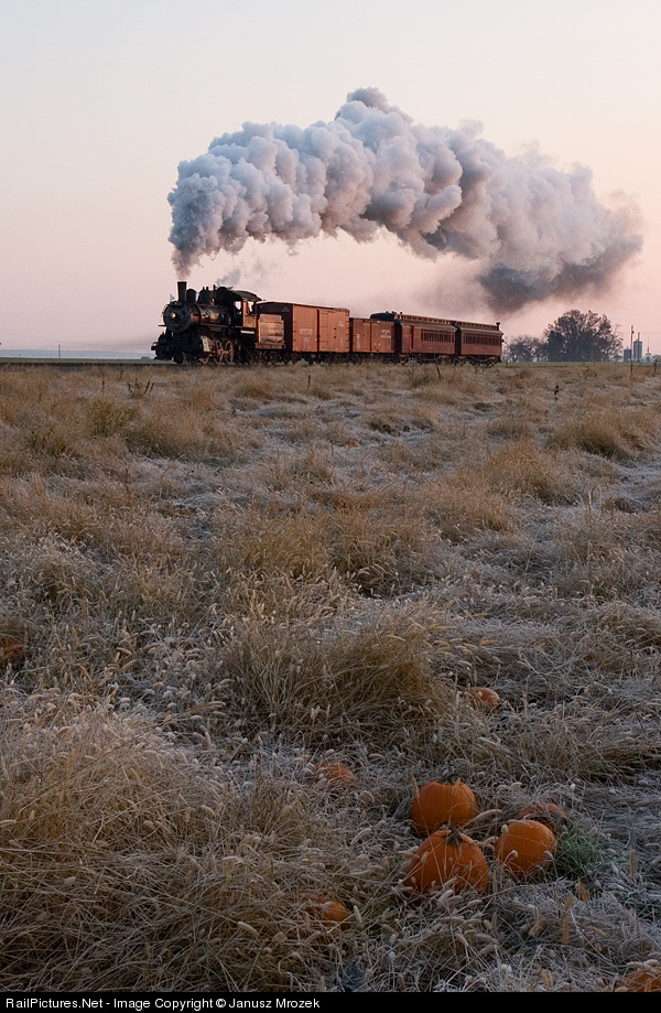
Consider this shot, what I call my "pumpkin" shot (captioned version here). One person whose opinion on rail photography I respect says they really like the shot. Another person whose opinion on rail photography I respect says the shot does not hold together. How can we reconcile these opposing viewpoints?

The shot is straightforward, a train in the background, some pumpkins in the foreground. The train is distant but conspicuous in location and motion and is obviosly the subject. So what ties the pumpkins to the train?

From one perspective, not much. There are no agricultural rows, say, that lead from one to the other. There is no apparent notion of the train serving the farm. Two objects, two worlds, arbitrarily brought together by the photographer. I see such shots from time to time, the photographer has stepped away from shooting the train to shooting the train in its environment, and the second object was present, and the photographer put them together. More to it than a simple wedgie but, really, it "does not hold together."

From another perspective, connections are prevalent. First, the frost on the ground can suggest late fall, and sure enough, a pumpkin suggests late fall. Second, while the compositional elements may not connect strongly, the shot has a pastel flavor throughout that joins, with various pinks throughout. The shot does not have a great deal of contrast, often a bad thing, but perhaps here it adds to a feel of softness, of lack of differentiation, of evenness. Third, the textures are harmonious - an expanse of gently frosted turf, and even the pumpkins nest into the plants, blend in, their forms becoming less distinct as they do in tonality as well. The train and foreground blend together and bond together, not in terms of compositional elements but in color and tonality and texture.

So the shot can be viewed in different ways. How it is viewed depends on what the viewer brings to the shot. Does he love fall, does he love the cripness of a frosty morning, and also the tranquility? If one misses the frost and the color then it is just a train here, some vegetables there.

Does she love agriculture, does she feel a bond to the land, to the farmland? There will be no flow between train and pumpkins, just two different spots on the image separated by dry weeds, unless one has an appreciation, a positive response of some sort, to the foliage. (I myself have a distinct negative reaction to an expanse of corn in particular that makes me less appreciative of the across-the-cornfield view seen in, say, shots from Ohio. They just have a boring foreground to me.)

Images come together, coalesce, in many ways. Commonly they do so in terms of composition, element A leads the eye to element B leads the eye to element C. Sometimes, however, the connections are through other dimensions, through common characteristics, repeated color, complimenatary tonality. Ultimately, however, that connection is made not only by the image but by the viewer, who sees with the eyes but draws connections and appreciates in the mind.

Wednesday, July 29, 2009

Two Interesting Sites

I'm always looking for web sites with interesting images. Actually, I wish I could spend more time on that, and one goal of this site is to seek, find, and present the gems. Here are two gems I have run across.

Gallery of Steel: International Railway Art Exhibition is "where I capture and share the very best, most artistic, compelling, creative, moving, bold, original, unique, edgy, brilliant (in my opinion) railway-related photographs on Flickr." A person (persons?) after my own heart! A nice range of creativity, most notably in a sizable volume of HDR work, done not for realism but for expression. This is a Flickr-based moderated group of images. There is a regular page here but what is interesting and nicely done is the alternative black-background presentation linked to above. The regular page includes a brief statement of principles from which the above quote is taken.

Beyond the Wedge is less creative than Gallery of Steel in that it does not feature photography that deviates from representational photography to the same extremes. Which doesn't mean it is worse, or better, just different! One thing I notice (because my preferences favor them) is the many shots that involve capturing equipment and other details, plus broader perspectives, with severe and/or non-standard cropping. But that is just one part of a set of images with interesting variety. Also Flickr-based, also moderated.

Two website, recommended for you viewing pleasure! Always accessible through my links at lower right. I'll keep looking for more.