Saturday, September 6, 2008

Lew Ableidinger and the Open Spaces

Lew Ableidinger works primarily in black and white. In going through his images, I immediately took an interest in several shots from the Woodworth, ND area. I love the ways these shots convey open spaces through composition and texture.

In the first shot, "Road to Nowhere," note the unusual angle of the train. It's barely in the frame and it is already up and out of here, heading over the small hill (an effect enhanced by the road which is also going up and out). This shot does not have en expanse retreating into the distance, and for that matter the train doesn't appear small relative to its surroundings. And yet, the unusual angle, the train sitting on some sort of a ridge, the balance with the road and the tree give this somewhat odd view great appeal. It perhaps does not fit with the rest of the shots here as the "open spaces" feel is weaker and there are more elements in the frame (including the grassy textures). But I enjoy the way the subject is the road, enhanced by the tree/bush and the fencing, and one is in effect driving up to meet the train and both will subsequently make their own explorations on the other side of the ridge.

I will treat the next two shots, "The Open Country" and "Life in the Vast Lane," involving the same crossing and tree, as a pair. They are simple compositions, a train, a road, a tree (or two), and the endless plains.

The first shot of the pair is a classic scene, a road leading up to a short train. The foreground tree provides depth in front of the train and the receding plains behind, and stands on the left, balancing the light source at the right background. The plains have just enough roll to them to provide a stronger sense of distance. The combination of snow and backlight make for excellent contrasts, both at the "macro" level in terms of the tree and train and at the "micro" level in terms of the grasses in the snow. It's a peaceful, interesting scene.

Sometimes a road takes the eye in a direction, but sometimes it frames. In the second shot of the pair, it forms a diagonal that "supports" the trees and train. The two trees create an internal framing for the train, helping to keep the eye from following the road to the right. In doing so, however, the road is left as a strong triangular element; too strong for me. To me it is a large dark object, dominating the smaller tree, the train, and what is visible of the open spaces. It detracts, without itself bringing sufficient interest in terms of its texture or otherwise (unlike the road in the opening shot of this post).

The final shot, "Trains and Plains," turns out to my eye, surprisingly, to be an abstract. Compositionally, it has three elements, two of which are the lines of the train and horizon and the block of the backlit engines. The third, subtle but to me rather striking, is a curve in the sky, a bowl shape formed by variations in the light and clouds.

Complementing these simple elements are restrained variations in light and texture. The fine granularity of the grasses poking through the snow fades into a formless sky with diffuse changes in light across the frame. The land has just enough roll to the land to convey a greater sense of depth. The light does not radiate but rather glows in an odd, foggy/hazy manner, with only a partial sense of the direction of light. The black, backlit power enters the frame from the left (presumably), proving a dominant element, but to me, participating in the scene as an equal party rather than being the focus of it.

I think of this shot as being conceptually equivalent to a pastel picture; just as pastels tend to have subdued colors, this image has subdued compositional elements and light, but the overall effect conveys an interesting glow and a strong, uplifting, almost spiritual sense or presence.

Recently I've been absorbing David Plowden's recent tome, which has a number of non-RR shots of this type. The present of a train makes Lew's shots more accessible to me, because they draw a contrast between the small train and the large space, a contrast enhanced by my knowledge that the train is actually large. And yet, the trains don't necessarily appear small in these pictures; it is not that the trains become smaller when faces with these expanses, but that the expanses appear timeless, permanent, as the train temporarily occupies part of the space.

Saturday, August 23, 2008

Alex Craghead: Book Reviews


Alexander Craghead is a self-described writer and photographer (whom I don't know). He has just written a detailed review of the upcoming book "The Call of Trains: Railroad Photographs by Jim Shaughnessy," due out in November but for which he received an advance review copy. I ran across his review in the Yahoo ObsCar group and found it fascinating, and his blog even more so, because he has also reviewed the David Plowden book "Vanishing Point: Fifty Years of Photography." (Several years ago he also reviewed "A Passion for Trains" by Richard Steinheimer; alas, only in a cursory manner.) He has also reviewed a number of other books on railroad subjects; here is his book review section and here is his personal web page (with a very interesting organization, analogous to sections and chapters of a book).

Shaughnessy is of course an important figure in railroad photography and I look forward to the book. But the review is worth examining in its own right, of course especially if one is considering buying the book (or putting it on one's holiday wish list, which I definitely am). He not only discusses some of the images in the book but also comments on the accompanying essay by Jeff Brouws and expands on that to discussing his own views of the (implicit) comparison to Steinheimer created by the mere existence of the book, in similar form and by the same editor/author as the Steinheimer volume. The review is detailed and rich.

His review of the Plowden book is equally valuable. He also gives significant attention to the included essay (by Steve Edwards) and also goes through the images, in even greater detail than in the Shaughnessy review. Having re-read the review with my copy of Plowden at hand, I can attest to the quality of the insights made. In turn, that makes me look forward even more to the Shaughnessy book.

One might quibble with some of Craghead's points. For example, in discussing Plowden he notes "the clinical inhumanity of a nuclear power plant" but later he says "We walk freely amongst barns and inside of feed mills. It seems that dust still hangs in the air, as if someone was just here, just working, but where have they gone? There is a profound solemnity, as if in church, and each successive image shows us less and tells us more." One wonders the extent the observation is driven by the actual differences between the images versus the personal perceptions of the nuclear power and agricultural industries. Having less of a romantic view of farming, I am less taken by the barn images, devoid of surrounding tools, animals, even footprints in the mud and thus quite dry (plates 213, 217, and 220 leave me unmoved) and categorize them more closely to a number of the images of industrial structures with a similar flavor.

Nonetheless I have learned much by reading Craghead's reviews. His mind operates differently than mine; I do not write phrases like "mixing a lyric style of photography with a documentary sensibility" or think thoughts like "b
eyond, there is no world, no ocean, no hills." By nature I don't read stories into pictures, or at least I leave them in my unconscious. By reading material like this, I can try.

In writing about the reviews and the reviewer, however, I should not overlook the reviewed! I have the Plowden and Steinheimer books and will purchase the Shaughnessy when it comes out. The first two are lengthy and beautifully printed compendiums, retrospectives of their work, and the Shaughnessy should be of the same editorial and production quality as the Steinheimer. I have contemplated blogging on some of the individual Steinheimer images and intend to inquire about the use of smaller versions of the images here; otherwise I might yet do it anyway without images, simply referring to the plate numbers.

Only a small portion of the Plowden book features RR images, however, 28 in the opening chapter plus a handful at the end; a few images elsewhere in the book have some RR content. I find them of less interest than those by Steinheimer, with the possible exception of plate 14 and 20 and perhaps 7 and 230. As a whole I find the images in the book more difficult to appreciate but am finding that the effort bears some fruit. Nonetheless, I don't favor Plowden's style overall, although a number of the images do move me or capture my attention.

[NOTE: I have not asked for permission to use the images from the dust jackets of the books. As those images are being used to sell those books, I presume there is no problem with my use of them here.]

Sunday, July 27, 2008

Steve Crise: Shallow Depth of Field

Steve Crise (website here; look not only in "railroads" but also in "Project 3751" and in "Urban Environments") has done some excellent work with extremely shallow depth of field. Here are some similar compositions, verticals with track as the foreground/in-focus element. In these shots the zone of focus is particularly narrow, encompassing only a few ties in shots with much more depth.

Let's start off with this frog shot, with intermodal cars in the background. Interesting shot, lots of details, muted yet colorful with browns and some reds and blues (compared to most people, I am more of a fan of rich browns). But I find the shot busy, cluttered; where is my eye supposed to go? The focal point is weak, due in large part to the frog being simply longer than the range in focus. Also, the background is rather busy and in some sense visually close to the frog, resulting in a lack of separation. Nice, but lets turn to shots that are really nice!

Really nice would be this track and signal shot. So much to see, two different signals, two different signal colors, pinkish hue in the sky which is picked up in the rails. I am a fan of what I think of as a triangle compo- sition, here formed by the two signals and the zone of the track in focus.

What I find interesting here is the choice to limit the focus to an arbitrary, nondescript section of track - no switchpoint, switchstand, spike, anything. I like the effect, I think because it equalizes the three points. The foreground, which could be a stronger element if more distinct, becomes equal in presence; the left signal is a strong element here. Overall, I love the peaceful flavor here, interrupted only by the knowledge that green over red means a train is coming. The shallow depth of field eliminates all minor elements that one might find in a scene, junk and weeds in the foreground, the signal boxes, details of the mountains, leaving a beautiful semi-abstraction.

The third image is powerful. The foreground is distinct, the spike, the complementary nearby fasteners. Balanced against this element is the train, strong and powerful yet not over- whelming, colorful (nice contrast against the overall coldness), with distinct form. The absence of focus reduces the nose to basic elements, three circles on a field of red (itself shrouded by clouds, with blue only above - cool!).

More than that, the shallow depth of field reduces the entire scene to basic elements, and the key here is that Steve has chosen the elements well, track and the train that runs on it. The blur gives added emphasis to the track, which to my eye results in excellent balance, just the right emphasis on the track, eliminating the natural instinct of any railfan to focus on the engine.

When I began to ponder this post, I was of the opinion that this engine/spike shot was by far my favorite. In pondering them more, I now realize that the signals shot is its equal if not more favored. The pastels are so nice, the lines (rail parallel to signal post) so strong, the essence of the scene so well conveyed. Sweet!

Steve, hope you don't mind, but I am going to copy this type of composition, if not the exact forms here, at the next opportunity! :)

Wednesday, July 23, 2008

Mechanics versus Artistry

It has been noted that I take a somewhat mechanistic approach to an activity that is inherently spontaneous or inspired. Certainly true! I have a good bit of an engineer's mentality.

A correspondent recently wrote of my blog that "perhaps the process is one of trying to put into objective terms what was originally done very subjectively by the author." By this he meant that no photographer thinks in the terms I use in my commentary. (See also the comments made on my Subtle Color post.) This is undoubtedly mostly true, although I suspect some photographers to think about dimensions of composition in conscious or semi-conscious ways.

But what happens to spontaneity? One could argue, for example, that a rules-based (rule of thirds!) approach necessarily hinders one from achieving higher artistic qualities in one's work. Following rules stifles creativity, one might say. I suspect that, instead, the effect is in the other direction. Certainly the better we become at the technical aspects of photography, exposure and such, the better our images become and the more likely we are to achieve something beyond the mundane.

Surely this goes beyond the technical aspects to the creative ones, however! The more we know about, and internalize, aspects of composition like form, line, texture, etc., and the more we learn to see the aspects of light in a scene, the easier it is to release ourselves from the rules-based, nuts and bolts, mechanistic aspect of composition and see creatively, and thus achieve great results in our work. To internalize the objective in order to free the subjective.

But this blog is as much or more about appreciating shots already taken than about shooting. I find it helpful to think about these images in terms of principles of composition. "Debugging" these shots gives some insight into how they are put together. At the same time, I certainly realize that the best shots often have an extra quality that cannot be reduced into basic principles. Some shots "work" and some shots have innate beauty, and some of those qualities are beyond my language to express.

Any effect of these musings on the reader's practice of photography is, while welcome, incidental or at least secondary. Other than my hope that people are inspired by interesting images to try new ideas in their work.

As for my mechanistic approach in this blog, well, it's true! The principles of composition, as I have informally learned them, are the main "language" I have for expressing my thoughts. Over time here also I will be pursuing a non-mechanistic mode of expression, but it will be a while!

[The image is mine, one of the more creative shots I have taken. Captioned, B/W version here.]

Saturday, July 12, 2008

Trains in the Distance

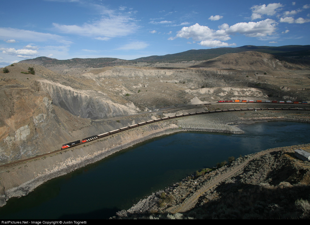
In a recent post, I made the following statement: "The image is a train in its environment, not an environment with a train in it." By this I implicitly referred to a tension between the size of a train in a shot and its presence within the image. A train can be a small element within a shot and yet have a much larger presence, in fact, be a major focal point, as it is in the images in that post. The converse is not necessarily true, usually, as a train that occupies a sizable part of an image will necessarily tend to have presence. Nonetheless, size and presence need not be in proportion. Here I want to consider a set of images where the train is small but their presence differs from minuscule to significant.

Consider first this image by Justin Tognetti (captioned version here; more of his work here). The train is pretty small, but this is obviously a train shot, in fact, two trains appear. The scene is basic, terrain, water, sky. I just love the way the front of the more distant train is framed by cloud shadows, which also gives it a more distinct identity relative to the first. The terrain has lots of interesting textures and hues and the two trains have a bit of lower left / upper right positioning. Very nice!

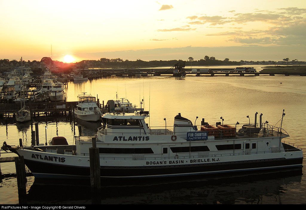
But the train need not be such an obvious part of the image. This boat shot is by Gerald Oliveto (captioned version here; more of his work here). The light is nice and the color of the water is subtly gorgeous. But the train is difficult to find (and would be more difficult but for the precise framing of the power in front of a brighter spot of water). It's an interesting scene, but not particularly a railroad image, as the train is barely visible. (For my tastes, had the shot been a bit wider, so that the boat was less squeezed and more of the marina were present on the left, it may have had better balance.)

Both of those shots are landscape scenes. Instead, a shot can be more abstract. Here is one by Tom Mugnano (captioned version here; more of his work here). The train has a subtle presence here, but a bit stronger (and it is hard for me to judge since I know the location well and therefore the train is more obvious to me). What I find interesting is the layout of the town - all the blocks and buildings (and windows within them) give the shot a bit of an abstract feel. It reminds me of shots I have seen and taken, from a much lower angle, across an old European cities with a series of tile roofs. Lots of rectangles and such.

So, then, how does one consider this image, by Graham Williams (more of his work here)? This is the image that first compelled me to contemplate this subject. The scene lacks an obvious subject - there are a number of elements, (short) train, village, windmills, isolated farms, trees. One could say the scene is the scene, or that the scene is a pastiche of things, one of which happens to be a train. I happen to find this scene pretty, in a way, and interesting, in that my eye dances around the scene. At the same time, my eye doesn't stop much; perhaps I can exaggerate and call it an anti-composition because it lacks form. It's a jumble of elements with only tangential relationships to each other, in my view, but it all works for me. It's pleasant, it's interesting to look at. It's not a great shot, but it is a nice shot, and it's a bit off the beaten path of scenics, so it is inherently interesting.

Sunday, July 6, 2008

Subtle Color

My favorite dimension of photography is color. Yes, more than light, as much as we all love great light. Here are some shots whose use of color has particular appeal to me, even though in both cases its role is secondary.

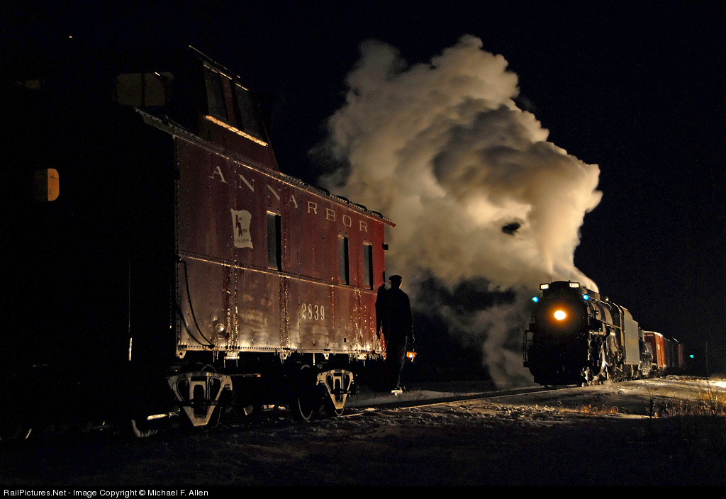
First is a night scene by Michael Allen. One can photograph night scenes in many ways, such as the extensively-lit, colorful shots by Gary Knapp. Usually one must take a moderate approach, however. Michael's shot (captioned version here) was taken during a photo charter, using several light stands to light up the train but not the surrounding scene.

I love the rich yet understated hue of the caboose; one gets a strong sense of what it would look like during daytime, yet here it has a quiet presence. But in addition, there are splashes of green, in the marker lights and in the distance (a signal? on another caboose?). And the red of the caboose is repeated in the boxcar behind the tender. (I also like the hint of browns in the plume.) By no means is this a colorful shot, yet the colors make it rich and complete.

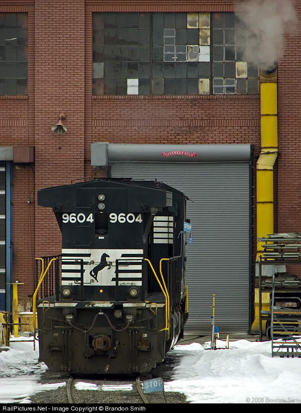
Next is an engine-shop shot by Brandon Smith (PBase site here, RP pix here). The light is muted, but the colors, while not vibrant, stand out (perhaps in part because they are primary colors, red, yellow, a bit of blue in the STOP signs). The yellow of the exhaust pipe is echoed in the yellow of the handrails and of the post on the left.

The composition (captioned version here) is interesting also, with the engine well off center and below. I think of the shot as two blocks, the big vertical rectangle formed by the engine staring in the lower left and taking up a good bit of the frame, and the smaller horizontal rectangle of the window above, slightly off center, and further weighted toward the right by the stronger pattern in the panes on the center and right compared to the left. The exhaust pipe ties it all together, and there is even a bit of steam.

In addition, there is a nice mix of textures, with the pattern in the bricks, the horizontal lines in the roll-up door, the smooth surface of the front of the engine, and the snow. All in all, sure I'd prefer stronger light, but still very nice work, so much else there to enjoy.

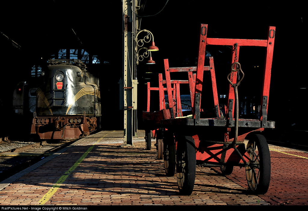
Finally, look at Mitch Goldman's shot (captioned version here). It's a better known shot than the other two, so normally I would not use it, but I just like it! and it's a shot I think of when I think of color. What makes this shot so nice is that strong colors are set in front of a black background, making them appear brighter and stronger. The dominant red of the cart is echoed in the PRR keystone on the nose of the GG-1. Softer reddish hues appear in the bricks, the lamps, and to some extent on the pilot of the GG-1. The splash of bright blue above the engine, the area of reflected light, and the yellow stripes give the left side a bit of color complexity to balance the strong presence of the red on the right.

Overall, the first two of these shots use color with some subtlety. They are not about color primarily, but color greatly contributes. The third shot has dominant color, but what is of interest to me is the color in other parts of the image that makes subtle contributions.

Tuesday, July 1, 2008

Extreme Positioning

Photographers pursuing making images beyond simple snapshots tend to quickly run across the rule of thirds. But rules are made to be broken, as the cliche states, and sometimes a shot works well with the subject closer to or at the center. (For that matter the "rule" of thirds is only a guideline, after all.) What interests me here is the opposite, where one moves the subject of a shot, or at least one of the important elements, further away from the rule of thirds locations towards the boundaries of the image. Here are two images that do so quite successfully.

The first image is a mountain image by John West (captioned version here). And that is the point; in one sense it is a mountain image, against which the train measures up as a trivial presence. Of course, the primary subject is the train. In particular, it does not appear so small that it is difficult to observe and relate to, and for that matter the mountain is not so much a second element in the composition as the primary background and definer of scale. The image is a train in its environment, not an environment with a train in it. And yet, the mountain is huge; its peak is clearly well above the top of the image. Its height receives greater emphasis because of the placement of the train at the very bottom of the image, instead of, say, at a rule-of-thirds location.

Of course, there are other things to love about this shot, the falling snow, the splash of yellow in an otherwise field of muted colors.

The second shot, by contrast, is a flatland scene by Francois Iliovici, taken at Fagelsta in Sweden. This shot also reduces the scale of the train relative to that of nature, albeit in a different way. The shot has two elements, of course, train and moon. Francois could have easily placed the train at the lower rule of thirds location and the image would have been just fine. Instead, he places it further down, not on the margin but well down toward it. As a result he creates a greater sense of space, in the compositional meaning of the term as well as the astronomical! Thus, here, instead of a mere mountain, it is the cosmos itself that is being juxtaposed with the train.

Notice also the gradual transition, the gradient, in the sky color, from whitish blue at the bottom with hints of light red to a full sky blue at the top. Very nice! [BTW, the orientation of the scene is such that it appears not to be level, but it is.]

It comes to mind that this type of composition has something in common with the Cut The Corner compositions I discussed a few weeks ago. Both posts show examples of how photographers can successfully go beyond standard approaches.