


So we have gone through a bit of a tour of John's images, from smaller to larger in the scope of the scene. John's extra touch of contrast makes his work yet more appealing. Great stuff!
So we have gone through a bit of a tour of John's images, from smaller to larger in the scope of the scene. John's extra touch of contrast makes his work yet more appealing. Great stuff!
For a lengthier overview of what I am trying to do here, see my very first post from years ago, here, and my first substantive post here.

Please note that I had anticipated spending a day or two buffing up the content, in particular reestablishing expired links to material. That will happen soon. In other instances, such as the Keith Burgess post a little further below, the thumbnails no longer work for reasons not apparent to me, but you can click on the boxes to see the images in their original location. Alas, that won't be true of all posts, until I track down the photographers and find out where there images are. Incidentally, all images are used here with permission.
New material coming out soon, as I am finishing a half-year intensive work project and am renewing my interest in this blog. If you have any comments, please include them in the comment section, and feel free to email me: jrm underscore rr, my id for yahoo email, with comments or suggested topics, and especially images or web pages worthy of my consideration. I especially seek out images which fall in an "artsy" category; those seem to be hard to find.
As this is a rush intro - I will polish it down the road, or not, maybe I'll put my energies solely into my next post - I show you merely an image of no particular quality, one of my own, just to add some color and life to this particular post. I much prefer to write about images created by others. I critique better than I shoot, at least I hope you come to that conclusion.
 This shot is a wedgie zoom pan, nicely done, rich purple skies complementing the dark yellows further down. I like the blur in the sky, with the clouds particularly dynamic, and the train sort of zooms out of background. Nice action shot with interesting color.
 Here we see a traveler of some sort crossing the tracks. I like how the light appears on both sides of the person, headlights on the right, headlight reflections on the left. The person's gaze is angled a bit some so one can see a bit of his face. Shallow depth of field and black/white treatment complete the work (and the bit of flare does not bother me). An interesting moment in the night time.
 I love the idea behind this shot, as I see it, to emphasize the height of the bridge by capturing only part of the legs, and by showing an entire tree comfortably ensconced underneath. The train completes the scene, filling a bit of a hole in the middle, but for me it remains about the bridge and its context, which at this time just happens to include a train.
 I am a big fan of town and train scenes, and this night version is a real beauty. The town is present as much in street and window lights as it is in buildings The train provides obvious interest (and its headlights create a nice code line pole silhouette, and reveal roadbed detail) but the structure is equally interesting. A small bar, open late, with one patron? What is that purple light shining out of its window? (The purple nicely contrasts with the overall mustard hue) A tree breaks up the horizon, itself silhouetted by an extra glow in the sky. (I might prefer cropping a bit off the right, but losing some lights in the background reduces the town feel.)
 Of course, Travis can capture a traditional scene also, witness this bridge shot, framed in a classic manner with branches, and nicely capturing snow blowing off the bridge as the train passes.
 Catching a snow plow snow blast at night had never occurred to me until I saw these two shots. Instead of the scene being too dark to catch the dynamism of the snow movement, it turns out that light sources shining through the snow from the back create a fascinating glow, and the lack of visible detail leads to greater abstraction. In the first show, the glow is great, the grabirons from the engine provide just enough presence (along with the ditch lights) to explain the scene, the car and structure (a sign?) establish the location, and the streaks of light along with the clumps of snow convey the energy and the motion.
 The second shot tells its story through more complete abstraction. Capturing the snow being pushed over the grade crossing signal adds bold color; the crossbucks are barely visible above. The engine is essentially not visible, despite the bit of nose, and the white lights contrast with the red. The snow flies, there are few lines if any, everything has a soft feel. A real beauty of abstraction, a study of color and light.
 Finally, a shot of the station at Red Wing, MN. A nice compositional choice to put the train in the background to feature the station more. Not ideal, in terms of edge distractions, and I think the placement of the light pole, but an interesting shot.
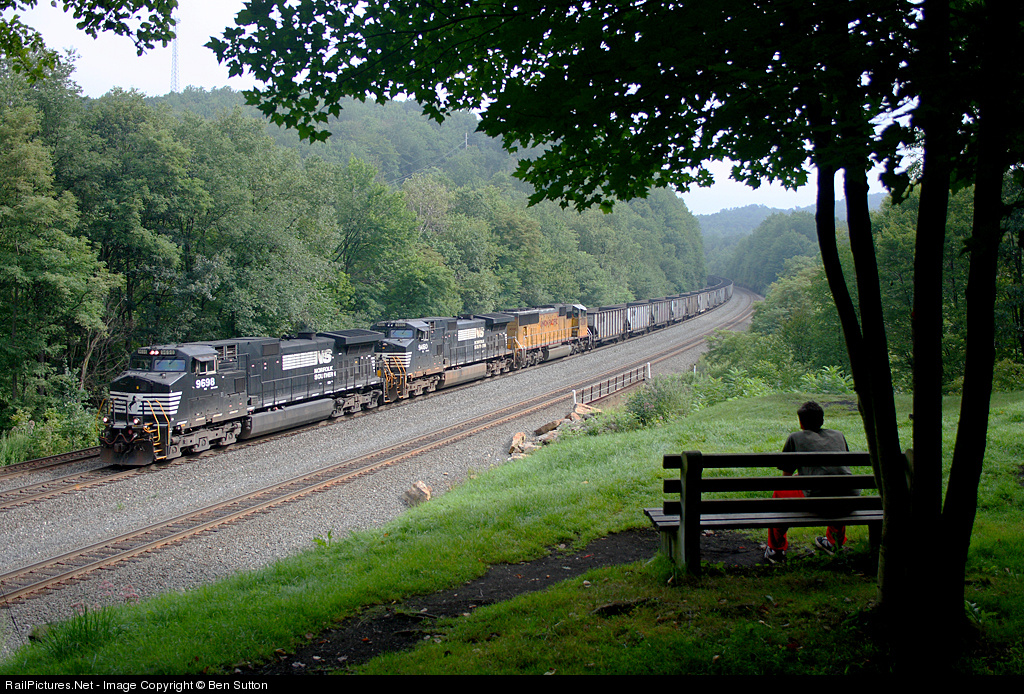 The question is when is it OK to make the train the main focus and when is it ok to have more human interest? Well, I would suppose it depends on what sort of story you are trying to tell.
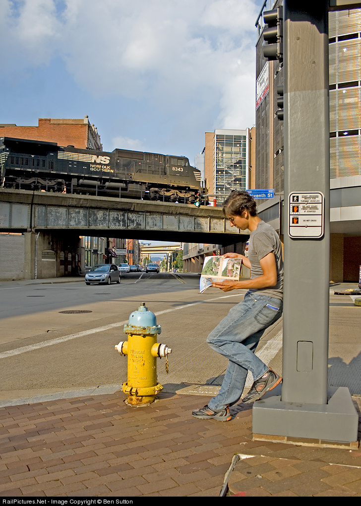 In this one (also by Ben Sutton), there is tension between the person, the train, the magazine, the bright yellow fire hydrant, and the leading lines of the street with the many angular overpasses receding into the distance. We look at the train and the person, but the person's attention is not on the train or us, but the magazine, which itself is about trains. This isn't a "relaxing" composition, because the viewer is left wondering what is the "story". It is "strange". I like it anyway because of that tension and "strangeness".
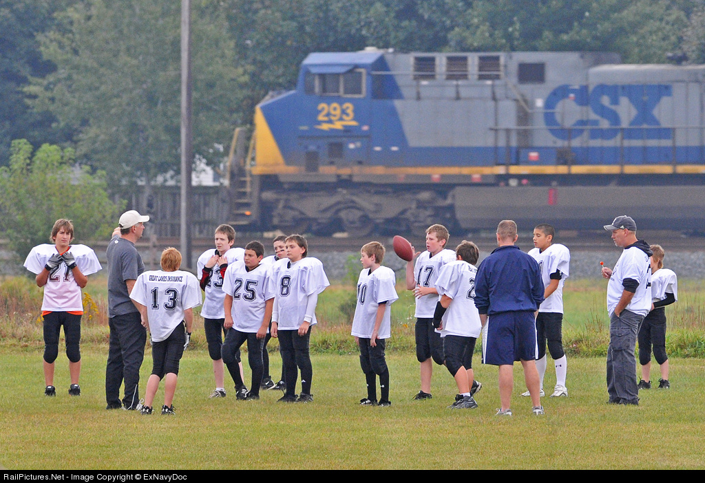 Here, I was trying to show the train as part of the scenery. The kids and coaches are here to play football, not watch trains. The train noise nearly drowns out conversation, but the team ignores the intrusion. The focus is on the people; the train passes through, and the game goes on.
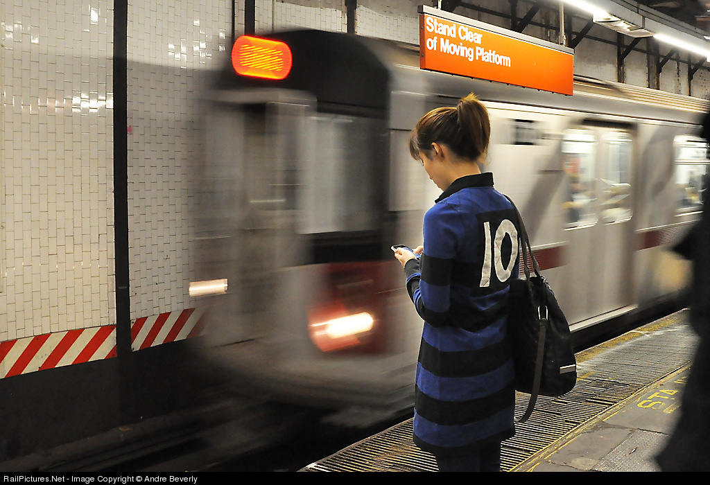 Not mine (by Andre Beverly, other shots here), but I love this shot. The girl stands mere feet away from the onrushing transit train, but is completely oblivious. We can imagine the noise and rush of air as the train enters the station, but she might as well be a statue. The viewer wants to look at the massive object in motion, but instead we are drawn to her handheld device. Who is she texting? What message is so important that she shuts out all her surroundings, including us?
 Keith has an extensive body of work so I could pick out all sorts of themes; I'm going with a few shots that combine aspects of texture and mood. Texture, taken literally, conveys a tactile impression visually: soft, rough, slippery. I view it as more than that, as a way to emphasize part of the character of location. Texture itself also contributes to mood, just as light does, so photographs that emphasize both dimensions are particularly powerful.
 In the second image the use of texture is more straight-forward and at the same time more unusual. The shimmer and granularity of the water contrasts with the diffuse, soft slopes and the smoke off the engines, giving a counterpoint to the presence of the train. Beautiful terrain but it doesn't look like a great time to be there, the mood is somber, yet with signs of life from train and sparkling water. By no means a striking image but worthy of contemplation.
 The third image is a classic B/W with low light creating strong shadows on the ground, highlighting the dirt, stones, debris, and rails of the yard, contrasting with the diffuse shapes and tonal variations in the steam and the rigid geometry of the wall and doors on the right. The presence of the shovel mechanism conveys a sense of abandonment or waste, or at least better days, even though the facility looks to be active and well kept. I'm a fan of the emphasis through contrasts and shadows on the rough ground textures.
 As usual the last image is my favorite of the set. The variety of textures! Snow blowing in the air, seen as distinct streaks of snow, and also as snow dust kicked up by the train; the ripples in the water; the fine lines of the tree branches; the ballast and ties. The backlight and the snow reduce the extent of color, and the yellow engine noses is soft rather than bright, subtle. The backlight also makes the blown snow streaks visible and creates a quiet mood.
  Until then, consider what I have written as you contemplate this shot. It's like a homework assignment! :)
 I was unaware that Railfan & Railroad magazine has a contest. Unfortunately entry deadline is extremely soon, last day of September or first day of October, something like that. $200 first prize; don't recall the theme, if any. Sorry for not having more info; I couldn't find any info online. Now I know to look for it next year.
 Finally, the Center for Rail Photography and Art is doing their annual contest again. This year's theme is "Beyond the Locomotive" with the added explanation that "This year’s theme challenges the photographer to understate (or even eliminate) the locomotive in the photograph and emphasize other aspects of the railroad environment." First prize is also a Canon 50D! Deadline December 31; modest entry fee of $10 for non-members of the Center. Link here.
 PS: I forgot all about Day In North America, a competition/compilation where everyone submits their shots taken on one day; the selected shots appear in an issue of Railroads Illustrated. That day was October 3, 2009, so it is too late to make a plan, but if you took a nice shot that day, the information for submission can be found here.

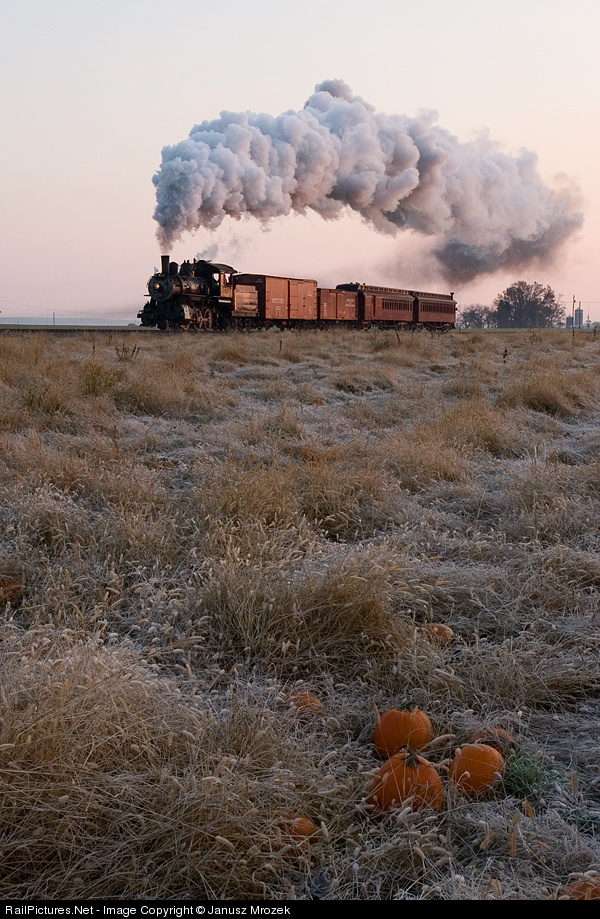 Consider this shot, what I call my "pumpkin" shot (captioned version here). One person whose opinion on rail photography I respect says they really like the shot. Another person whose opinion on rail photography I respect says the shot does not hold together. How can we reconcile these opposing viewpoints?
 Gallery of Steel: International Railway Art Exhibition is "where I capture and share the very best, most artistic, compelling, creative, moving, bold, original, unique, edgy, brilliant (in my opinion) railway-related photographs on Flickr." A person (persons?) after my own heart! A nice range of creativity, most notably in a sizable volume of HDR work, done not for realism but for expression. This is a Flickr-based moderated group of images. There is a regular page here but what is interesting and nicely done is the alternative black-background presentation linked to above. The regular page includes a brief statement of principles from which the above quote is taken.
 Beyond the Wedge is less creative than Gallery of Steel in that it does not feature photography that deviates from representational photography to the same extremes. Which doesn't mean it is worse, or better, just different! One thing I notice (because my preferences favor them) is the many shots that involve capturing equipment and other details, plus broader perspectives, with severe and/or non-standard cropping. But that is just one part of a set of images with interesting variety. Also Flickr-based, also moderated.
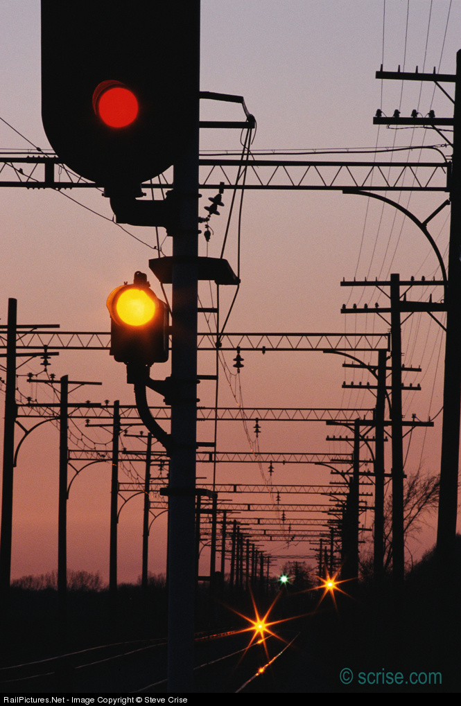 But it need not be so. Let's take a look at some shots by Steve Crise (webpage here, railroad stuff here). Yes, it is my second look at Steve's stuff, and there are LOTS of other photogs with great stuff, but the topic came to mind and it turned out he has some shots worth discussing. I go where my mind takes me! (And besides, as long as it has been since the last post, I really need to follow my thoughts while they are active and get some things written.)
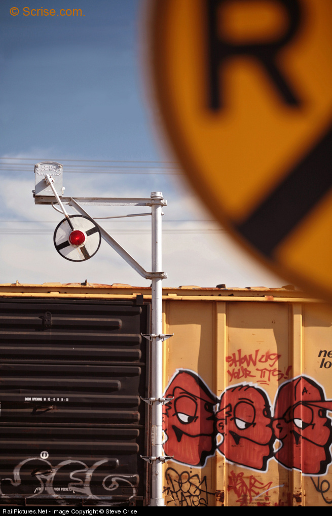 Now, take a look at this shot featuring multiple cut-offs (annotated version here): crossing sign in the corner but also the boxcar, and signal post, at the bottom. The cut-off of the crossing sign is somewhat understandable, along the same lines as above: feature it more prominently and it becomes the story instead of contributing to the story. Here, keeping it in means that the shot has some depth rather than being essentially flat, and gives some context for the unusual signal.
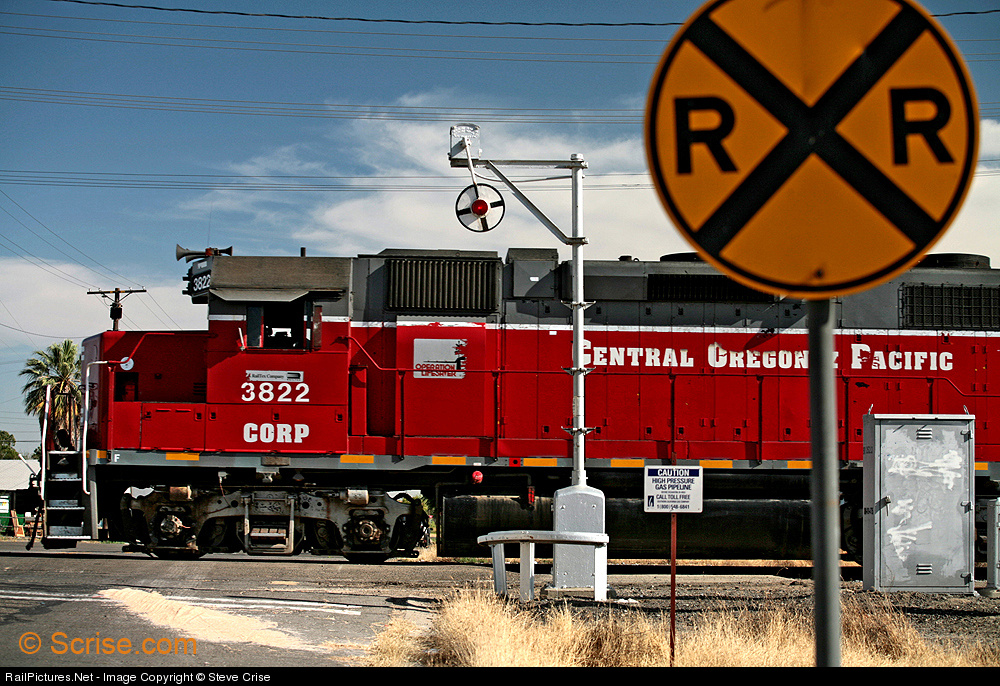 I can enhance the point by comparing with a more conventional shot at the very same location (annotated version here). In this shot the crossing sign is again cut off, to a lesser degree, but the other elements are not, other than the trailing end of the engine. So the look is more "conventional" in framing, much like the first shot, and has no abstraction. Rather, it is a "tight" look at a scene.
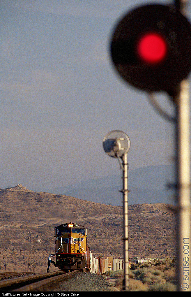 Let's finish with another successful shot. This shot takes an ordinary (but attractive!) train and signal scene, one we have all shot a zillion times, and adds a second signal in the foreground (annotated version here). The signal head is trimmed just a bit on the side but the bottom half of the post is not shown.
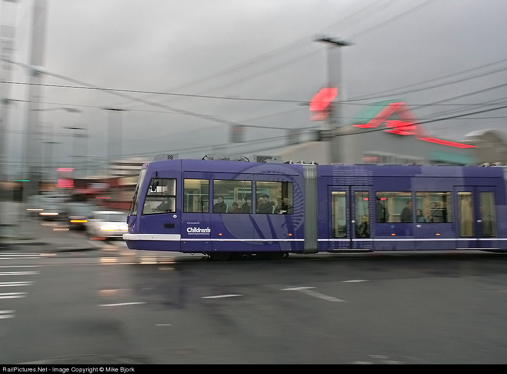 I usually don't care for pans; to me they seem like roster shots with shallow DoF, just an engine and a blurred background, just a different kind of blur. Diesels especially, even with the implied motion there isn't much life in those sorts of shots. But I have seen pans that bring more to the table; here are a few. The key is that the background show some context or offer some contrast, some juxtaposition to the subject.
 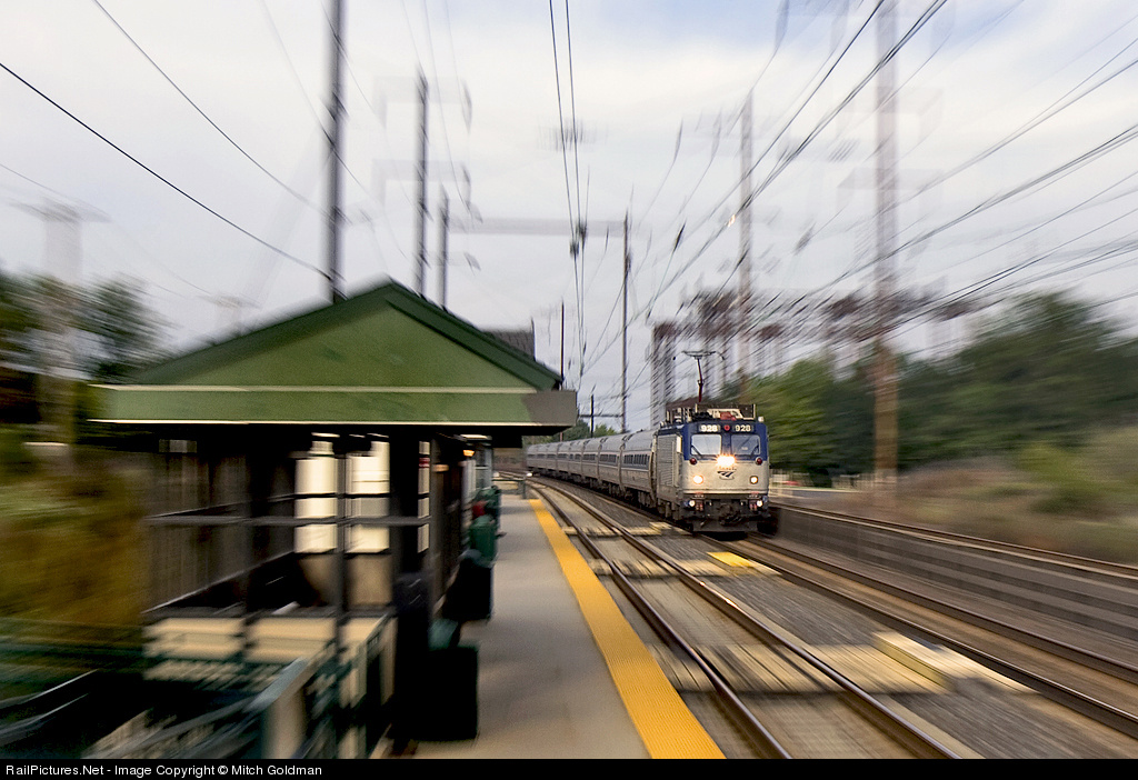 Mitch Goldman, well known for his pans (and other great shots, RP shots here) has been developing his zoom pan technique recently. What I love about this one (captioned version here) is the context. It can be tricky to do an "electrified pan" because one can end up with just a mess of blurred wires and catenary structure. Mitch solves the problem here by doing a zoom pan at a station. By doing the nose-on shot he has room to include trackside elements; by shooting at a station he finds interesting elements to include, not just the shelter but the yellow warning stripe and the wooden paths for boarding on the inner track. He places the train further back, increasing the depth and thus adding to the sense of motion, not just a generic blur but an approaching speedster. Excellent!
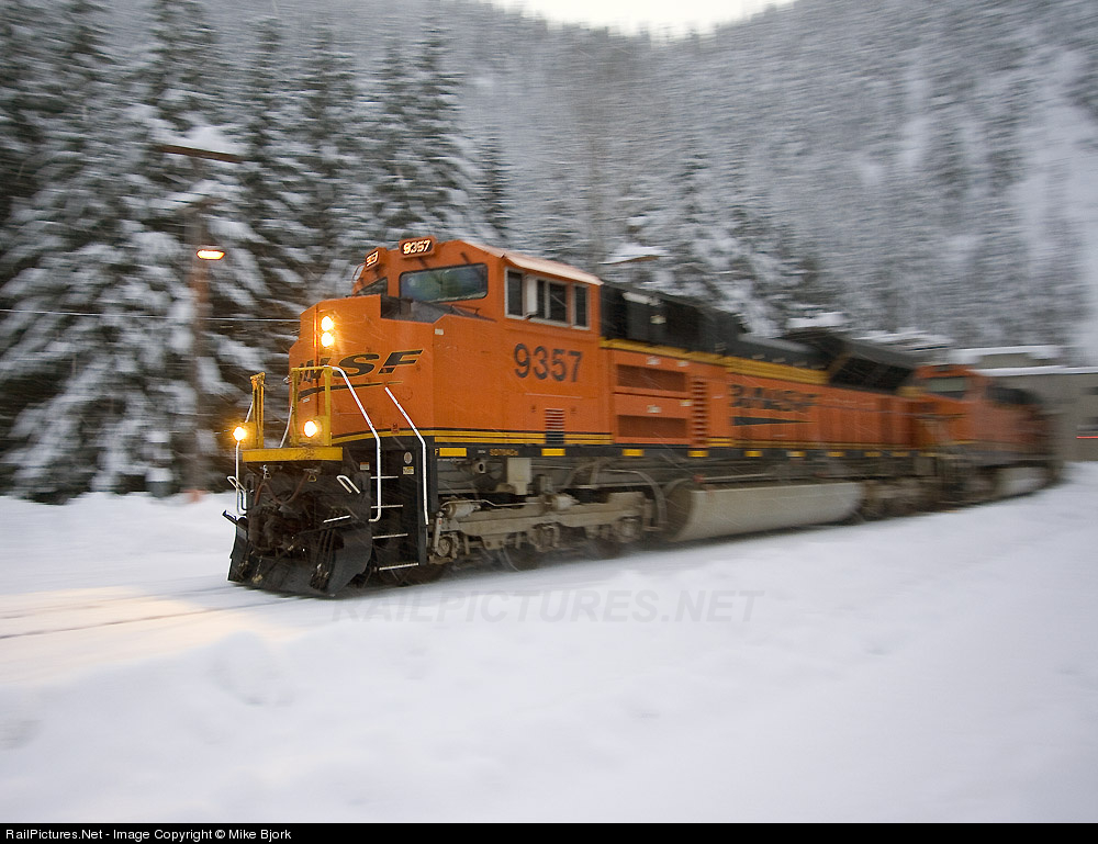 For the final shot, let's go back to Mike Bjork. He recently shot what I will call a "wedgie pan" at Cascade Tunnel (captioned version here). The wedgie angle results in the pan only freezing part of the engine, but look at what one gets from that angle, a view going back down the train to the portal, adding context and interest. Given that the angled view means less panning is required, one gets less blurring of the background, which here means the trees retail reasonable definition. Add to that lots of snow and the semi-selective color that comes with shooting BNSF orange during darkening conditions and you end up with a super shot!
 I won't claim to have made a full study of all night-time rail photography work. I don't want to get into recent debates, or more serious ones, about what constitutes excellence in the night. All I want to do, really, is to point out that Nick Suydam's recent slide show, "A Late Night in the City: The Railroad Capital After Dark" is tremendous!
 The man and the platform tie the pieces together as he is on the left side but about to walk onto the right, where the vanishing point for the various lines lies. The color is a surprisingly attractive yellow, with splashes of blue and red. One engine is seen from the side, the other nose-on. A really interesting combination of elements!
 The next shot is a dusk shot. I won't claim that this is a great shot, maybe not even a good shot, but I find it interesting, mostly because of the compexity. It is a maze of geometric patterns and blocks of light. I like the way some of the cars have only single containers, exposing the ends of some of the containers to light, creating dark/light variation, with other bright blocks formed by the ribbed container side and the signal box. I like the way the signal bridge in the background is lit up but the foreground cantilever is dark. I like the way the verticals in the train (container sides, wells, container edges) go along with the verticals in the power line support structures. I like the way the yellows and pastels are accented with the red in the signals and the green reflecting off the sides of the train.
 Ok, then, let's now get to a shot I love. This shot is what pulled me in to this body of work, what led me to search it out to see what else was there. This shot has it all, forms, lines, mood, color, depth, motion. What a dramatic scene!
 I'm a fan but not a huge fan of Nick d'Amato's shot (captioned version here). In looking at running gear I like the interplay between the curves of the drivers and the lines of the rods and so forth. In Nick's shot the curves are barely visible and the lines are primarily horizontal, with just the one short diagonal. The shot does not have a nice blend of geometric elements. Also, being a flat shot, a shot taken perpendicular to the subjext, it does not have a great deal of depth. What I do like are the textures on the metals, not to mention the wisps of steam here and there and the light coming through from the back at top center, not to mention the many bolts.
 Keith Burgess goes for the angle and steam approach (captioned version here, website here), with the main rod and the steam telling the story. The presence of the steam is sort of a tradeoff; one loses the details of what is a magnificent beast but instead one gets a stronger sense of its life. The steam on the right also hides what would have been distracting complexity, putting the focus on two main rods and one wheel, although my curves-favoring eye is also drawn to the upper curve in the next driver forward. (I will admit to a bit of confusion as to why it is so high; I feel like I am misreading something in the mechanical arrangement.)
 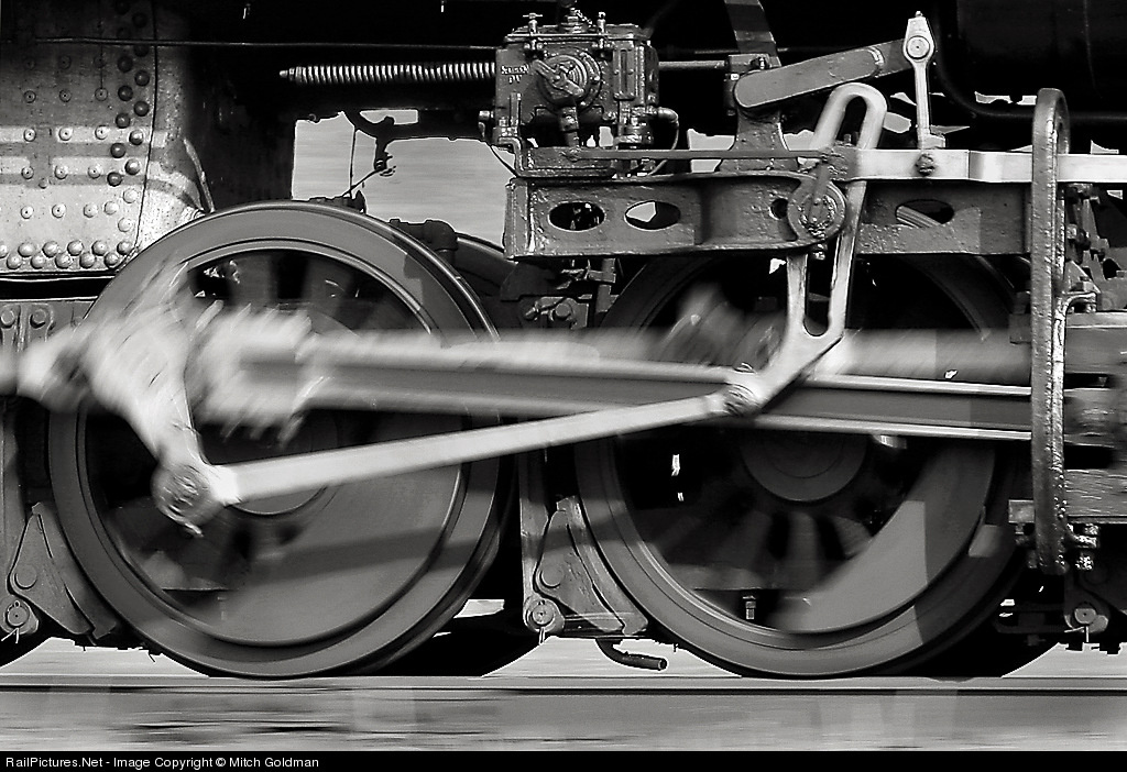 Mitch Goldman goes for what I will call a "detail pan" (captioned version here) with interesting results. This one, unlike the others and unlike most running gear shots, shows the gear running! He's got the up/down on the rod and the circular motion of the drivers, excellent! There is a large expanse of open background flying by. For some reason, that does disturb me, I must say. I think I would prefer a bit more of the boiler to be visible to provide some more weight at the top of the picture. It is nice that the driver area is so open - and so well lit! - but there is a bit missing of what I can only call gravitas. Still a cool shot. I bet Mitch could take a running gear crop of any of a number of his pans and I would love it, but I only like this one.
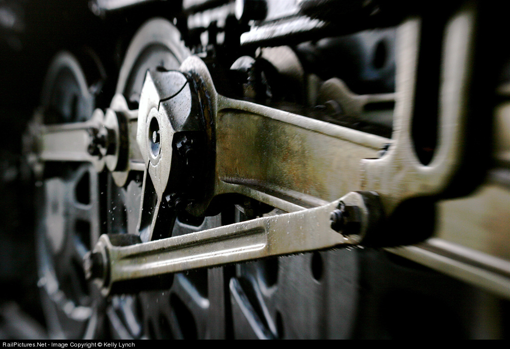 Kelly Lynch's shot (captioned version here, website here) has some really interesting details. First, it has a particular, eccentric (a pun!) mix of focus and out of focus areas; Kelly used a lens baby to create the effect. The focus is on the pivot, an oddly-shaped piece of metal, but with the connections going to it and the contrasting angle formed by the line of the secondary rod and the U-shape in the right foreground, and the drivers in the backgrounds, with their spokes, there are lots of fascinating lines, curves, and shapes to feast on. All seen at a dynamic angle.
 Posts
All Comments
Posts
All Comments


