Saturday, July 12, 2008

Trains in the Distance

In a recent post, I made the following statement: "The image is a train in its environment, not an environment with a train in it." By this I implicitly referred to a tension between the size of a train in a shot and its presence within the image. A train can be a small element within a shot and yet have a much larger presence, in fact, be a major focal point, as it is in the images in that post. The converse is not necessarily true, usually, as a train that occupies a sizable part of an image will necessarily tend to have presence. Nonetheless, size and presence need not be in proportion. Here I want to consider a set of images where the train is small but their presence differs from minuscule to significant.

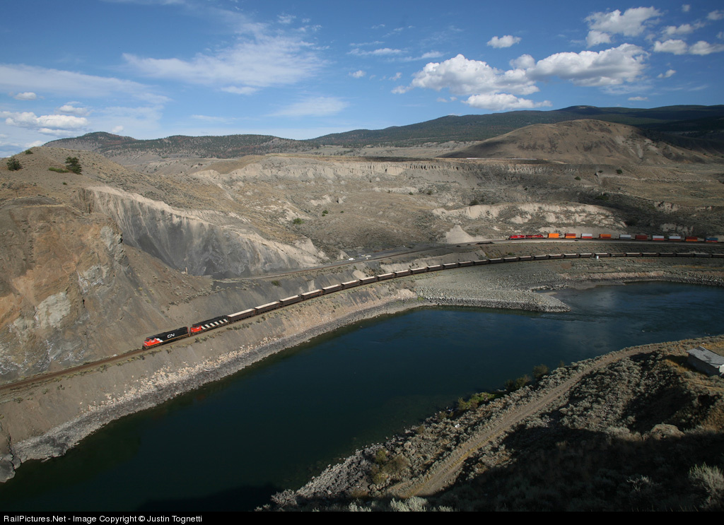
Consider first this image by Justin Tognetti (captioned version here; more of his work here). The train is pretty small, but this is obviously a train shot, in fact, two trains appear. The scene is basic, terrain, water, sky. I just love the way the front of the more distant train is framed by cloud shadows, which also gives it a more distinct identity relative to the first. The terrain has lots of interesting textures and hues and the two trains have a bit of lower left / upper right positioning. Very nice!
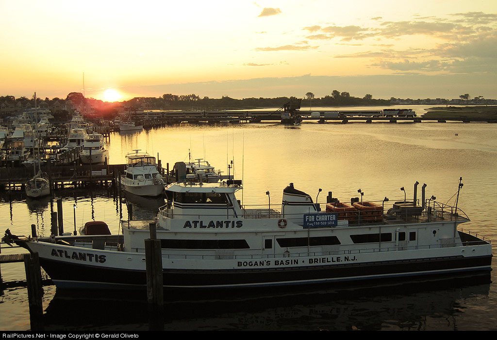
But the train need not be such an obvious part of the image. This boat shot is by Gerald Oliveto (captioned version here; more of his work here). The light is nice and the color of the water is subtly gorgeous. But the train is difficult to find (and would be more difficult but for the precise framing of the power in front of a brighter spot of water). It's an interesting scene, but not particularly a railroad image, as the train is barely visible. (For my tastes, had the shot been a bit wider, so that the boat was less squeezed and more of the marina were present on the left, it may have had better balance.)

Both of those shots are landscape scenes. Instead, a shot can be more abstract. Here is one by Tom Mugnano (captioned version here; more of his work here). The train has a subtle presence here, but a bit stronger (and it is hard for me to judge since I know the location well and therefore the train is more obvious to me). What I find interesting is the layout of the town - all the blocks and buildings (and windows within them) give the shot a bit of an abstract feel. It reminds me of shots I have seen and taken, from a much lower angle, across an old European cities with a series of tile roofs. Lots of rectangles and such.

So, then, how does one consider this image, by Graham Williams (more of his work here)? This is the image that first compelled me to contemplate this subject. The scene lacks an obvious subject - there are a number of elements, (short) train, village, windmills, isolated farms, trees. One could say the scene is the scene, or that the scene is a pastiche of things, one of which happens to be a train. I happen to find this scene pretty, in a way, and interesting, in that my eye dances around the scene. At the same time, my eye doesn't stop much; perhaps I can exaggerate and call it an anti-composition because it lacks form. It's a jumble of elements with only tangential relationships to each other, in my view, but it all works for me. It's pleasant, it's interesting to look at. It's not a great shot, but it is a nice shot, and it's a bit off the beaten path of scenics, so it is inherently interesting.

Sunday, July 6, 2008

Subtle Color

My favorite dimension of photography is color. Yes, more than light, as much as we all love great light. Here are some shots whose use of color has particular appeal to me, even though in both cases its role is secondary.

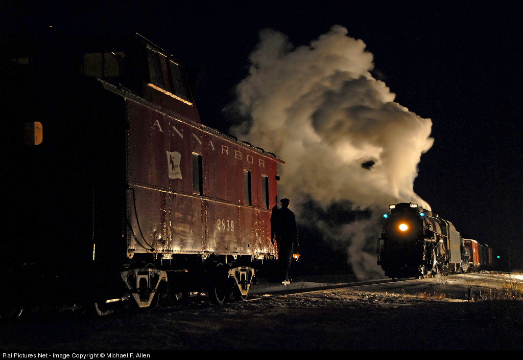
First is a night scene by Michael Allen. One can photograph night scenes in many ways, such as the extensively-lit, colorful shots by Gary Knapp. Usually one must take a moderate approach, however. Michael's shot (captioned version here) was taken during a photo charter, using several light stands to light up the train but not the surrounding scene.

I love the rich yet understated hue of the caboose; one gets a strong sense of what it would look like during daytime, yet here it has a quiet presence. But in addition, there are splashes of green, in the marker lights and in the distance (a signal? on another caboose?). And the red of the caboose is repeated in the boxcar behind the tender. (I also like the hint of browns in the plume.) By no means is this a colorful shot, yet the colors make it rich and complete.

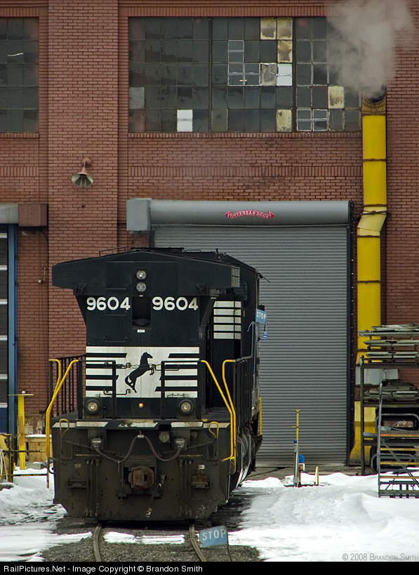
Next is an engine-shop shot by Brandon Smith (PBase site here, RP pix here). The light is muted, but the colors, while not vibrant, stand out (perhaps in part because they are primary colors, red, yellow, a bit of blue in the STOP signs). The yellow of the exhaust pipe is echoed in the yellow of the handrails and of the post on the left.

The composition (captioned version here) is interesting also, with the engine well off center and below. I think of the shot as two blocks, the big vertical rectangle formed by the engine staring in the lower left and taking up a good bit of the frame, and the smaller horizontal rectangle of the window above, slightly off center, and further weighted toward the right by the stronger pattern in the panes on the center and right compared to the left. The exhaust pipe ties it all together, and there is even a bit of steam.

In addition, there is a nice mix of textures, with the pattern in the bricks, the horizontal lines in the roll-up door, the smooth surface of the front of the engine, and the snow. All in all, sure I'd prefer stronger light, but still very nice work, so much else there to enjoy.

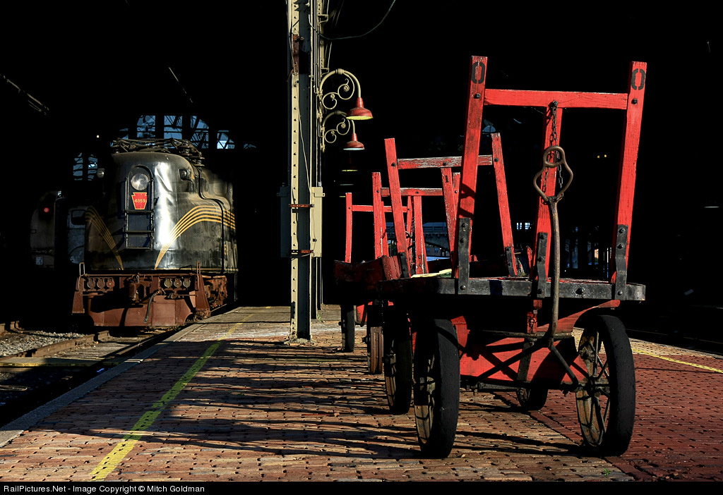
Finally, look at Mitch Goldman's shot (captioned version here). It's a better known shot than the other two, so normally I would not use it, but I just like it! and it's a shot I think of when I think of color. What makes this shot so nice is that strong colors are set in front of a black background, making them appear brighter and stronger. The dominant red of the cart is echoed in the PRR keystone on the nose of the GG-1. Softer reddish hues appear in the bricks, the lamps, and to some extent on the pilot of the GG-1. The splash of bright blue above the engine, the area of reflected light, and the yellow stripes give the left side a bit of color complexity to balance the strong presence of the red on the right.

Overall, the first two of these shots use color with some subtlety. They are not about color primarily, but color greatly contributes. The third shot has dominant color, but what is of interest to me is the color in other parts of the image that makes subtle contributions.

Tuesday, July 1, 2008

Extreme Positioning

Photographers pursuing making images beyond simple snapshots tend to quickly run across the rule of thirds. But rules are made to be broken, as the cliche states, and sometimes a shot works well with the subject closer to or at the center. (For that matter the "rule" of thirds is only a guideline, after all.) What interests me here is the opposite, where one moves the subject of a shot, or at least one of the important elements, further away from the rule of thirds locations towards the boundaries of the image. Here are two images that do so quite successfully.

The first image is a mountain image by John West (captioned version here). And that is the point; in one sense it is a mountain image, against which the train measures up as a trivial presence. Of course, the primary subject is the train. In particular, it does not appear so small that it is difficult to observe and relate to, and for that matter the mountain is not so much a second element in the composition as the primary background and definer of scale. The image is a train in its environment, not an environment with a train in it. And yet, the mountain is huge; its peak is clearly well above the top of the image. Its height receives greater emphasis because of the placement of the train at the very bottom of the image, instead of, say, at a rule-of-thirds location.

Of course, there are other things to love about this shot, the falling snow, the splash of yellow in an otherwise field of muted colors.

The second shot, by contrast, is a flatland scene by Francois Iliovici, taken at Fagelsta in Sweden. This shot also reduces the scale of the train relative to that of nature, albeit in a different way. The shot has two elements, of course, train and moon. Francois could have easily placed the train at the lower rule of thirds location and the image would have been just fine. Instead, he places it further down, not on the margin but well down toward it. As a result he creates a greater sense of space, in the compositional meaning of the term as well as the astronomical! Thus, here, instead of a mere mountain, it is the cosmos itself that is being juxtaposed with the train.

Notice also the gradual transition, the gradient, in the sky color, from whitish blue at the bottom with hints of light red to a full sky blue at the top. Very nice! [BTW, the orientation of the scene is such that it appears not to be level, but it is.]

It comes to mind that this type of composition has something in common with the Cut The Corner compositions I discussed a few weeks ago. Both posts show examples of how photographers can successfully go beyond standard approaches.

Friday, June 27, 2008

This Website Will Continue!

With a gap of three weeks between posts, some may have wondered if this was a flash in the pan. While I have had family and work (and therefore sleep!) obligations crop up, I want to say I have a number of ideas accumulated, a number of photographer permissions to use pictures received, and continued interest in pursuing this approach to my interest in rail photography. I expect going forward that I will continue to post at least every two weeks, with some waves of extra effort and, necessarily, the occasional hiccup, leading to the occasional gap in timing of new material. The effort is harder than I expected (individual posts are not put together in 10 minutes but take contemplation over time as well as writing and rewriting to bring ideas to final fruition).

Please continue to check back occasionally; I intend to continue to provide commentary worth your time. Toward that end, I now provide RSS links on the right hand side of this page.

Scott Lothes: Bridges

Scott Lothes (website here; take a look at the image on his home page!!) has graciously offered to have me write about some of his shots. He sent me six and I have chosen these two for discussion. Neither is the best nor the worst (least good?) of the six, but both serve as exemplars of his style without additional complications. These are different shots of the same bridge, one Scott has been "working on" for some time.

My first observation is simply that his style here is different than I am accustomed to. I am used to looking at rail and non-rail landscapes that are somewhat dramatic, colorful (or broader tonality in B/W) and sharp.

These shots are interesting to me because they are just the opposite; the effects are subtle. Yes, they are silhouettes, but the light in them is neither colorful nor bright. The light is quite dull, both faded and subtle in shading. They approach B/W in feel, in emphasis on tonality, yet by retaining what appears to be natural color, they retain a presence in reality.

This is my bias; while I love good B/W work, my reaction to it has always involved an element of distancing from the subject, an abstraction. While viewing a B/W shot, I never feel as though I am standing trackside myself; rather, I absorb the image much as I would a painting. Thus, I view B/W work as a bridge, to some extent, between the realism inherent in photography and the abstraction in painting.

Back to these shots. I have mixed preferences here; I like some aspects of each shot. The first shot has more implied action, in the cloud bank moving in and in the lights on the distant shore under the bridge, a motion in time rather than space, towards nightfall or daybreak.

I also see the pattern of the wavelets in the water. I notice these wavelets in particular because I am a windsurfer (lapsed, I should say) and I have learned to see the wind coming/shifting through them. There is a zone, a triangle at the lower left, continued a bit somewhat higher, just in front of the left end of the bridge. [I'll make the probably obvious comment that we all bring our own experiences to bear when we look at an image.]

The shot has an interesting three-zone layout, sky at the top, then darker cloud with dark, then light water. At the same time, this is the major weakness of the shot, in my view. I find that the bridge and the train get just a bit lost in the darkness. My reaction would be less so were there not brighter areas elsewhere in the frame. Also, the bridge separate poorly from the darkness of the far short below the bridge, especially on the left side.

The second shot is simpler, a more pure silhouette, albeit one with more going on in the darker elements. The medium tone of the distant port, to the right of the bridge pier, is a nice second focal point. [Again, my experiential baggage, I love ports. Does your eye go to this area of the shot the way mine does?] The birds bring an element of life to the shot, always dynamic, that the first shot lacks.

However, it has less interesting color, sort of like a sepia in that there is one dominant hue, whereas the first shot has a bit of yellow/orange in the sky, a bit more reddish in the quieter water in the lower left corner, and some bluish in the clouds (the latter I think is actually not part of the actual hue, but my brain basically puts it there as a response to the entire image). The image is a bit hazy, in a way which seems to be part of the style but I personally don't find interesting. Again, I tend to like things to be more dramatic.

[It occurs to me that another dimension of this is that these images by Scott are not razor sharp; that does not bother me at all and I think that aspect intentionally contributes to the muted feel of the shots overall, but I know some will find it a distinct shortfall in image quality.]

The question of drama is a good point to end on. There are various levels of pizazz in images. These shots feature reduced tonal and color drama in favor of other elements. The amount of drama is one of many choices in our palette of style elements. Ultimately, I doubt I will become a fan of this style of shooting. But exposure to it, and seeing and contemplating what it does and what it conveys, helps in gaining a broader appreciation of photography.

By the way, take a look at Scott's website, which has a modest number of excellent shots, culled from a larger body of work as among his best. If your tastes run toward mine, you will find plenty of interest, with notable differences in styles. I would argue that many of those shots are "better" than the two here, but of course that reflects my preferences. I would love to write about the others down the road, and thanks to Scott's further permission, I will!

Sunday, June 8, 2008

2009 CRPA Contest Theme

The 2009 contest theme is "light impressions." I should take some time and mull over what this means, especially given that photography is all about capturing light. My initial thought (after having read the additional text in the announcement, link above) is that this means any sort of light except plain light. In other words, an image that has some combination of interesting pattern, texture, line, form, and color, but nothing interesting or noteworthy about the light, will not do well.

So, while light is an important element in photography, one can get excellent shots which emphasize other dimensions. For example, it is often suggested that outdoor portraiture can be done well when it is overcast, because then the light is soft and thus more flattering. I view "light impressions" as excluding shots for which light is not a predominant defining factor. My suspicion is that this excludes much mid-day rail photography - even during times of the year when "high sun" is not a factor - because, while the subject are well-lit, they are not necessarily lit in an interesting way. A well done sunny postcard-style landscape shot is a well done shot, but is not artistic in how it uses light.

However, the guidelines make explicit reference to "mid-day light"! How about that! As I shoot most of the time in such conditions, unfriendly to interesting light, I will be contemplating what one can do during that part of the day.

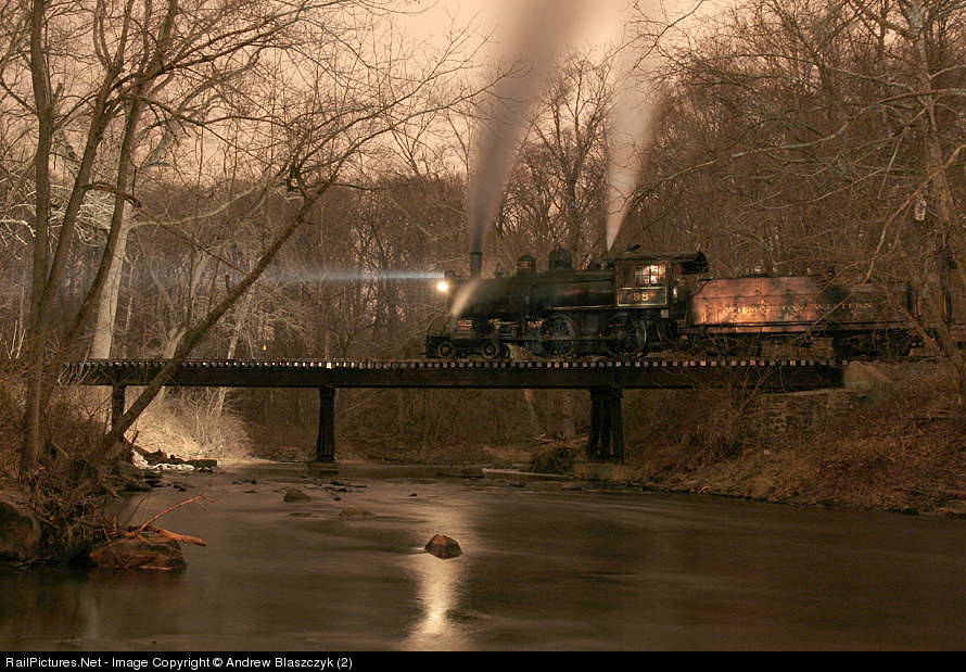
The included image may not be the ideal illustration for "light impressions" but it is at least interesting in that dimension, and I feel a bit lazy today and I want to get this out (blogging is hard, I am finding!), so I have simply grabbed an AB2 shot (captioned version here); thanks Andrew! I love everything about this shot (except, for some reason, the headlight beam grates on me, perhaps because it is off-color, bluish, compared to the rest of the shot). Note how the reflection of the light coming off the engine lights up the water and the stone, and see how the pinkish hue of the glint upper right is complemented by the pinkish glow of the limbs near the water lower left. Subtle details like that expand the image, adding to its complexity and the unity of its structure.

Saturday, June 7, 2008

Cut the Corner

When I spotted this shot by Walter Scriptunas (captioned version here), I was immediately reminded of a favorite Andrew Blaszczyk shot. In both shots the tracks cut off the lower right corner, running from the lower margin to the right margin. Why did this particular style of composition work for me?

Let's take a look at Walter's shot first. Shooting steam results in unique challenges. One, for me, is that having the plume come up out of the engine means that one tends to think vertically in composition, especially if the shot is nose on (or, here, tail on). If one goes horizontal, one has to use the considerable space on either side of the subject.

The best way to fill that space is with interesting environment. But Walter is in a stand of trees - what to do? First of all, he shoves the engine to the right. Since the plume hangs off the left side a bit, he is able to fill the middle of his shot, not only with the top of the plume, but with two well defined tree trunks that lead the eye upwards. And he has a nice bonus for the viewer, a water tank peeking out from near the right edge. So, while all of the hardware action, so to speak, is in the right and lower right, he uses the plume to spread things out.

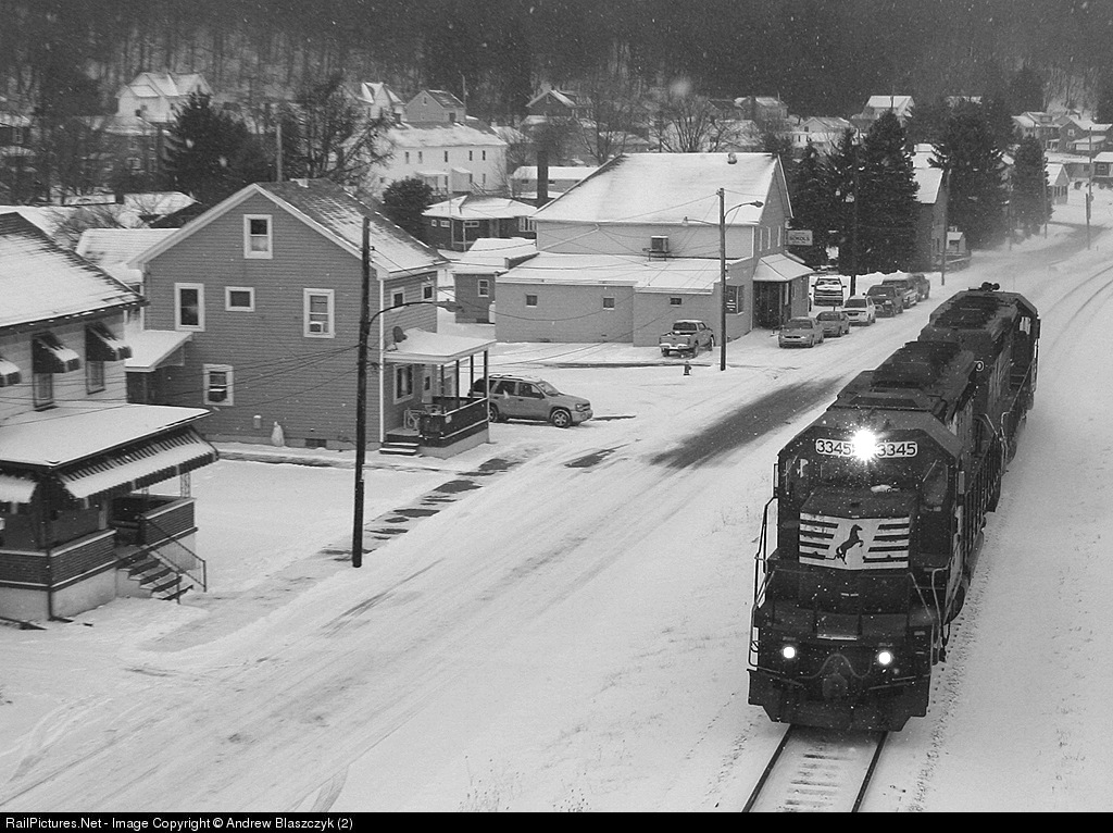
Andrew's shot (captioned version here) is a beautiful town and train shot. I see a diagonal with the railroad world on the right and the town on the left. The houses face the railroad, both literally in the position of their porches and in how their horizontal lines, the rooflines, the pieces of siding, lead to the tracks. The railroad side, by contrast, is a series of near verticals - the tracks, the engines in a pleasing near-vertical diagonal. The engines are a helper set, so the train fits completely within the frame and the eye is not drawn to the edges of the frame. The snow on the ground and in the air gives a nice base for the BW treatment.

One can always quibble. In particular, I think Walter leaves too much space on his left margin, so not quite enough compositional oomph over there and a bit of imbalance. So I would have cropped more. But then, I would not have gotten this shot in the first place! But both shots are the sorts of shots I think about when I am out, or that come to mind when I am at home and realize some missed possibilities. Try putting the train in a corner and fill the frame with elements that complement it.

I really, really like Andrew's shot and so I may return to it in a different context.